
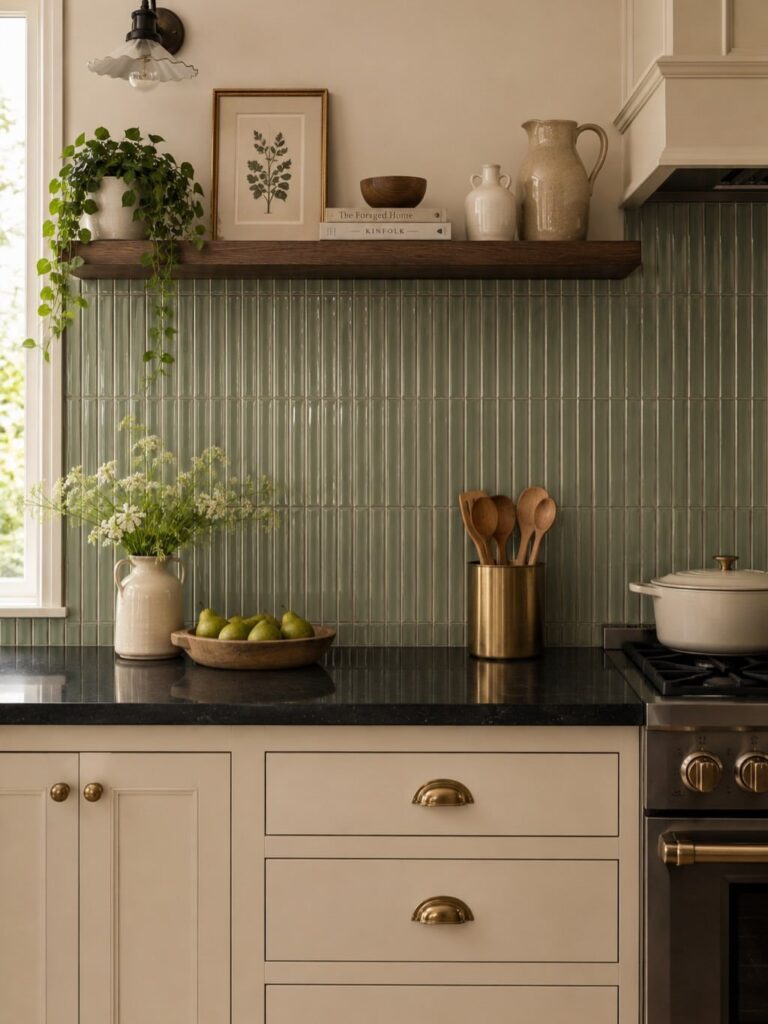
What separates one choice from another is not taste alone but the wall you are willing to maintain: glossy tile wipes clean, rough limestone asks you to clean as you go, and grooved surfaces mean spring cleaning with a brush down each channel.
The proof is in the extremes, Carla Rockmore matching her entire room to a deep green subway tile sample, and Silver Fox brick hauled from a hometown in Wisconsin.
1. Zellige Tile
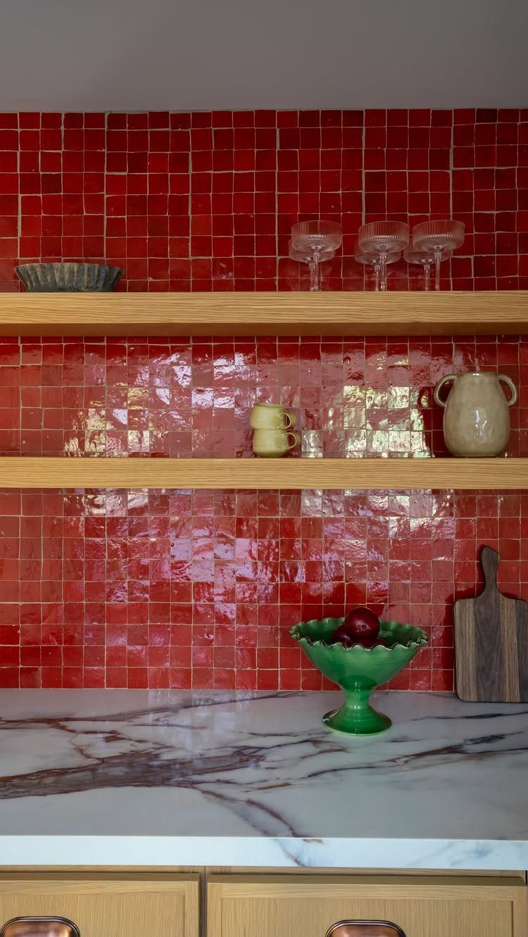
Zellige tile carries the slight unevenness of hand-cut clay, so light moves across the wall in ways factory tile never manages.
The glaze shifts from tile to tile just enough to catch light without turning into a pattern, which keeps a modern kitchen from feeling too controlled.
Warm white grout eases the color jumps between tiles so the wall reads as one surface. A straight stack layout reads cleaner than offset if you want the artisanal look without clutter.
The surface photographs well, so kitchens built for entertaining benefit most.
If your kitchen already has busy veining or strong hardware, zellige competes rather than complements.
2. Marble Subway Tile
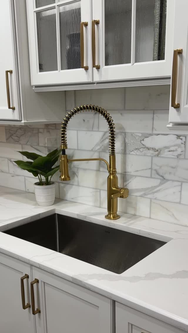
Marble subway tile keeps the familiar shape but trades ceramic flatness for natural veining. That movement pairs cleanly with white cabinets and dark countertops, a combination I see often in kitchens where the owner wants upgrade without risk.
The veining runs different on every tile, so lay out several boxes dry before you commit. What looks random in the box can cluster unpleasantly on the wall.
I check for this even with reputable suppliers.
This suits renters or first-time renovators who want the subway tile safety net with something extra. It costs more than standard ceramic and stains more easily near the range, so seal it yearly if you cook with oil often.
3. Handmade Mosaic Tile
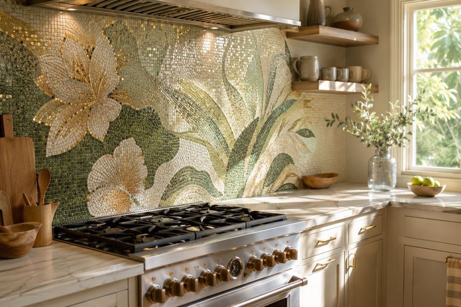
A handmade mosaic backsplash puts something on the wall that no one else has. You commission or paint the design, or you find an artisan whose stock patterns speak to you; the method matters more than any single garden scene.
Custom work takes time. Commissioned mosaics take longer than anything off a shelf, and hand-painted field tiles longer still.
Budget for extra material too; the cutting around outlets and windows wastes more than standard tile.
This suits someone staying put. The investment in labor and the emotional attachment mean you will not want to leave it behind.
For a shorter horizon, look for limited-run artisan lines that give some of the charm without the commitment.
4. Graphic Black-and-White Tile
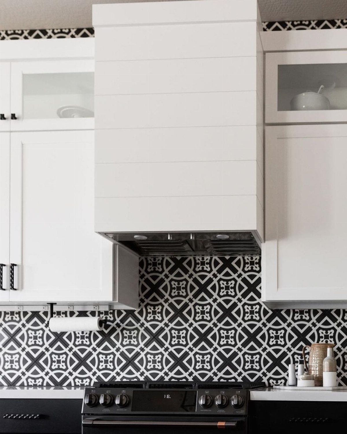
Graphic black-and-white tile gives you bold contrast that white cabinets can absorb without war.
A geometric pattern becomes the focal point only when nothing nearby tries to share the stage: no open shelving with dishes, no strong hardware, no second pattern in the countertop.
Keep the surrounding surfaces quiet. A dark countertop works if it is solid or nearly so; veining fights the tile for attention.
Modern finishes, meaning simple pulls and slab fronts, let the pattern do its job.
This is not a backdrop choice. It suits owners who want the kitchen to announce itself, and who can live with a statement that does not fade into the background over years.
If you tire of visual noise quickly, pick something calmer.
5. Ceramic Tile Backsplash
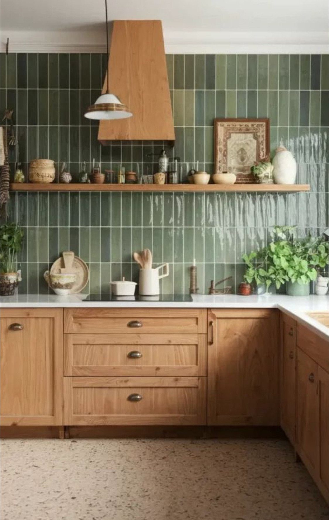
Glossy green ceramic stacked vertical reads differently than the usual horizontal subway run. The vertical lines draw the eye up, which helps in kitchens with standard-height ceilings that feel low.
The gloss bounces light around, useful in spaces with one window or none.
Laura Kirar used ceramics from Delores Hidalgo in her Mérida kitchen, pairing them with wood tones that carried the same warmth. The glaze has brush marks and slight variation that read as intentional imperfection, not flaw.
Unglazed options exist if you want the color without the shine, though they stain more readily near cooking areas.
This suits wood cabinetry especially well. The combination of natural grain and handmade glaze avoids the coldness that glossy tile sometimes brings.
6. Classic White Subway Tile
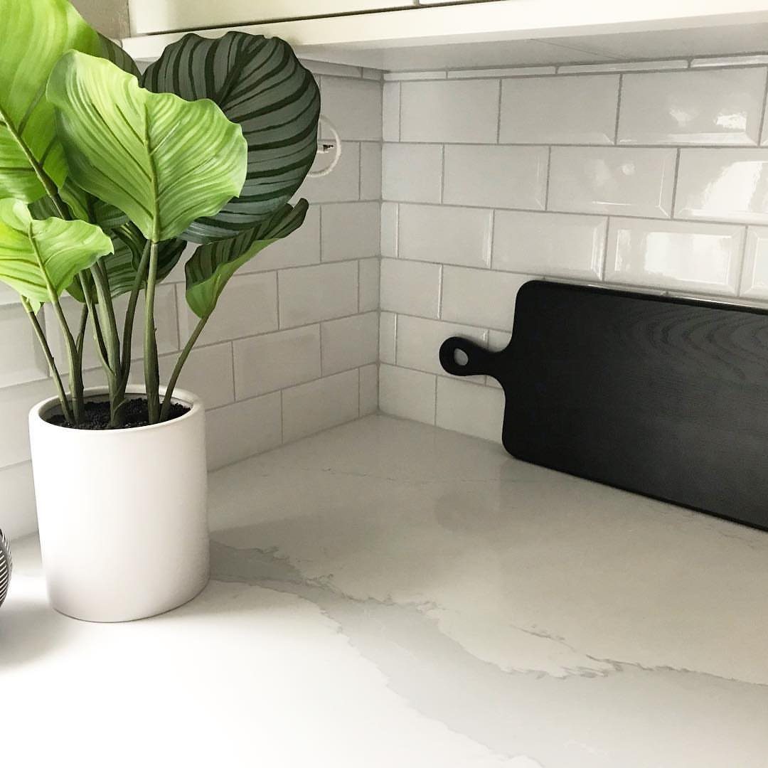
White subway tile persists because it adapts. White subway tile recedes so your objects, your colors, your daily life become the interest.
Contrasting grout changes the whole look for the cost of a bag of grout and an afternoon. Warm metals nearby, brass or copper, keep white from reading as clinical.
Colorful accessories rotate with the season or your mood.
This is the choice for uncertain tastes or resale in your plans. It trades away the immediate impact of pattern or strong color for flexibility you may use constantly or never think about, both valid outcomes.
7. Bold Color Tile
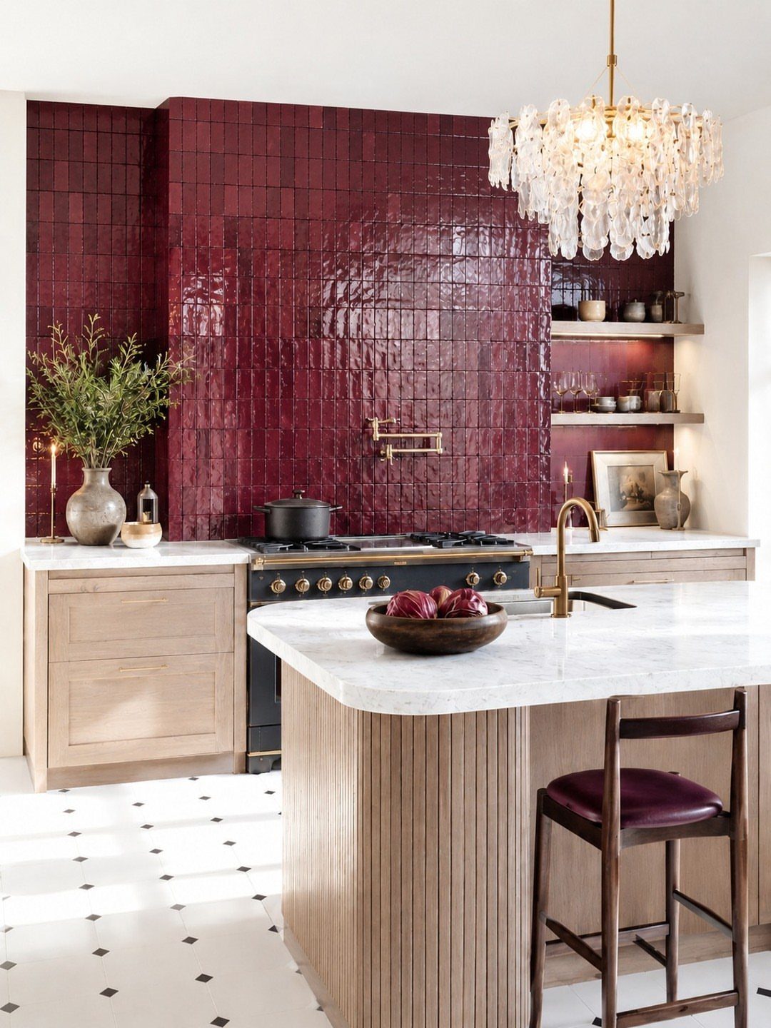
A glossy burgundy backsplash turns the wall behind your stove into the room’s anchor.
Deep blue, earthy green, or wine-red tile works best when cabinets stay white and countertops stay neutral; the color does the talking so nothing else has to compete.
Glossy glaze on ceramic or porcelain cleans up easier behind the range; matte finishes hold onto grease and need more scrubbing.
If you have a kitchen island, painting it to echo the tile hue ties the room together without matching exactly.
This move suits kitchens that need one strong focal point near the range. Keep the rest simple.
8. Herringbone Tile Layout
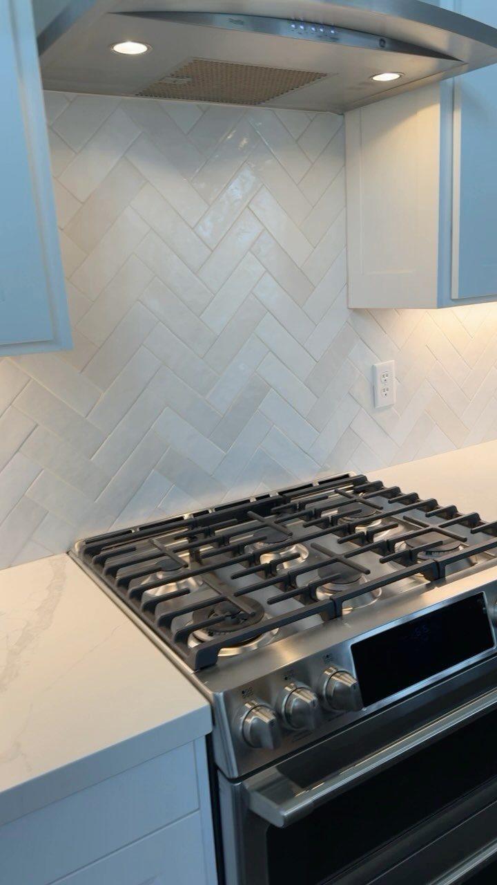
Herringbone sends familiar subway tile in a new direction. The angled rows bring motion to the wall, and the pattern reads tailored without feeling ornate.
Half-offset rows soften the grid so it does not look mechanical. In a galley kitchen, stacked horizontal rows on the long wall read wider; herringbone belongs where you want the eye to land.
Warm white grout against warm white tile keeps the pattern visible but calm.
9. Chevron Tile Layout
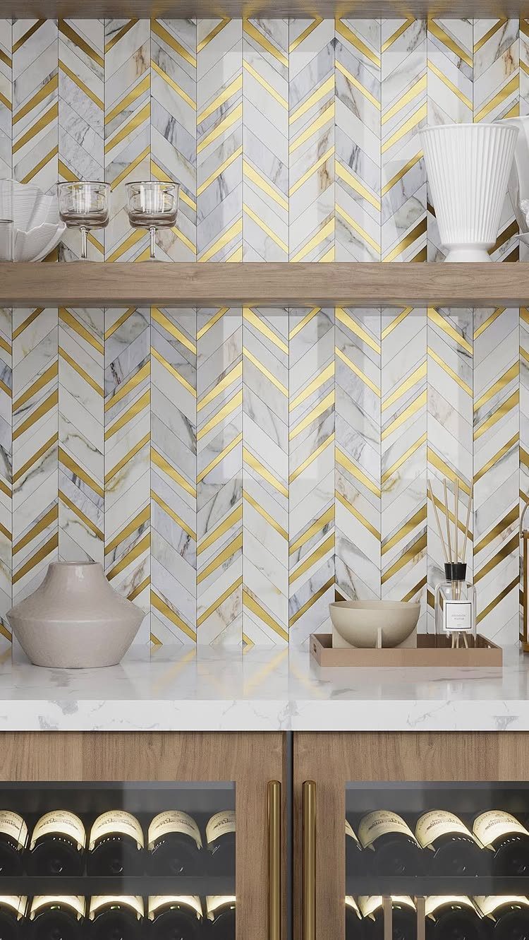
Chevron pushes the V-shaped angle further, so the tile itself forms arrows rather than broken zigzags. Marble with soft veining reads elegant; solid color in matte or gloss turns graphic and modern.
Gold veining through white marble picks up brass hardware and warms the whole wall.
I would let the cabinet color set the tone, then choose the material to support it: taupe or wood cabinetry suits warm marble, while crisp white cabinets can handle a cooler stone or a saturated solid.
Metal trim at the edges keeps the points from looking ragged. This pattern draws the eye by nature, so place it where you want attention: the bar wall, the range, the coffee station.
Not every wall at once.
10. Smoky Mirror Backsplash
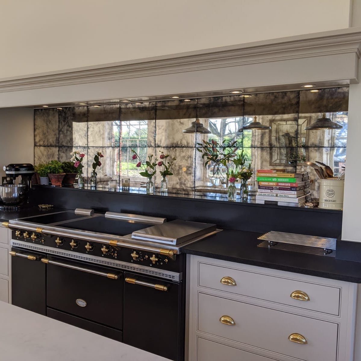
Antiqued mirror behind a bar or cooking zone catches pendant light and doubles whatever sits in front of it. The smoky finish keeps the reflection soft, so the wall glimmers without throwing back a clear image of the room.
I would use this where glassware lives, since the mirror amplifies the sparkle of bottles and decanters behind open shelving or glass-front cabinets. In a darker corner, it bounces what light there is without the harshness of plain mirror.
The antiquing matters: too clear and the wall becomes a distraction, too dark and it loses the lift.
Check your ceiling height and your lighting plan before committing. Low ceilings with one overhead fixture can turn reflective surfaces into glare; layered light from pendants or sconces fixes that.
11. Limestone Walls
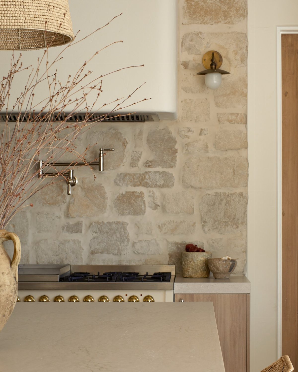
Rubble-finished limestone turns the kitchen wall into something that looks gathered rather than installed. The blocks vary in size and edge, so the surface reads like a found structure, not a applied finish.
This is the move for when the wall itself is the feature and you do not want to cover it with anything else. Sealing matters more here than with cut stone, since the rough surface holds grease and splatter.
I would test a sample near the cooking zone for a month to see how it cleans before committing the whole wall.
The storybook feel trades away the wipe-down ease of tile. It suits cooks who clean as they go and kitchens where the stove is not the hardest-working station.
12. Dramatic Black Backsplash
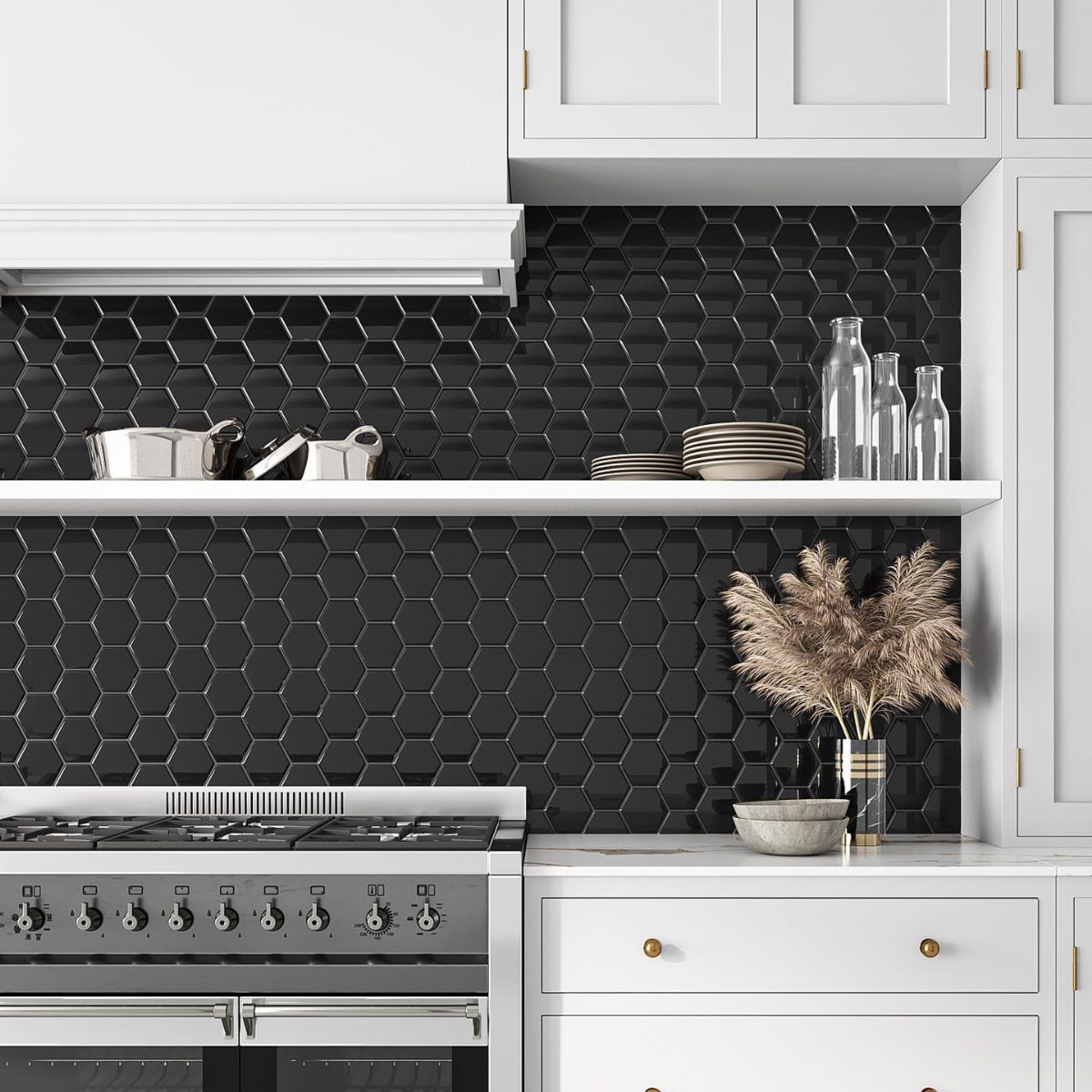
Black hexagonal tile against white cabinetry creates contrast that reads intentional, not accidental. The gloss on the tile catches light so the dark wall does not flatten into a void.
Dark stone adds depth, but the material needs to run continuously for the veining to read as architectural rather than decorative.
I would keep the grout tight and dark so the shapes hold their geometry; light grout fractures the pattern into a grid you did not choose. Gold or brass hardware warms the pairing, as with shelf brackets and pulls.
This suits kitchens with good natural light or strong overhead fixtures, since black absorbs illumination. The trade is maintenance: every water spot and fingerprint shows, so the wipe-down habit matters more here than with mid-tone tile.
13. Neutral Squares
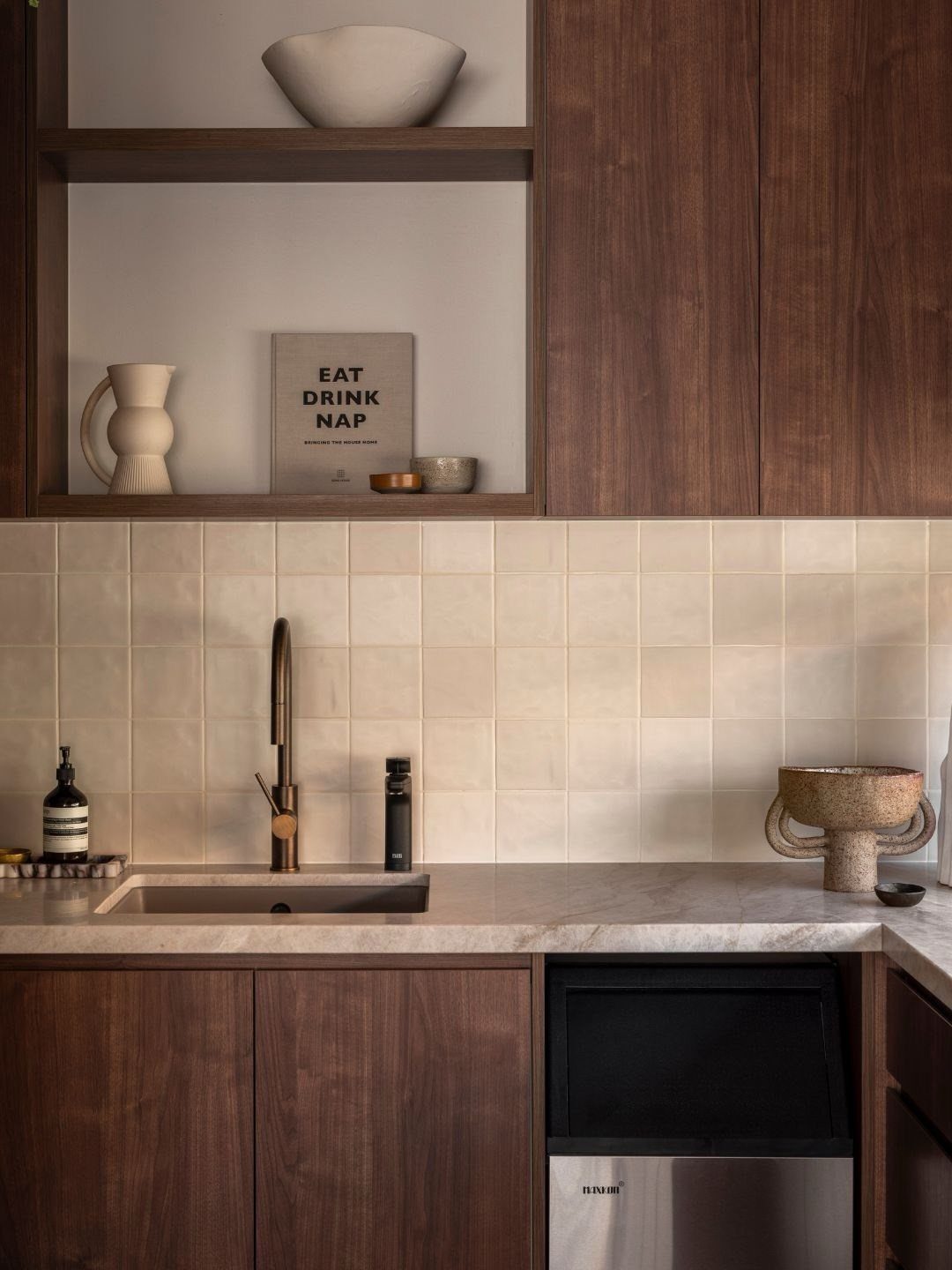
Square tiles in a quiet neutral keep a bright kitchen from feeling busy. Designer Meghan Shadrick chose exactly this for a project where custom cabinetry deserved the attention; the backsplash stepped back so the eye stayed on the joinery.
A staggered bond pattern, set to the ceiling, reads as texture rather than pattern. Waterworks makes tiles in this spirit if you want the same restraint.
This suits anyone pouring most of the budget into cabinets or countertops. The tradeoff is plainness; if you want the backsplash to carry the room, pick a stronger idea from this list.
14. Light Brick
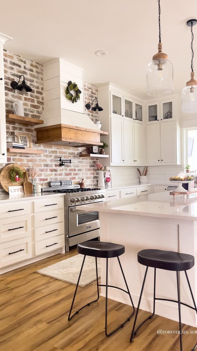
Salvaged brick reads as an exterior wall brought indoors. One Studio Dearborn kitchen used Silver Fox brick sourced from a client’s hometown in Wisconsin.
She limited it to the sink and stove areas, letting the familiar material do the work.
Not everyone has a hometown brick pile waiting. Floor & Decor sells matte white brick ceramic tile that catches the same farmhouse note without the hunt.
Check whether your wall can handle the weight of real brick, or if a ceramic version makes more sense for your cabinets.
The look needs wood or stone nearby to ground it; against glossy white cabinets it can feel pasted on.
15. Textured 3-D Tile
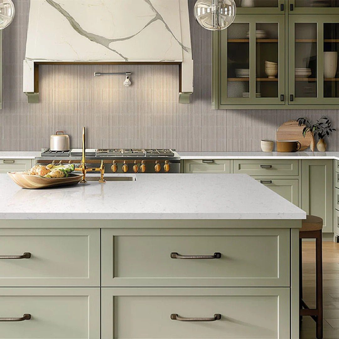
Vertical fluting catches light at different angles through the day, so the same wall looks different at breakfast and at dinner. Even in a single color, the shadow play gives the kitchen architecture it didn’t build in.
Tangram’s Asas Branco 3-D tile is one way to get this; Italian tiles in a leafy pattern work if you want the texture plus color.
Aim light across textured tile, not straight at it; the ridges need grazing light to cast their shadows.
This rewards anyone tired of flat backsplashes but not ready for pattern. Ridges collect grease near the range, so keep a brush that fits the grooves.
16. Graphic Patterns
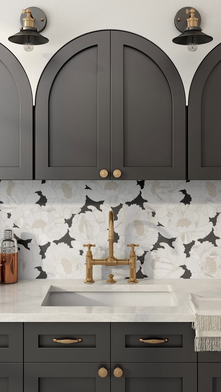
A black ground with oversized white florals turns the backsplash into a mural you cook against. Arabesque and encaustic-inspired shapes carry the same boldness if the floral literalness feels too sweet.
Polished natural marble cut into bold floral motifs gives a pattern weight and durability that printed ceramic can’t match.
This demands restraint everywhere else. Gold hardware and a quiet countertop let the wall speak; busy cabinets nearby fight it.
I’d pick this for a kitchen where the architecture is simple and the cook wants one dramatic moment, not a room of competing statements.
17. Oversized Floral Patterns
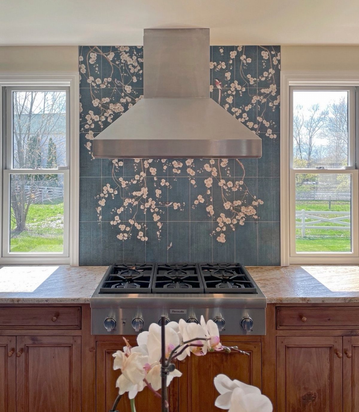
Custom hand-painted tile lets you commission a scene rather than shop for one. Anita Lang of IMI Design used Malibu ceramic tile with an oversized sunflower pattern for a Santa Barbara kitchen; the backsplash became the room’s art piece.
Not every budget stretches to custom work. Printed or decal tiles can approximate the scale for less, though they lack the surface variation of real brushwork.
A wall this bold needs lighting that doesn’t fight it. Black pendants with gold highlights and clear glass bulbs sit back and let the pattern lead.
I’d reserve this for a kitchen with enough wall space to let the pattern breathe; cramped between cabinets and windows it reads as clutter.
Along those lines, Carly Moeller, founder and principal designer of Unpatterned in Chicago, notes that 2026 will likely bring more colorful tile and bespoke tile backsplashes; she sees designers and clients alike gravitating toward “hand-painted, unique patterns, and one of a kind materials.”
18. Dark Green Subway Tile
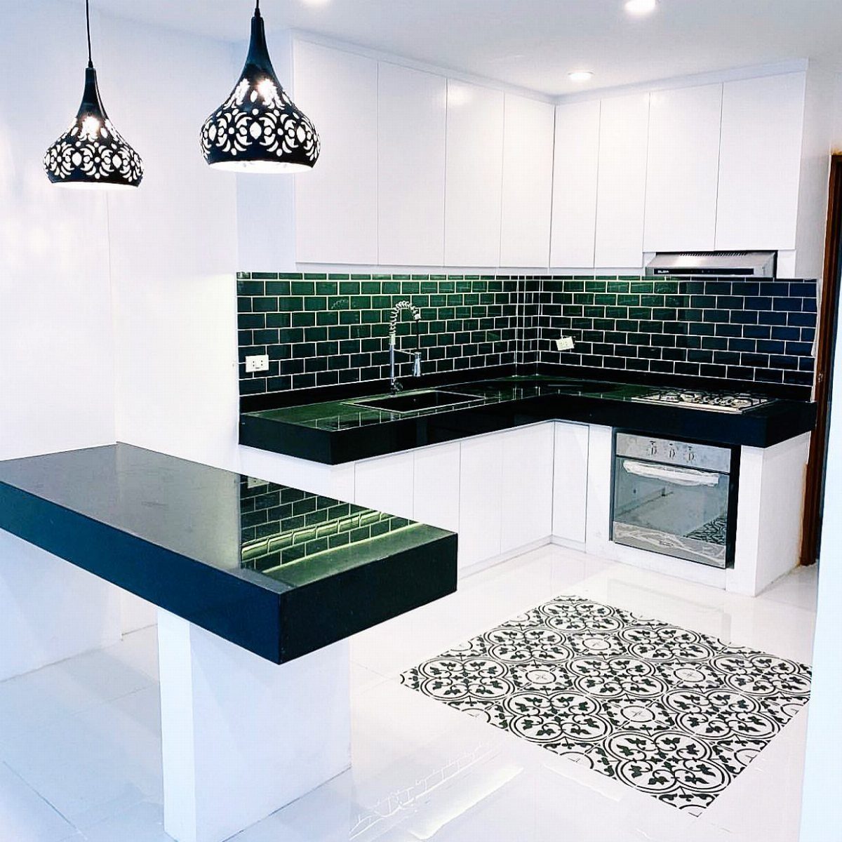
Deep green subway tile against white cabinets and black countertops gives the kitchen a color anchor without wandering into accent-wall territory.
Carla Rockmore matched her entire room to her backsplash, taking a tile sample to Sherwin-Williams and mixing cyan and magenta into a navy base until the paint matched.
You need not go that far. The tile alone carries enough presence; matching paint is devotion, not requirement.
Standard subway layout keeps the focus on the color, not the shape.
This suits anyone who wants color with discipline. Gloss dark green reflects light, which helps in smaller kitchens; matte would read heavier.
Check your grout choice carefully, white grout brightens the green while gray or black deepens it.
19. Solid Marble Slab Backsplash
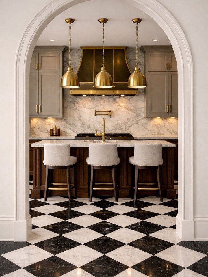
A single slab of statuario marble running from counter to hood turns the wall behind your stove into something closer to a gallery piece than a backsplash.
The veining carries across uninterrupted, and there are no grout lines to catch grease or shift color over time.
I would only try this behind the stove itself, where the visual weight earns its keep, rather than wrapping every wall.
The stone needs sealing, probably yearly in a kitchen that sees real use, and the cost climbs fast once you are sourcing pieces large enough to avoid seams.
White cabinetry and brass hardware give the marble room to breathe without fighting it. If your kitchen runs dark, the contrast turns even sharper.
20. Grey Subway Tile
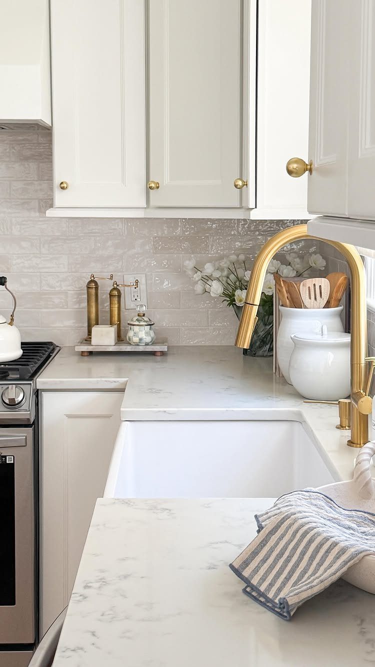
Glossy grey subway tile reads as neutral without defaulting to white, and the slight shift in tone hides the occasional splash better than something paler would.
I have seen it work behind farmhouse sinks in kitchens that split the difference between coastal and transitional, which covers a lot of ground right now.
Horizontal running bond is the safe layout; stacked or herringbone costs a little more in labor and tile but wakes the same material up considerably. Either way, the grout line is your decision point.
Matching grey grout disappears; white grout frames each tile like a grid.
The gloss matters more than the exact shade. Matte grey can turn flat under upper-cabinet shadow, whereas the reflective surface borrows light from the room.
21. Rustic Stone Wall Backsplash
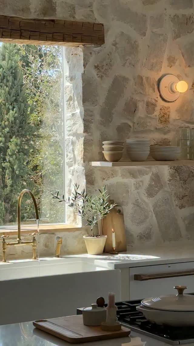
Rough stone behind a sink asks more of your wall prep than tile does, and the irregular surface means you are wiping around ridges rather than across them.
I would budget for a skilled installer who has worked with real stone, not someone learning on your kitchen.
Texture is the reason to choose real stone over porcelain; the surface catches light differently every hour of the day. A deep apron sink and brass faucet against that wall feel rooted, almost borrowed from somewhere older and better built.
Wood shelving above, with ceramic bowls you actually use, keeps the practical side from turning theatrical.
If the full rustic wall feels like too much commitment, a stone-look porcelain in large format gives you the visual weight with fewer grout lines and less maintenance.
The real thing suits kitchens where a little patina is the goal, not the problem.
22. Vertical Beadboard Backsplash
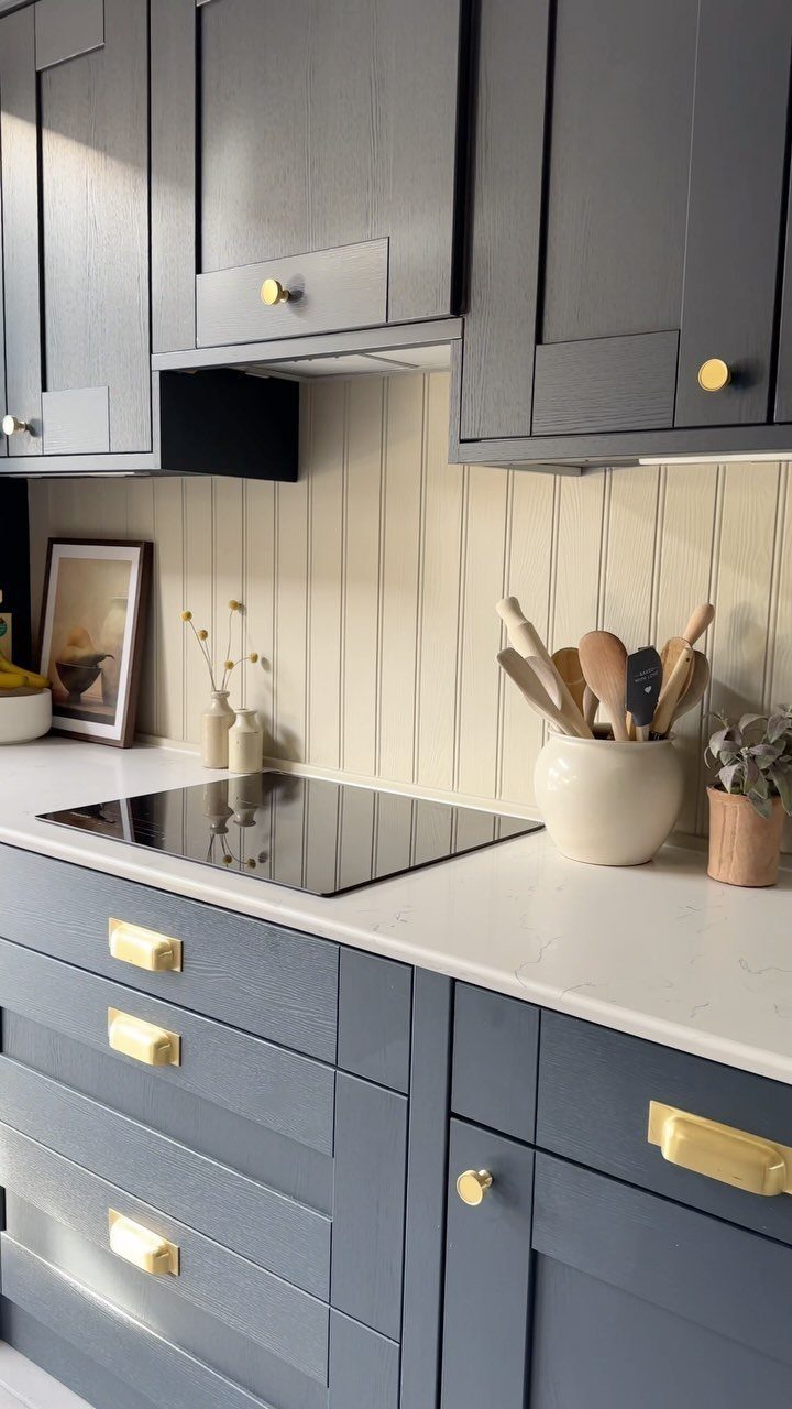
Vertical beadboard behind a cooktop runs the eye up and makes a low ceiling feel less pressing, though I would keep the grooves narrow. Wide boards can read as fencing if the scale slips.
Beige beadboard warms against dark cabinets; paint it a different color and the same material shifts toward cottage or coastal.
Either way, the material is wood, not tile, so you need a heat-resistant finish or a section of something noncombustible directly behind the burner.
Some installers run a slim strip of metal or stone at the cooktop line and beadboard above it, which solves the code question without killing the look.
Wipeability is the tradeoff. Grease settles into the grooves over time, and spring cleaning means working a brush down each channel.
23. Black Veined Marble Slab
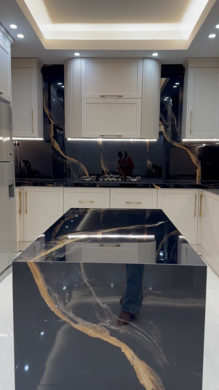
Black marble with gold veining is the most theatrical choice here, and it demands a kitchen that can handle the drama.
White cabinetry and recessed lighting let the stone be the event; anything else competing for attention turns the room into a shouting match.
A full slab from counter to ceiling, or wrapping the island as a waterfall, gives you the gallery effect: one continuous surface, no breaks, the veining flowing like something liquid frozen mid-movement.
Premium stone at this scale will push past standard backsplash budgets fast, and you are paying for the movement in the specific slab, not just the material name.
I would see the actual slab before committing, not a sample. The veining varies wildly, and the piece you get is the piece you live with.
Seal it, maintain it, and accept that etching from lemon or tomato is part of living with marble that bold.
24. Smooth Solid Surface Backsplash
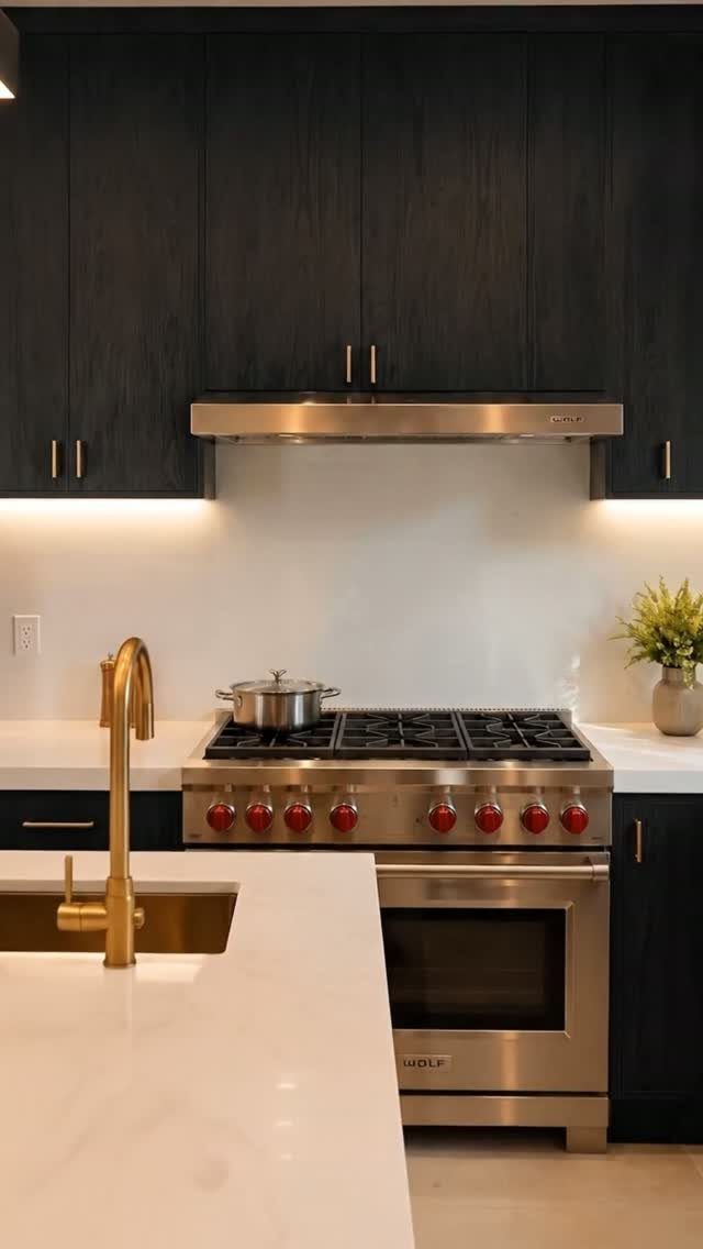
A solid surface backsplash in plain white, run continuous under cabinet lighting, is what I would suggest for anyone who cooks daily and cleans reluctantly. No grout, no texture, no place for sauce to hide.
The material is the same stuff used for counters, so you can run it straight up the wall without a visual break at the counter line.
Under-cabinet lighting on a pale backsplash does real work for anyone who chops vegetables after sunset. Without it, the surface can turn flat and clinical; with it, the wall glows and the shadows disappear from your prep area.
I would wire the lights to a dimmer, not a switch; full brightness for prep is a different need than the lower light you want when the kitchen shifts to evening.
Behind a professional range, check whether your solid surface brand rates for the heat exposure. Some need a buffer strip at the cooktop edge.
The rest of the wall is straightforward: clean drywall, smooth and grease-free, and the panel adheres directly.
Choosing the Right Material
Grout color and surface texture only tell the truth once the light moves across them.
Slabs and showy stone mean seam placement, outlet cuts, and hood integration have to be figured before anything else, or the whole job stalls.
When the budget is tight, stacking standard tile vertically, matching grout to tile, or doing one bold wall can read custom without letting the backsplash eat the whole allowance.
Nailing down material, edge detail, and grout early keeps the crew from stopping mid-job for decisions that cost extra days.
Functionality Vs. Style
If you are remodeling to sell within a couple of years, a safer backsplash option may protect your investment.
The material is not typically a large portion of the budget, so the risk of a bolder choice stays lower than with cabinets or counters.
Grout color plays a bigger role than most people expect.
Color Coordination
Pale tile bounces light into a dim kitchen. Strong color or pattern works best as a single landing spot for the eye, not scattered everywhere competing for attention.
Painting cabinets and tiling the backsplash in the same tone gives one continuous surface. The effect reads as intentional, not accidental.
I would let the countertop and cabinet relationship set the tone first, then choose whether the backsplash matches into that palette or steps out from it.
Two strong statements in the same view usually fight; one strong statement with support reads as design.
Installation Tips
Surface preparation matters more with tile than most people expect. Walls behind old backsplashes often hold adhesive residue or uneven patches that telegraph through thin tile.
I would skim-coat and sand before laying anything that shows variation.
Layout planning starts with finding the center of the run and working outward, not from one end and hoping the cut pieces land where they are least visible.
Outlets and windows interrupt every wall; map those cuts before you mix thinset.
Five backsplash directions keep surfacing in the 2026 remodels I am watching. Herringbone, vertical stack, or diagonal layouts add movement without shouting, though the cuts and hours go up.
A straight stack runs faster and wastes less.
Frequently Asked Questions
What is the current trend in backsplash?
Handmade materials are the direction right now, especially zellige and terra-cotta-glazed tiles with their slight unevenness and shifting glaze.
Graphic patterns and full stone slabs that read as architecture rather than decoration are still what I see most often in new kitchens.
For a quicker update, peel-and-stick options have gained ground with renters who want the look without the permanence.
Should the backsplash be lighter or darker than the countertop?
Either can work; the right choice depends on your light and what you want the eye to notice first. A darker backsplash against light counters creates a focal point, while a lighter one keeps the wall open and bright.
I would decide on the countertop material first based on how you actually cook, then build the color scheme from there.
What are common backsplash mistakes?
Ignoring how you actually clean is a frequent one; textured or rough stone catches grease and needs more than a quick wipe. Another is choosing a bold pattern without quieting the surrounding surfaces, so the room fights itself.
Grout color also gets treated as an afterthought, but matching grout softens a busy tile while contrasting grout turns even simple shapes into a grid.