
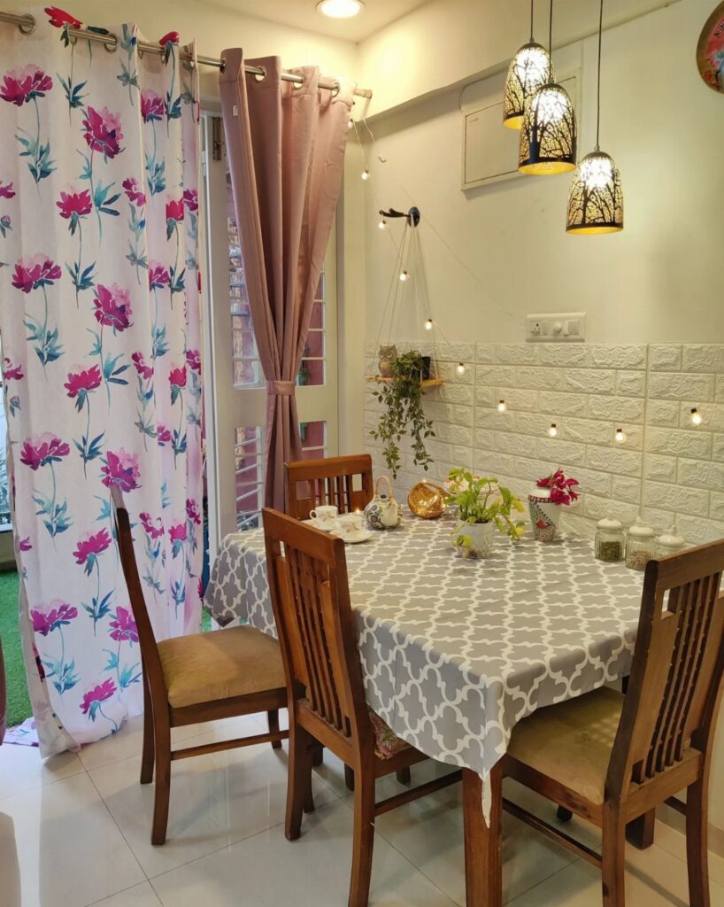
Dining room curtains run from a simple cotton café set to wired valance installations that need an electrician, and the right pick depends on whether your table sees pancakes at dawn or candles after dark.
A room that works both hours wants layered sheers and drapes on separate rods, which is covered later in the list. Dry-clean-only velvet twice yearly is the maintenance ceiling here; machine-washable white panels are the floor.
1. Velvet Curtains
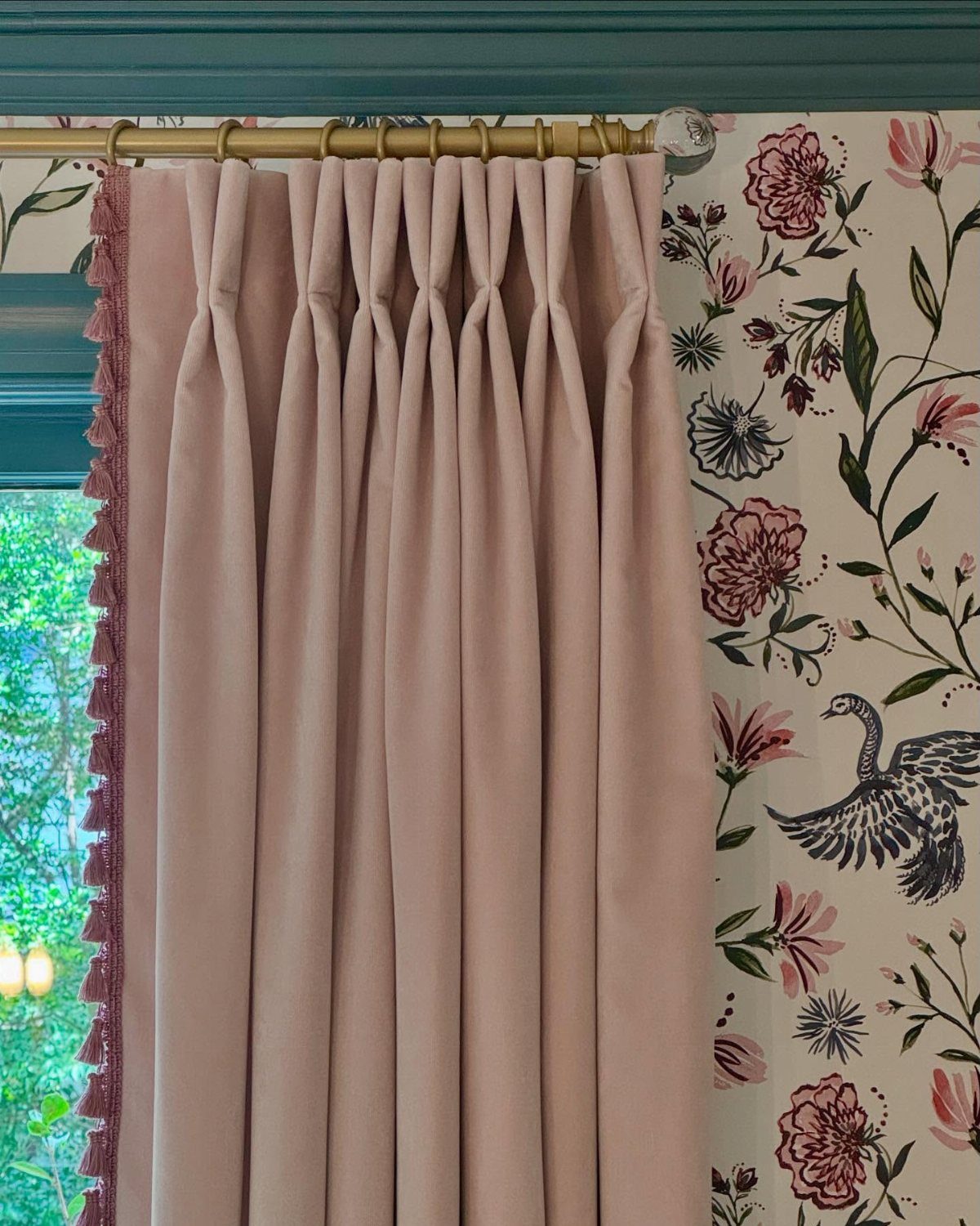
Velvet curtains carry weight in a way cotton never will. Pale pink velvet reads soft and romantic, but emerald or navy holds up better when your dining room hosts actual dinner parties rather than weeknight pasta.
The pile catches lamplight and holds heat against tall windows, which matters in older houses with drafts. Dry cleaning is non-negotiable; budget for it twice yearly or the nap mats and looks tired.
Gold rods suit the glamour, though black iron works if your table is more farmhouse than French. Skip velvet entirely if you have cats.
They climb it, and their claws leave permanent tracks in the weave.
2. Sheer Curtains
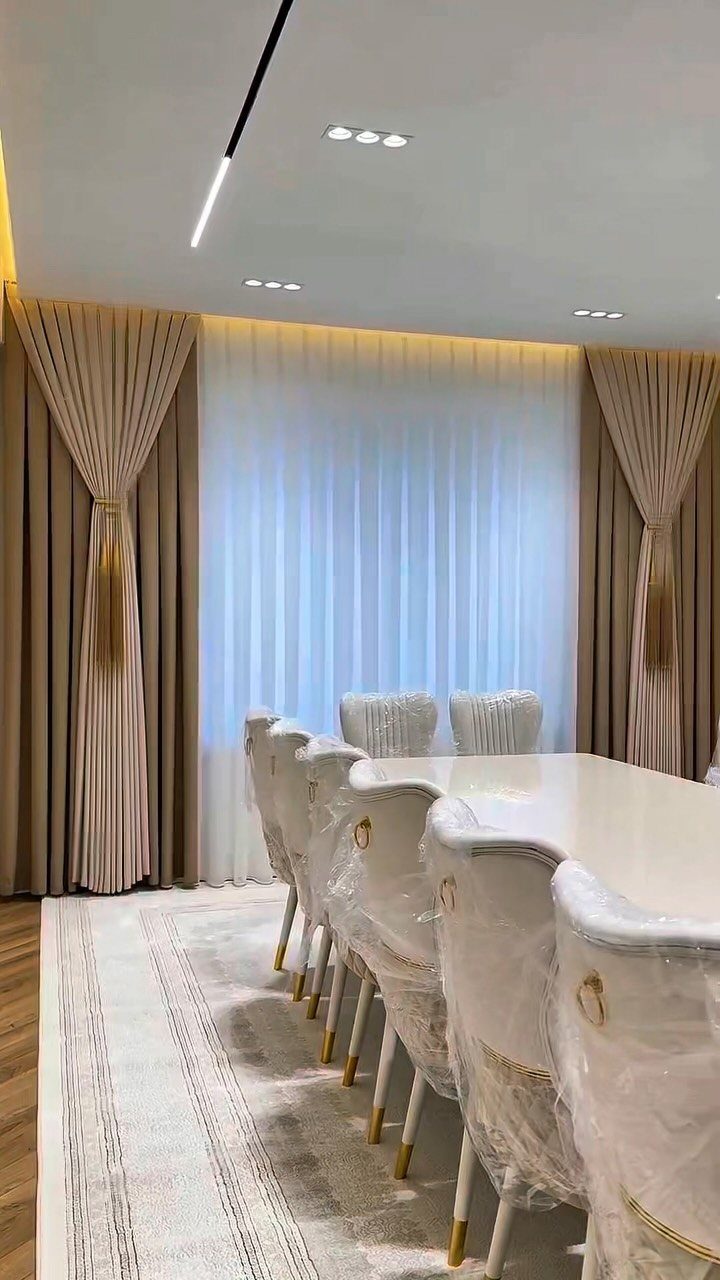
Sheer curtains let you keep the windows open during daylight meals without feeling exposed to the neighbor’s deck.
Sheers work best behind heavier drapes in most setups, though I have used them alone in a room that faced east and needed every morning hour of sun.
They collect cooking grease faster than you expect; plan to launder them on a regular schedule or the panels yellow near the stove side. Linen sheers cost more than polyester but breathe better in summer.
If your dining room doubles as a home office, this is your move: the light stays, the Zoom background softens, and you can add blackout later if you ever want to.
3. Patterned Curtains
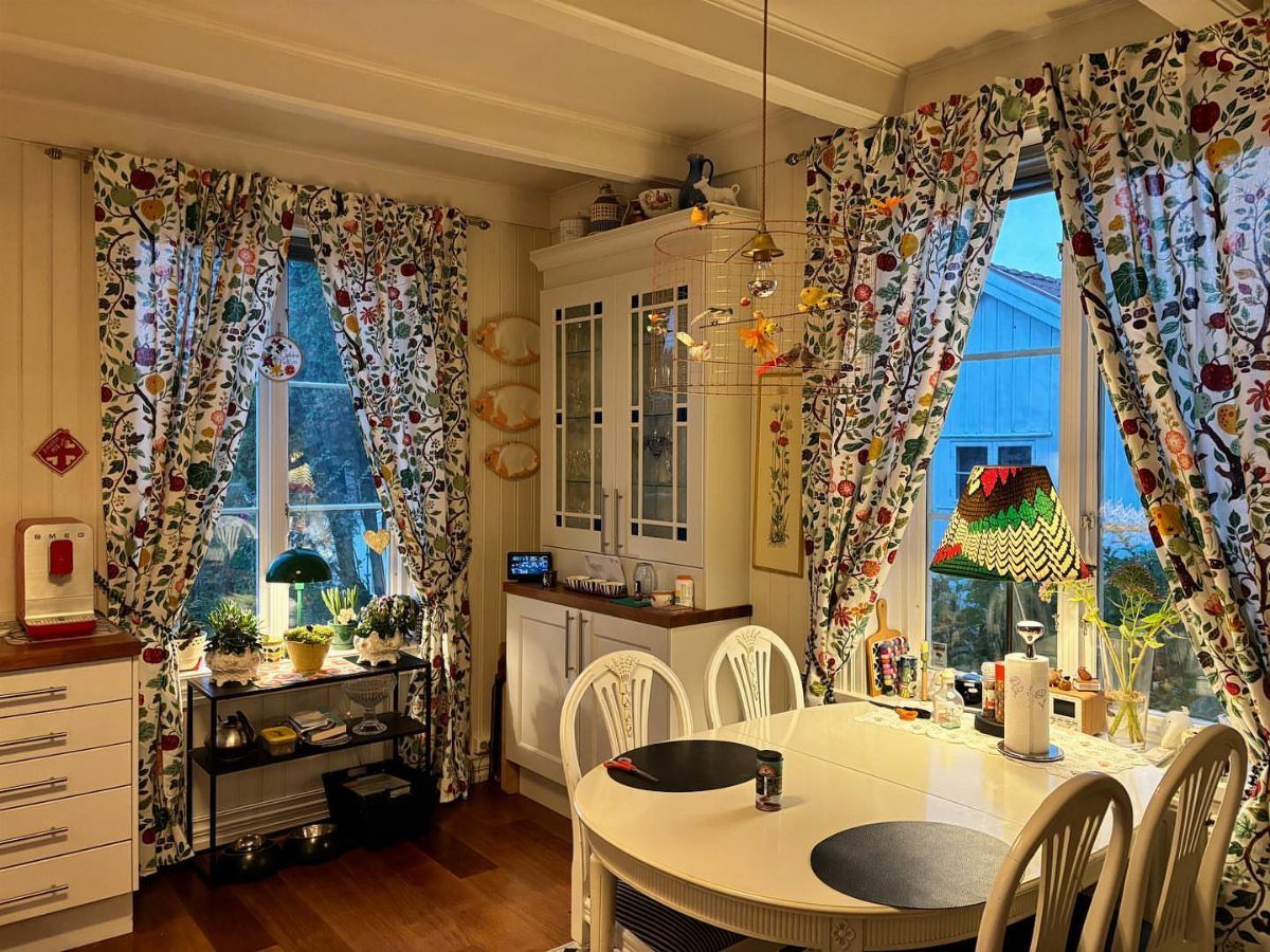
Patterned curtains work best when one color in the print already lives in your room. A floral and fruit motif works when it picks up something deliberate in the room: the plants, the cabinetry, the white table.
I would not hang bold prints against busy wallpaper unless you enjoy visual noise. Geometrics read more modern, florals more cottage; either one needs breathing room from patterned rugs or upholstery.
A solid tablecloth in one of the print’s quieter colors ties the look together without competing. Check the repeat size before you order: a large pattern on a narrow window looks chopped, a small one on floor-to-ceiling panels reads fussy.
4. Café Curtains
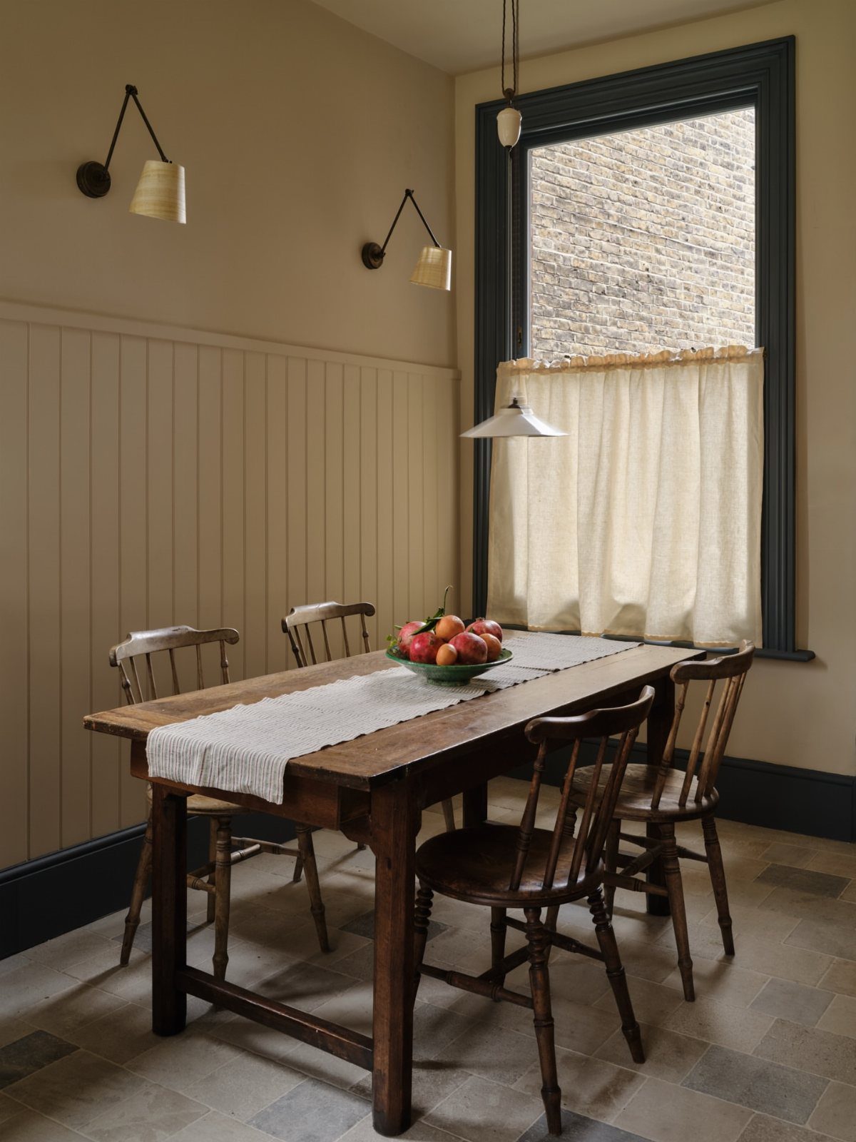
Cream café curtains suit a rustic table and paneled walls; crisp white with a dark metal rod moves the same idea closer to industrial.
Measure carefully: too high and you lose privacy, too low and the proportions look like a mistake. These need less fabric than full panels, so a decent cotton version costs noticeably less than full-length sets for two windows.
Layer sheers beneath if you want evening coverage without closing the room off completely.
5. Two-tone Curtains
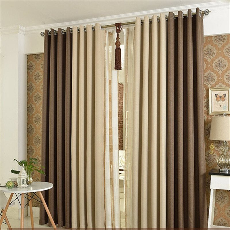
Two-tone curtains let you pull two colors from your room and give them equal billing. Brown and beige panels frame windows like vertical stripes, which draws the eye up better than a single flat color.
I would place the darker tone on the outer edge if your walls are light, or reverse it to contain a bright room. Grommets keep the line clean; rod pocket would bunch and fight the panel division.
The combination does not have to be bold: cream and pale gold read as texture shift rather than contrast, which suits formal spaces that cannot handle pattern.
Match one tone to your table, the other to your floor, and the room holds together without a single matching set.
6. Neutral Floor-length Curtains
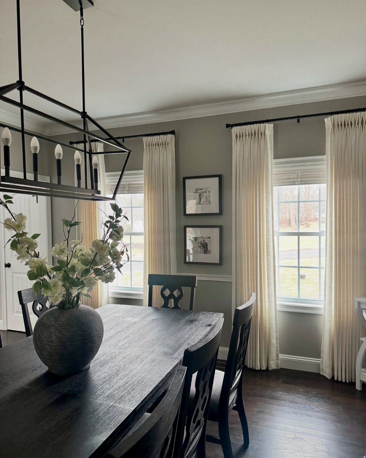
Floor-length cream curtains against grey walls and dark wood create a quiet frame that lets the table and chairs carry the personality. Deep, regular pleats mean more fabric than a flat panel and a fuller look when drawn.
Black rods repeat the chair color and keep the treatment from floating; brass would warm the room if your light fixtures lean that way.
A valance only makes sense if the ceiling needs help feeling higher, not for its own sake; the layered look works but costs more and gathers dust.
These panels need to kiss the floor, not pool, in a dining room where chairs scrape back and people pass with plates. Hem to half an inch above the wood for practical clearance.
7. Deep Blue Curtains
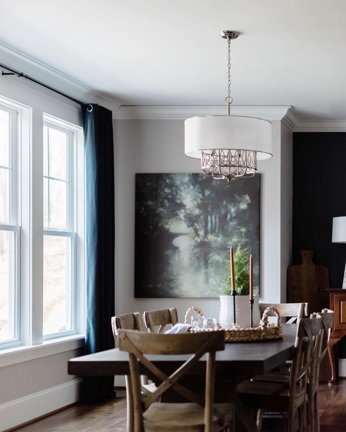
Dark blue curtains read as neutral in some light and dramatic in others, which makes them forgiving if your dining room sees sun at breakfast and lamps at dinner.
The color sits back against wood furniture and landscape art without competing for attention.
I’d check the fabric weight against your window size. A heavy cotton or linen blend holds the line of a long panel; anything lighter than that will billow and look like a bed sheet on a windy day.
If your walls are already cool-toned, slate blue is the safer move. Warmer walls want the deeper navy.
This suits renters who need one curtain to carry them through seasons without looking seasonal.
8. Cheerful Yellow Curtains
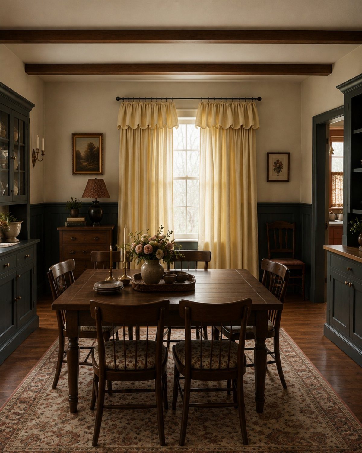
Yellow curtains against dark cabinets only work when the yellow has some mustard in it; pure primary yellow flattens and reads plastic under a pendant light. Brass would have fought the cabinets for warmth and lost.
For a small dining room or balcony setup, this much color on the windows can shrink the space.
Morning light is the price. Yellow glows early and can feel like a diner booth by evening.
Pair with dimmable bulbs if you eat late.
9. Modern Grey Pleated Curtains
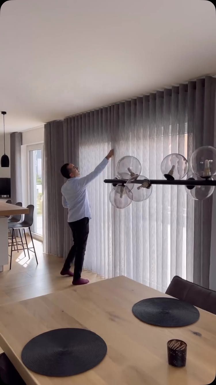
Ceiling tracks for pleated curtains keep the line clean where a rod would break up tall windows or a vaulted wall. The pleats themselves, hung on hooks spaced close together, fall straight and hold their shape even after daily opening.
Grey here is doing the work of a neutral without the flatness of beige. In a bright room with modern furniture, it reads as intentional rather than safe.
I’d pick a mid-tone, not too light or it goes lavender in north light, not too dark or it competes with the floor.
Linen texture adds warmth if your table and chairs run minimalist. Polyester holds the pleat better but can look office-like up close.
10. Bright White Curtains
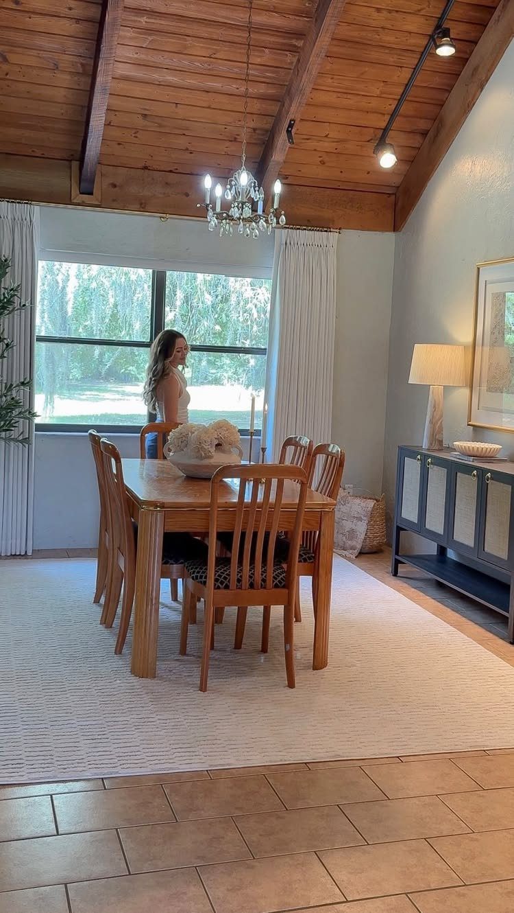
White curtains in a room with wood ceilings and a crystal chandelier sound traditional, but the fabric choice swings it. A crisp cotton or a slubby linen reads casual; anything with sheen or embroidery tips toward formal fast.
The practical question is dirt. White near a dining table collects grease and splatter faster than you’d think.
I’d budget for machine-washable panels and plan to take them down twice a year, minimum. If your window faces a street or neighbor, layer with a sheer for daytime privacy so the white stays functional, not just pretty.
For small rooms, white does what mirrors do: bounces light around and buys you a few visual feet.
11. Layered Drapes with Sheer Curtains
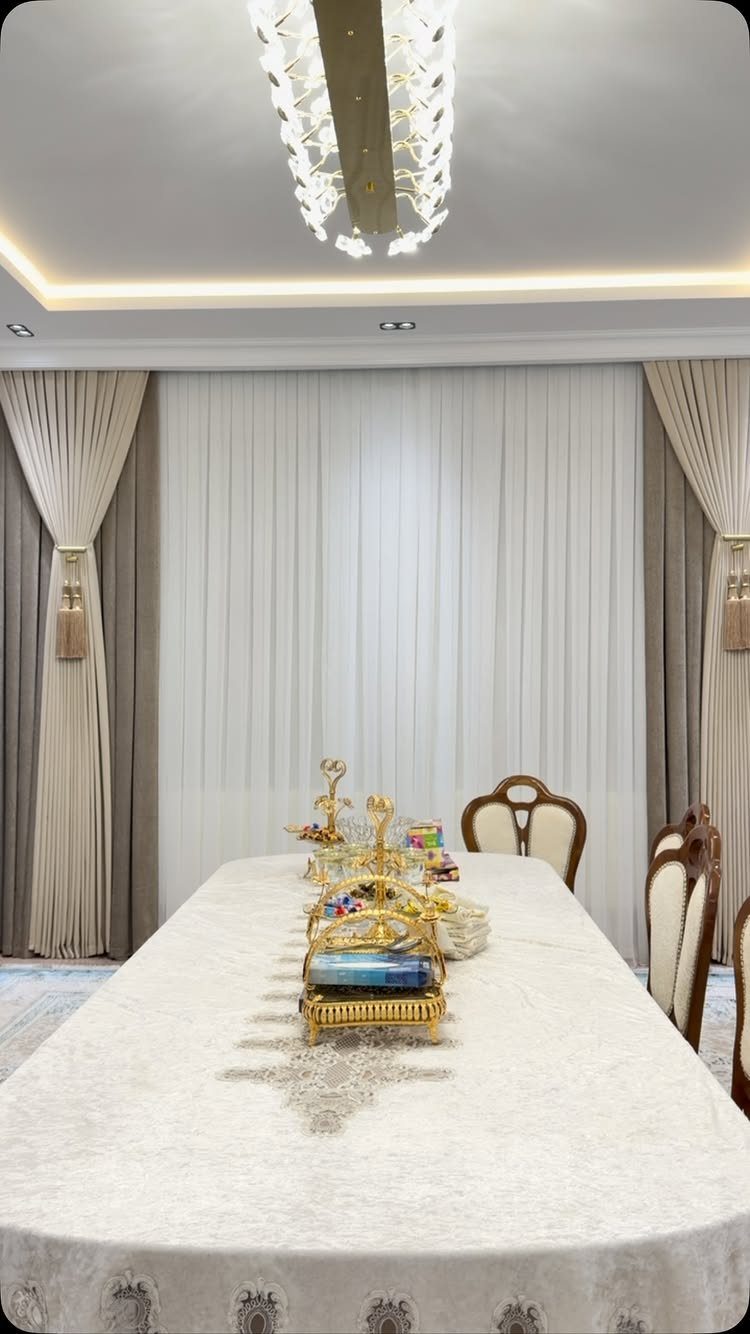
Layered drapes give you two systems for the price of one installation. Sheers stay closed for daylight meals when you want the room bright but not fishbowl; heavy panels pull across at night for warmth and privacy.
A decorative tie-back also trains the drape to fall in a curve rather than a crumple.
I’d hang both layers on the same rod only if you’re desperate for simplicity. Separate rods, outer one a few inches higher, let the sheer float and the drape frame it like a proscenium.
The extra hardware is cheap and saves the look.
This works best in rooms where you actually use the dining table at both hours. Otherwise you’re dressing a window for a performance it never gives.
12. Solid and Floral Curtain Pairing
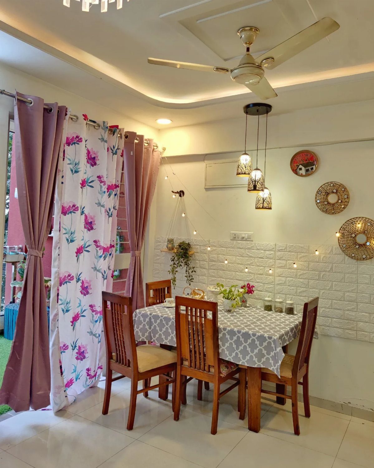
Pairing a solid mauve with a white floral lets you test pattern without committing the whole window to it.
The eye reads the solid as the curtain and the print as the accent, which keeps the room from feeling like a guest bedroom.
Matching the color is what makes it work. The mauve has to pick up a tone already in the floral, not just sit beside it.
Hold a swatch of each against your wall in morning and evening light before you order. What reads as dusty rose at noon can turn muddy by lamplight.
For a sliding door, this setup moves well. Both panels stack to the same side, and the print breaks up the solid mass when open.
I’d use a rod that extends past the door frame so the stack doesn’t block the glass.
13. Bright Pink Curtains
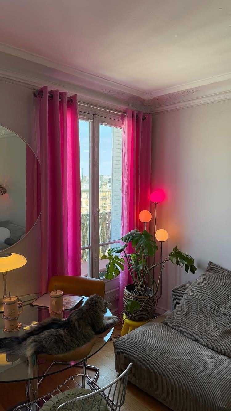
Bright pink curtains turn a dining room into something you notice the second you walk in. I saw this shade work best against grey or white walls where the color does the talking and nothing else has to compete.
Floor-length panels on a simple metal rod keep the look modern rather than playful. If your furniture is already loud, this is the wrong move; the pink wins in rooms with quiet neutrals and maybe one plant.
I would test a swatch against your wall at different hours before committing. Morning light cools hot pinks down, and lamplight can push them toward coral.
14. Curtains with LED Valance Lighting
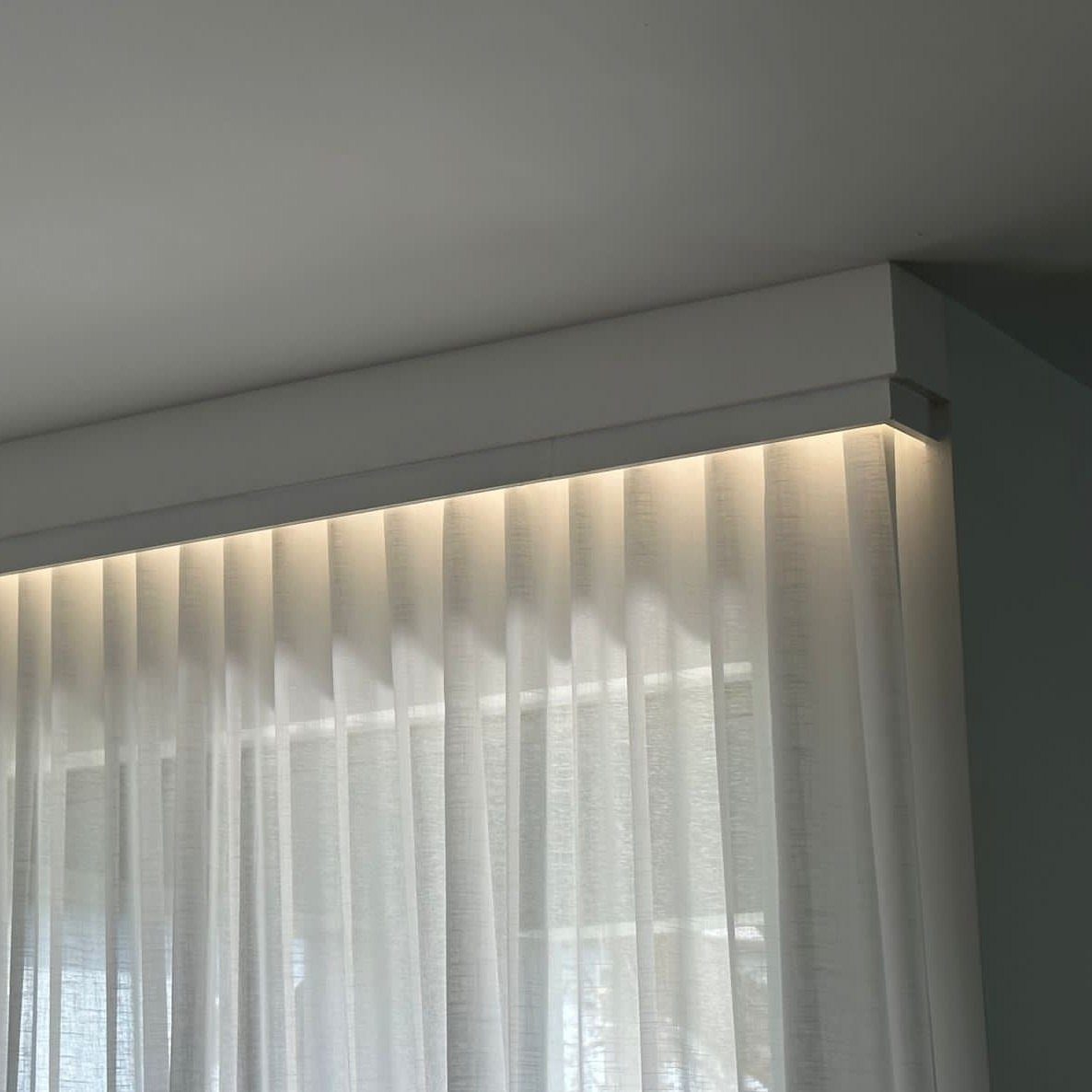
A ceiling-mounted valance with warm LED strips hidden inside turns curtain hardware into the light fixture. The strips face downward, so the glow washes the sheers from behind and softens the whole window into a lantern.
Installation means routing power to the valance box, which is the hard part; battery strips exist but dim faster than wired ones. I would wire this during any ceiling work already planned, not as a solo project.
Sheers underneath keep it from looking like a hotel corridor. White fabric keeps the light color-true; colored fabric would tint everything underneath it.
15. Beaded String Curtains
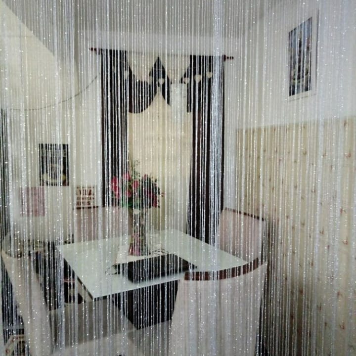
Beaded string curtains divide a room without walling it off, which matters when your dining space sits inside something larger. The silver catches light from windows or fixtures and throws it around in small moving pieces.
Mounting is straightforward: a tension rod or fixed header across the opening. I have seen these hung in doorways too narrow for a real door, or across a wide arch where solid drapes would kill the flow.
They trade privacy for atmosphere; anyone on either side still sees shapes and hears conversation. For a dining room that only needs soft separation from a living area, that trade usually works.
Dust them monthly or the sparkle dulls.
Choosing the Right Fabric
Cotton wins for versatility and survives the washing machine, which matters when grease settles on anything near a dining table.
Linen and muslin suit windows that face the garden; the weave lets light through and the fabric looks better with a few wrinkles than polyester does.
Velvet or silk frames a formal table, but the dry cleaning bill adds up fast. Match the weight to the job: sheer cotton for morning light, lined velvet for a north wall, and something washable anywhere the chairs scrape back.
Curtain Length Considerations
Floor-length panels read as the default for a dining room, and a 96-inch curtain suits most 8-foot ceilings with the rod hung 3 to 6 inches above the window frame.
That placement leaves a slight puddle or a clean kiss at the floor, depending on your measurement. Shorter lengths exist: 63, 84, and 108 inches are standard.
I would use 63-inch or 84-inch panels only where a radiator, a sideboard, or a bench makes floor-length impractical.
Café curtains fall in this shorter territory; they cost less in fabric and suit a rustic table, but the proportion wants careful measuring.
Matching Curtains with Decor
A curtain color already living in the room ties the window to everything else without matching exactly. The solid tone in a two-tone panel can pick up the floor; the brighter tone can answer a chair or a vase.
Echo that same color in a napkin or a seat cushion and the room holds together. In an open plan, carry one window treatment into the next space so the dining area does not float apart from the living area.
A rod that stops at the window frame looks like an afterthought; one that extends past each side lets the full panel stack clear of the glass.
Layering for Depth
Metallic mesh over linen or wood veneer above sheers is a mixed-media option that shifts as the sun moves across the window.
I’d add this only where the window itself is the room’s feature; otherwise the layering becomes the subject and the table disappears.
Frequently Asked Questions
What kind of curtains go in a dining room?
Sheer, linen, cotton, and velvet curtains all work, but the right choice depends on how you use the room. Sheers or cotton voile suit everyday dining because they let light in and layer easily with heavier drapes for evening.
Velvet holds up better for formal dinner parties but needs dry cleaning twice a year. Heavy fabrics block the morning light, so lighter ones make more sense if you also work in that space.
What is the new trend in curtains?
Beaded string curtains and LED valance lighting are showing up more often now. Beaded strings divide an open dining area without killing the flow, and they catch light in small moving pieces.
The LED valance hides warm strips inside a ceiling-mounted box so the glow washes sheers from behind. Both need planning: the beads want monthly dusting, and the LED valance needs power routed during any ceiling work already scheduled.
What colors are popular for dining room curtains?
Neutrals like cream, white, and grey stay current because they frame the room without competing with the table and chairs.
Deep blues and navy shift from quiet at breakfast to dramatic after dark, which suits a room that works two shifts. Mustard yellow works against dark cabinets where pure primary yellow would flatten and look plastic.
Bright pink makes the statement in otherwise quiet rooms with grey or white walls.
Should dining room curtains match living room curtains?
They do not need to match, but some shared element helps if the rooms are adjacent.
A similar fabric weight, a color that appears in both spaces, or the same style of sheer keeps the eye moving without demanding identical panels.
I would dress the dining room more formally and the living room more casually, since that matches what actually happens in each.