
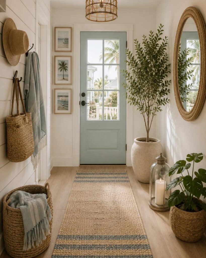
These ideas run from a single quart of paint to a full carpentry weekend, and the right one depends on whether you own the wall or just the air in front of it.
Renters will lean on over-the-door rope baskets and leaning art, while a permanent entry can take board-and-batten and a heavy woven pendant that needs a reinforced ceiling box.
The proof is in the details: a lamp’s warm glow, a single vintage chest found patient at estate sales, and the two-height hook row that only works if you hit the stud.
1. Hang Wall Hooks
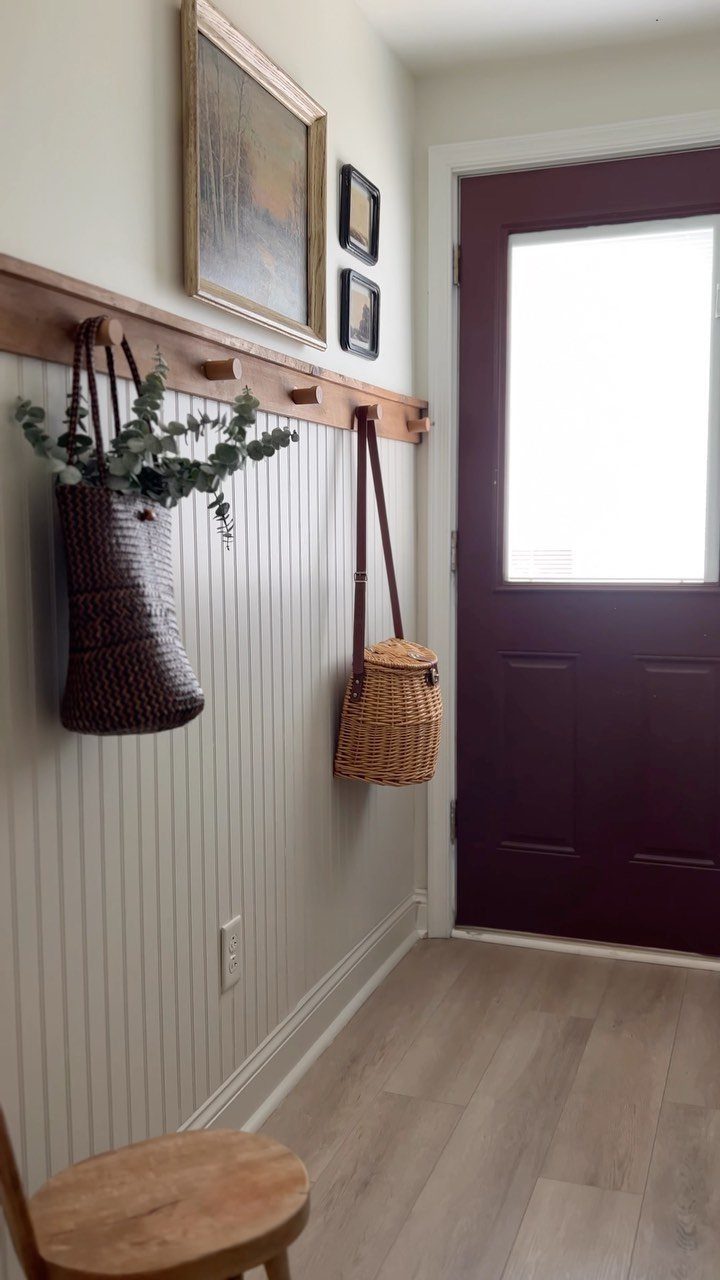
A row of wooden wall hooks mounted on beadboard turns an empty wall into storage without eating floor space.
For a narrow entry like this one, I would mount them at two heights: one for adult coats and one lower, for bags or a child’s jacket.
Finding the stud matters more than the hook style; a hook torn out by a loaded coat is a worse look than a cheap one.
Individual hooks let you space them to fit your wall, while a rack gives you a finished line in one piece. Either way, keep what hangs there limited to what you use daily, or the tidy effect collapses.
2. Gallery Wall
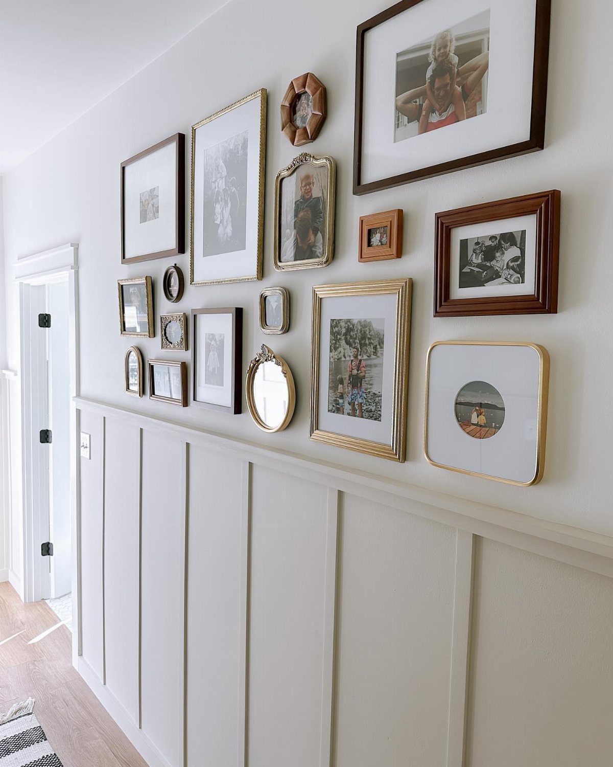
White board and batten wainscoting gives this gallery wall a built-in frame that keeps the arrangement from feeling scattered.
Keep the furniture below a gallery wall spare; a busy wall and a busy floor fight each other in a small space.
I would stick to one medium, all frames, or mix frames and small mirrors as this entry does, but stop there.
Family photographs read as personal without costing gallery prices, and a mix of sizes lets you add to the wall over time. Start with the largest piece slightly off-center and build around it.
3. Statement Mirror
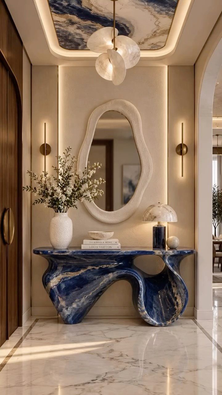
An organic-shaped mirror above a console does what a rectangular one cannot: it softens a corner where hard lines usually dominate.
A wavy white edge on a mirror picks up light differently than a flat frame would, and that matters in an entry with no window of its own.
I would hang it low enough that the reflection catches someone standing in the doorway, not the ceiling; the point is to double the sense of arrival.
Across from a window, any large mirror bounces daylight deeper into the house, but the shape is what makes this one feel chosen rather than installed by default.
4. Bench or Chair
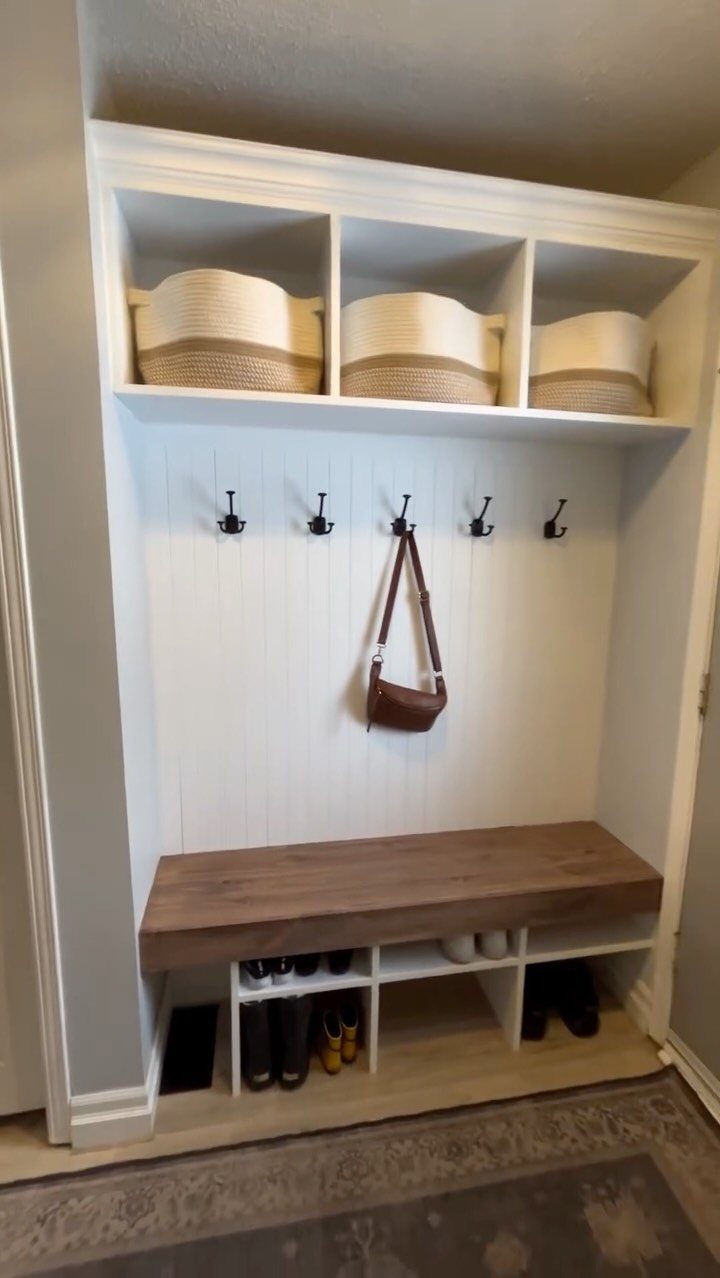
A built-in bench with shoe cubbies underneath solves two entry problems at once, but the seat is what changes how the space feels. Without somewhere to sit, putting on boots becomes a balancing act in the doorway.
A wooden bench top is harder than upholstery but survives wet coats and muddy shoes without complaint. I would add a cushion in a fabric that can be washed, or skip it and keep the surface wipeable.
The cubbies below work only if you actually fill them; empty, they read as clutter waiting to happen. For a rental, a standalone bench with a shelf underneath gives most of the function without the carpentry.
5. Console Table Vignette
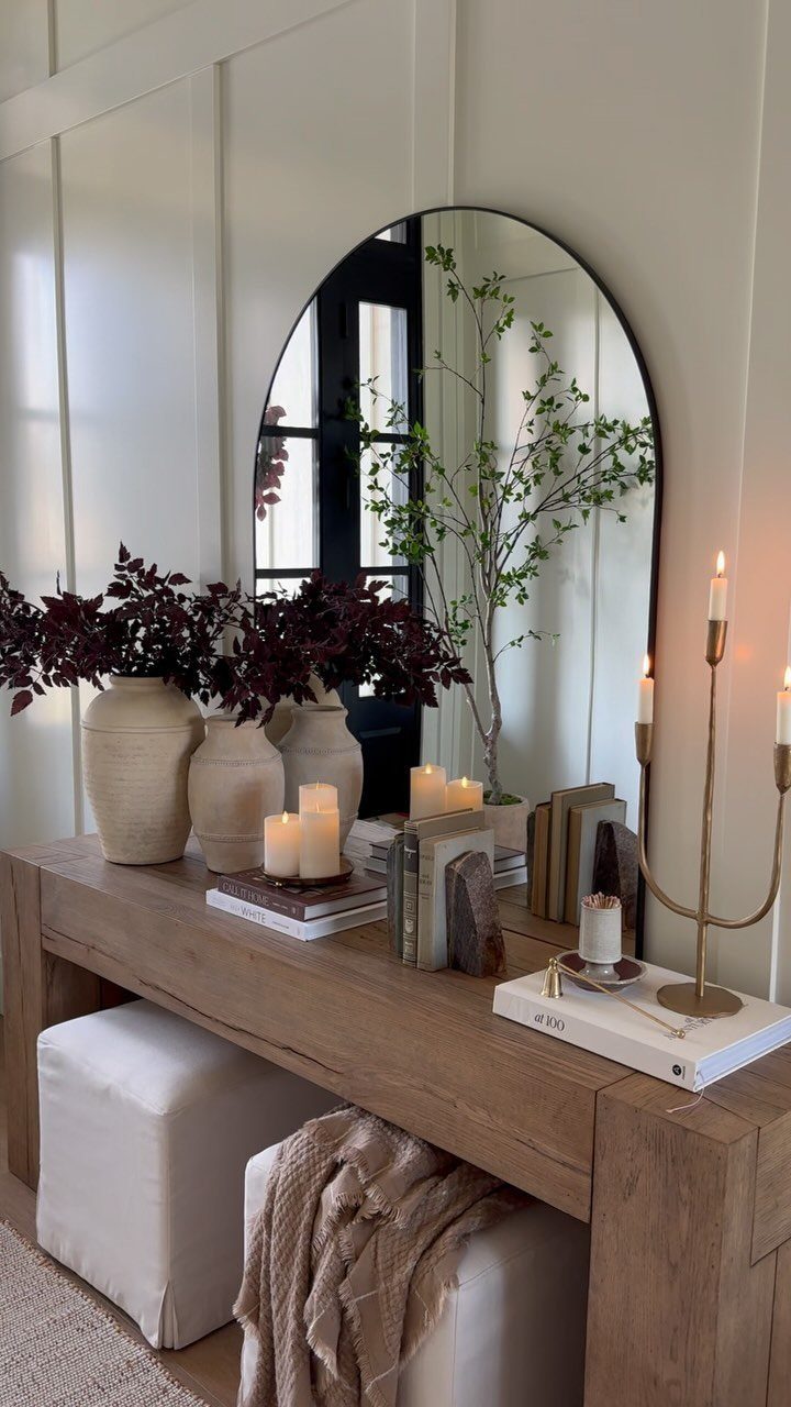
A console table in an entry is a commitment to the idea that the first room deserves the same attention as the last.
This one layers ceramic vases, dark foliage, candles, and books at three heights, which keeps the eye moving without feeling crowded.
I would start with the lamp, since it fixes the table’s position by the need for an outlet, then build outward. A tray for keys is non-negotiable; without it, the table becomes a dumping ground by Wednesday.
The oval mirror behind repeats the curves of the vases and softens the rectangle of the table itself.
6. Statement Light Fixture
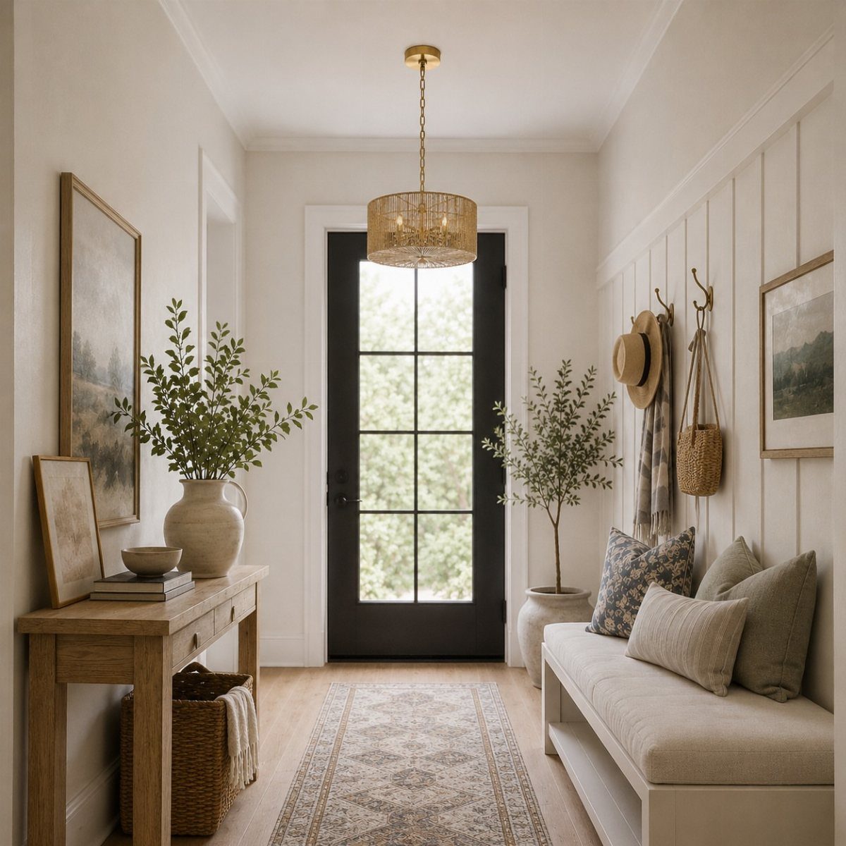
A woven drum pendant in an entry draws the eye up and gives a low ceiling the height it lacks.
A statement fixture can hang over a narrow hallway, not a room: in a tight space, the light becomes the architecture. I would check the ceiling box first; a heavy fixture needs support that a flush mount never tested.
For low ceilings, a semi-flush mount with some texture gets close to the effect without the headroom cost. The wattage matters less than the shape; this is the one place where a light can be sculptural without seeming precious.
7. Woven Baskets
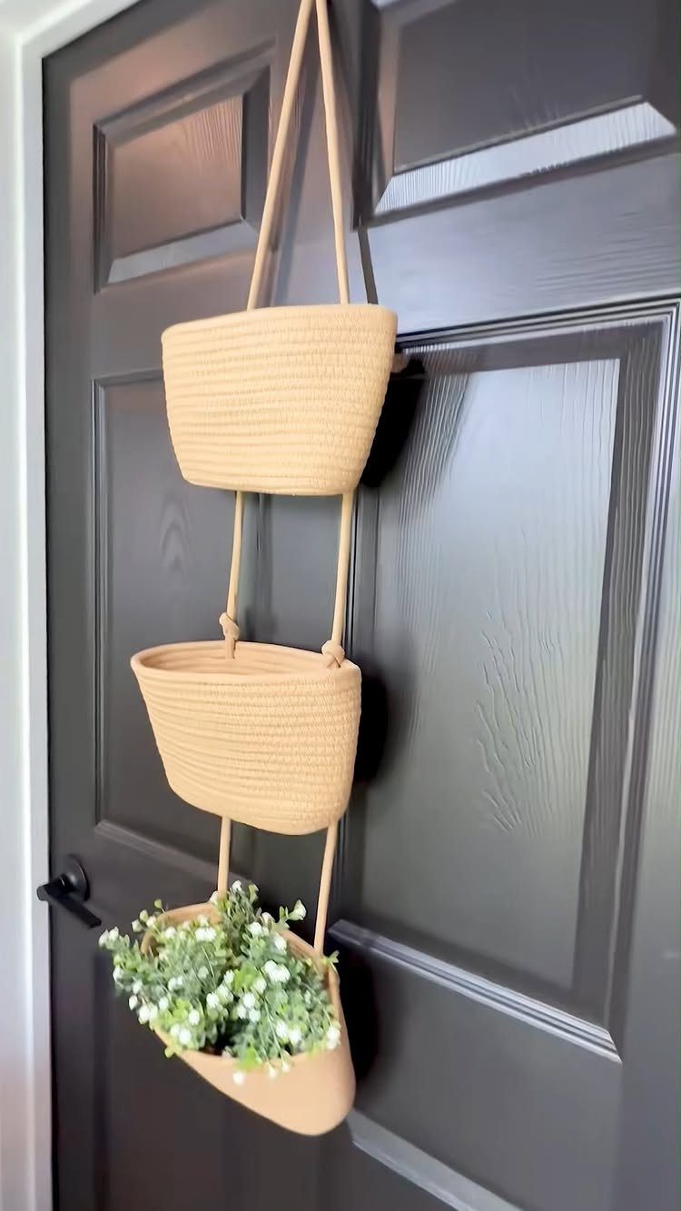
A door-mounted rope basket system turns dead space into storage for gloves, leashes, or that one umbrella that always goes missing.
Three tiers catch different categories: top for small items you grab daily, middle for scarves or hats, bottom for bulkier pieces or a trailing plant.
Seagrass or water hyacinth brings in warmth against a painted door. Mount with a simple over-the-door bracket if you rent; screw into the panel if you own.
Either way, the baskets should sit proud enough to open fully.
This suits renters and narrow entries where floor space is nonexistent. The tradeoff: you lose the back of the door for anything else.
8. Rug or Runner
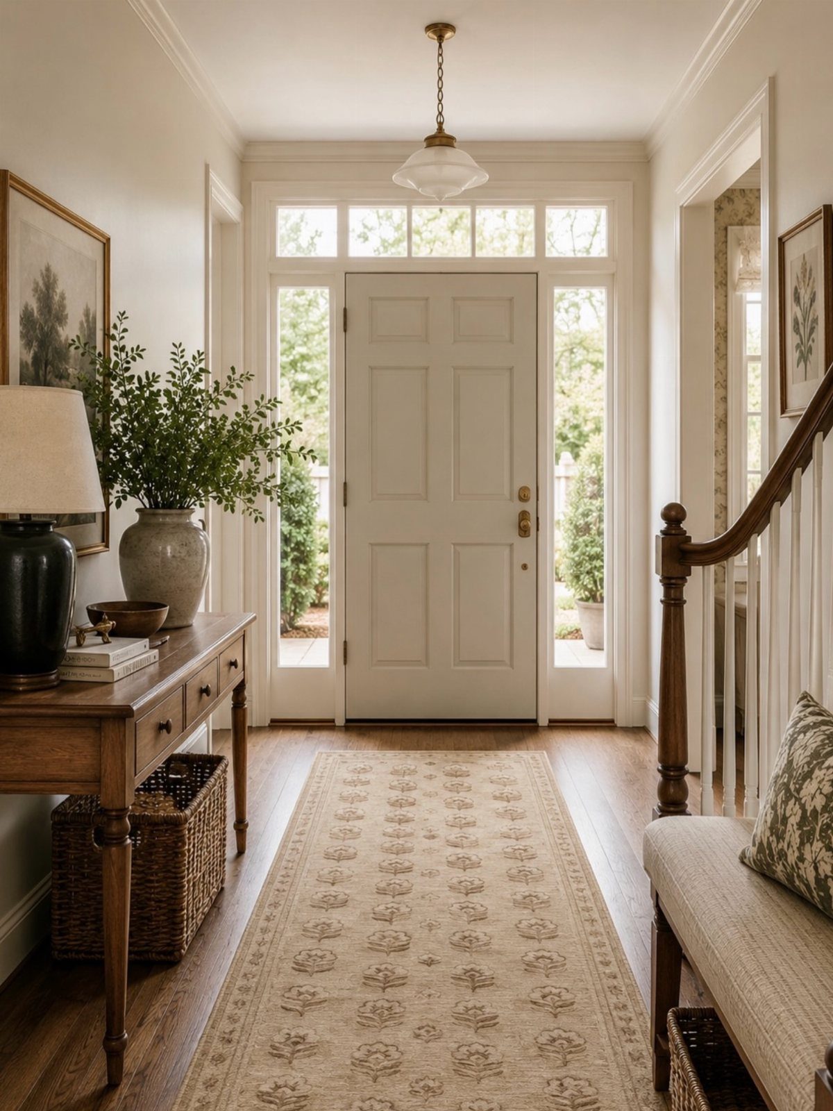
A runner does two jobs at once: it catches grit before it reaches your living areas, and it tells the eye where the entry begins. In a narrow hall, length matters more than width.
Run it wall to wall with a narrow strip of floor showing, and the space reads larger than it is.
Pattern hides the wear. Florals, faded geometrics, or a low-pile Persian-style design all work; plain solid colors show every tracked-in leaf.
For hardwood, a rubber-backed pad underneath prevents sliding and buys the floor a few extra years.
Budget pick: a cotton flatweave you can throw in the wash. Splurge: wool with a vintage patina already built in.
9. Accent Wall
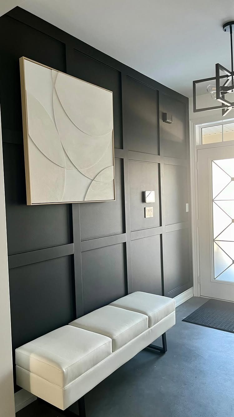
One wall in a deep tone changes how the whole entry feels without the cost or commitment of full paint.
Board-and-batten in charcoal is the move here, but navy, forest green, or warm terracotta work if your light runs northern and cool.
A painted door gives you a smaller dose of the same idea without committing a whole wall. Inside-facing door color reads as accent wall to anyone actually entering, and it takes a single quart.
Balance with a pale bench, pale art, or pale flooring so the dark has something to push against.
Small entry? Go bright and saturated instead.
Cobalt, coral, or a clean yellow bounces light around rather than drinking it.
10. Vintage Rug
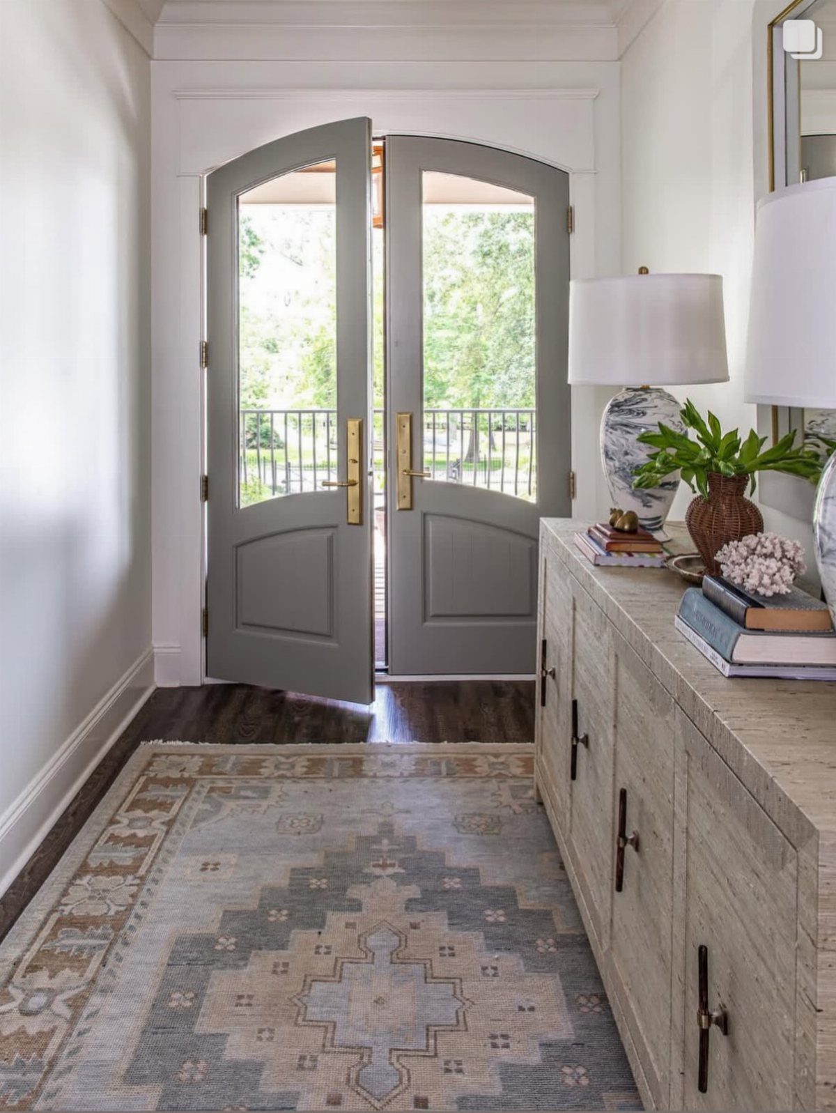
A vintage rug solves the entry that isn’t really a room: the open corner by the stairs, the slice of living room between door and hallway.
The worn pile and muted dyes hide dirt that would scream on something new, and the singular pattern gives the area its own identity.
Source at estate sales, auction sites, or reputable dealers who note condition honestly. Look for low pile for high traffic; a thick shag at the door is a maintenance battle you will lose.
Size to anchor the whole zone, not just the spot directly inside the door.
The tradeoff: real vintage takes patience to find and may need cleaning. New "vintage-style" works if you need it this weekend.
11. Oversized Art
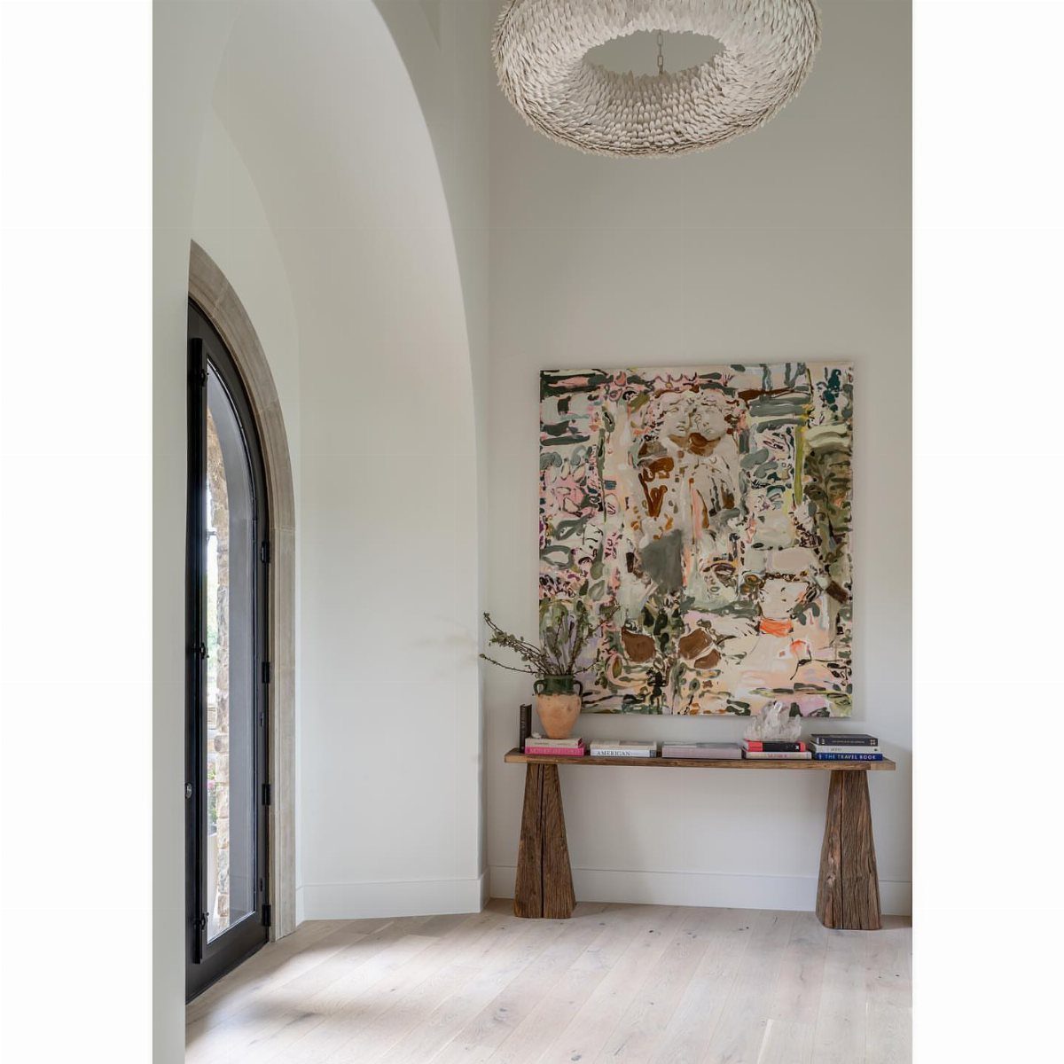
One large piece above a console reads intentional; a cluster of small frames often reads leftover. Pink, green, and beige against white is one route; photography, textile art, or a single framed poster follows the same principle.
Size the piece to the furniture below rather than to the wall itself. Hang the bottom edge well above the table surface; the top can brush near the ceiling if the piece runs tall enough.
Go large enough to fill the visual void above a standard console; anything too small gets lost.
For renters, leaning a large piece against the wall on the table skips holes entirely. Less stable with pets or small children, but the layered look has its own ease.
12. Molding or Wainscoting
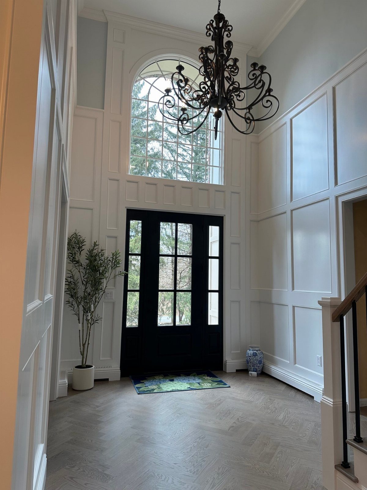
Wainscoting raises the finish level of even a basic builder entry.
Picture-frame molding is the DIY-friendly entry point: thin strips of primed pine, mitered at the corners and nailed to the wall, then painted to match. No removing baseboards, no coping joints.
A single free weekend with a miter box and nail gun.
Full board-and-batten takes more skill and more lumber but gives you real architectural weight. Crown molding at the ceiling alone is the smallest move that still registers as "finished" when you walk in.
Renters: peel-and-stick molding exists, though it will not fool anyone on close inspection.
13. Vintage Pieces
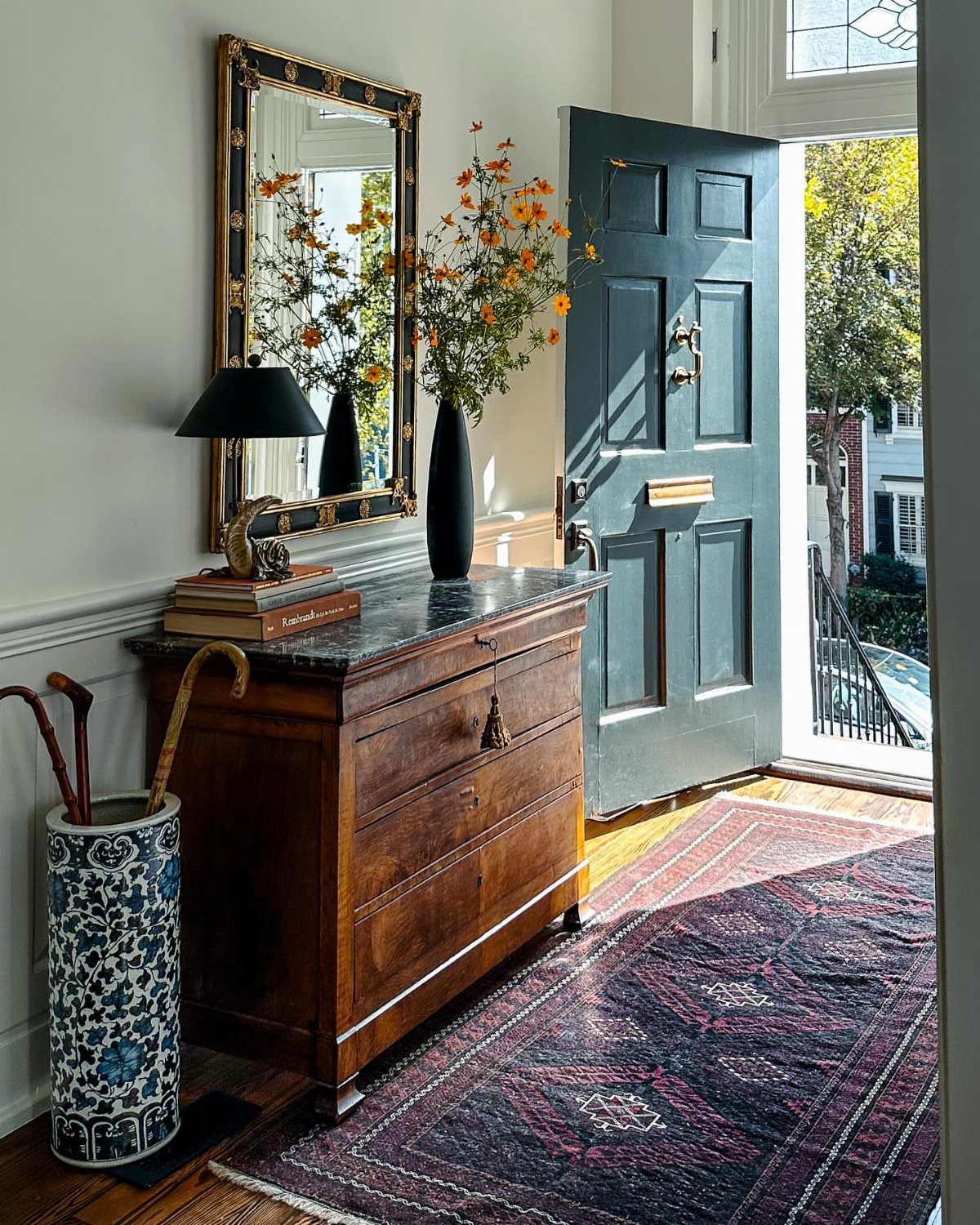
A single vintage piece does the work of several new ones if you choose it for scale and surface.
A marble-topped chest gives you a cool surface for mail and keys, and the stone holds up to daily use better than wood alone.
I would look first at estate sales and flea markets for anything with drawers or a lift lid; the weight alone tells you it was built to last.
Pair one old piece with clean walls and a modern mirror so the room does not turn into a set. The risk is clutter, so limit yourself to one vintage item per small entryway.
If your budget is tight, even a weathered wooden stool beside the door gives the same effect on a smaller scale.
14. Mix Different Textures and Materials
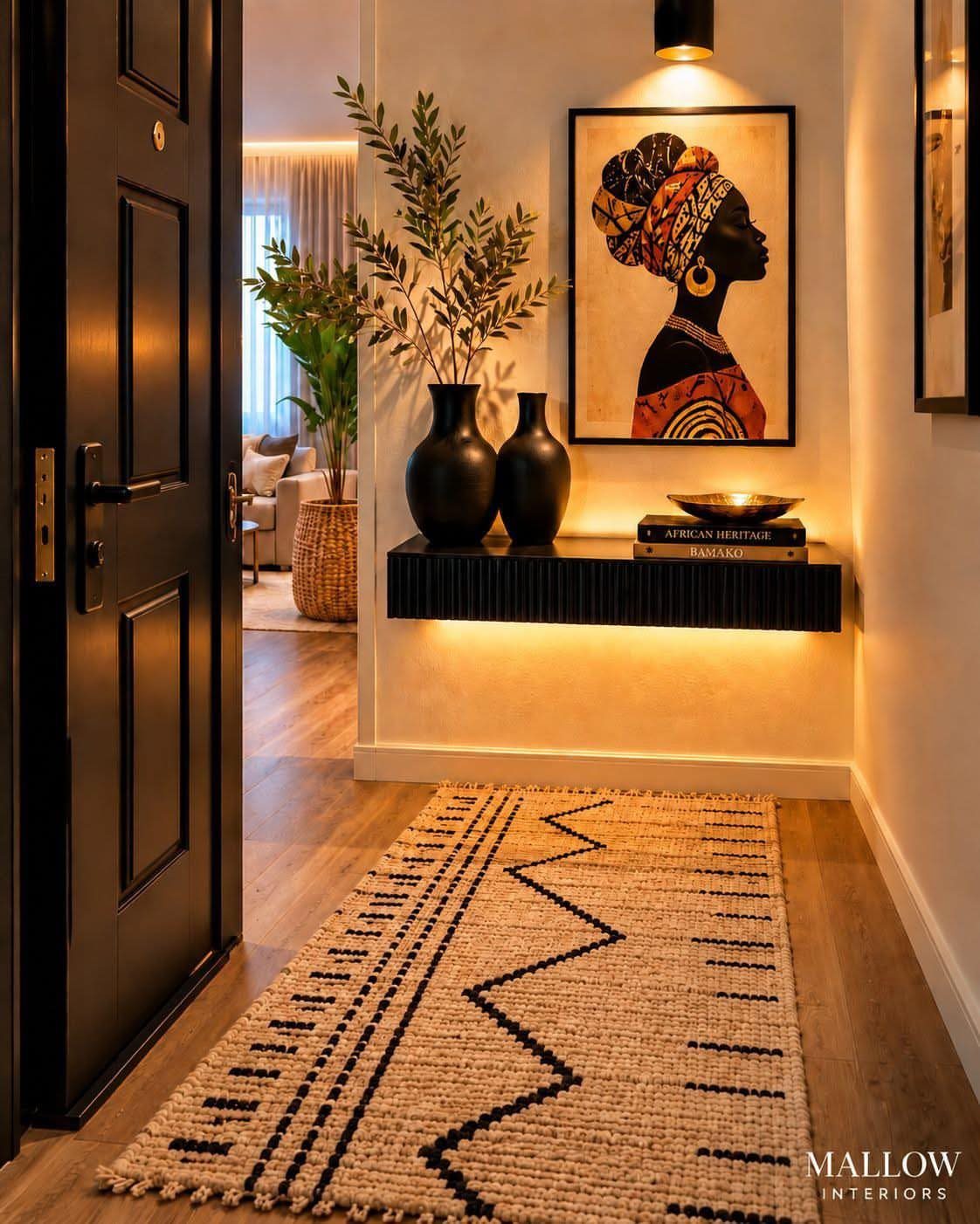
Wood, metal, and woven fiber together keep a narrow space from reading as flat. A smooth console against a rough, patterned rug gains depth when wall art picks up one tone without matching everything.
I start with the largest surface, usually the floor or the table, and build outward. A floating shelf in a tight entry works the same way: pair its clean edge with something handmade above or below it.
The trap is adding too many small things; two or three textures in strong proportion beat five that fight.
This suits renters and anyone working with a mixed collection. The pieces do not need to match era or origin, only weight and finish.
15. Symmetrical Console Table
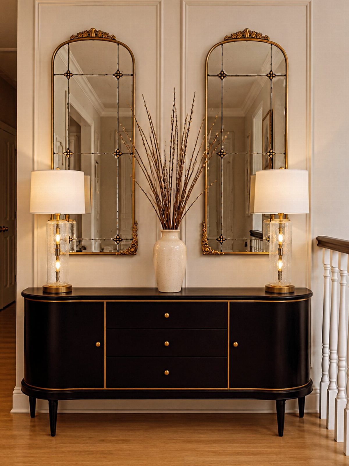
Two matching lamps and two arched mirrors frame a single vase with branches, and the result is formal without being stiff. Symmetry works best in entries with one clear wall and no door swing to break the line.
I would measure the wall before buying; the table needs enough room for people to pass, and the mirrors should hang at eye level for whoever lives there.
The pair of lamps means no hunting for the overhead switch in the dark, and the doubled light flatters faces.
Symmetry asks you to keep pairs matched, which limits what you can bring in. Every item must stay in its place or the balance falls apart.
This is for someone who tidies daily, not for a household that drops bags and runs.
16. Lamps or Candles
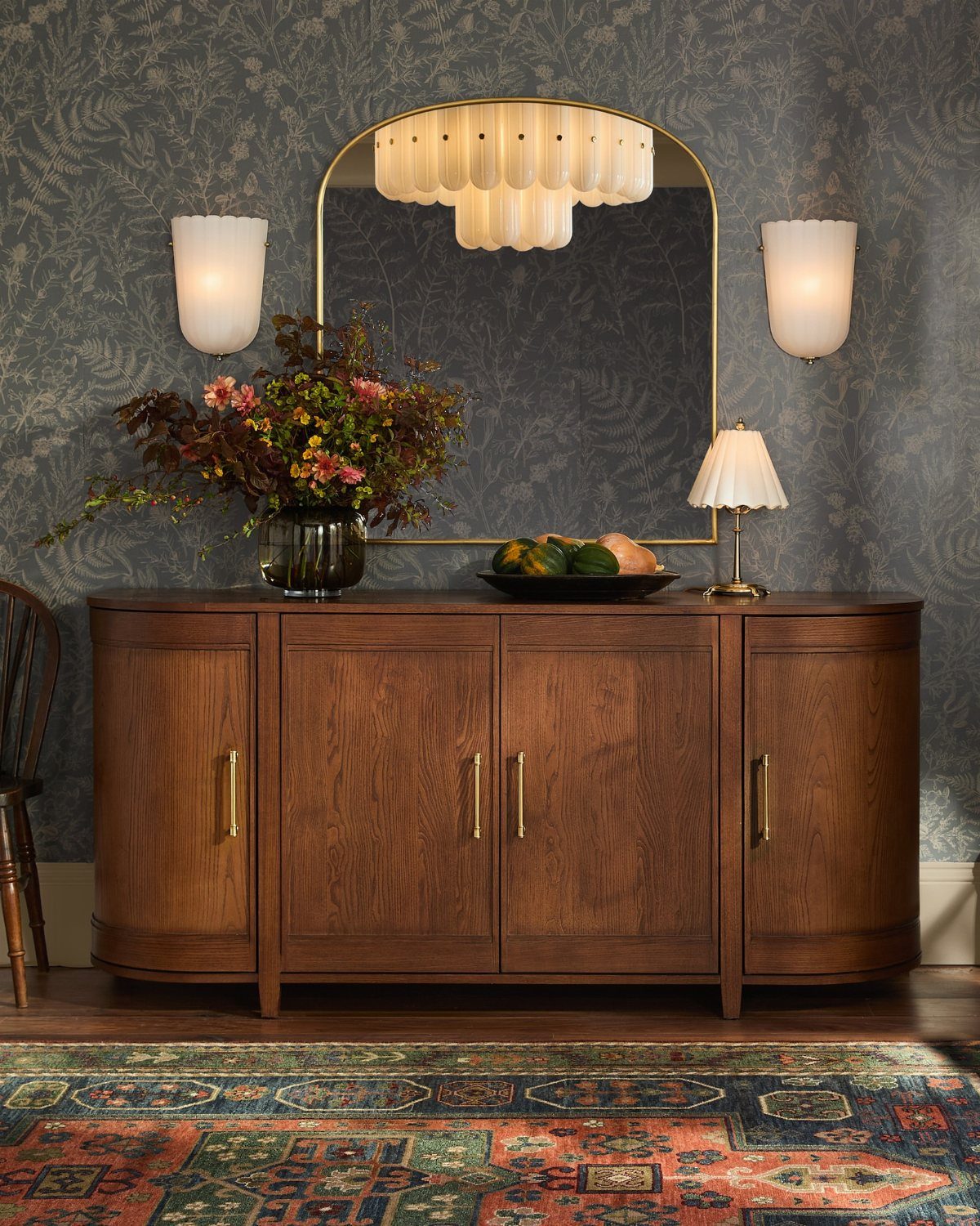
A small lamp on a sideboard gives light where you actually stand, not where the ceiling fixture lands. A pleated shade softens glare, and wall sconces free the surface below for mail and keys.
I keep the wattage low, 40 to 60, and choose a warm color temperature.
Candles in a drafty entry are a fire risk near coats and scarves, so I prefer enclosed holders or skip them for a diffuser with a light, clean scent.
The cost runs low; a basic table lamp and a pair of sconces together often cost less than one statement piece.
This is the finishing move for entries that already have furniture and storage but still feel cold at night.
Maximize Space in a Small Entryway
Closed storage beats open if you can manage it; seeing every shoe, jacket, and key at once is what makes a small entry feel crowded.
Hooks help, but a wall-mounted shelf with a small drawer or lidded bin above it hides the daily pile.
Skip anything that sits on the floor and blocks the door swing; a narrow console or floating shelf gives you a surface without the footprint.
A mirror above whatever you choose doubles the sense of depth, and a single plant or one framed piece keeps the wall from going bare without competing for attention.
You walk in, set down what you carry, and move on; every item that stays needs a reason.
Decorate a Small Entryway
A small entry is exactly where to use a color you would not risk in a full room. Patterned wallpaper works the same way: a single strip or one feature wall carries the load.
Statement lighting, a bold sconce or small pendant, draws the eye up and away from the floor. One strong piece reads as confidence; three fight each other and shrink the room.
Trending Entryway Styles
Multi-functional furniture is the current move: benches with hidden compartments, consoles with drawers slim enough for a hallway, anything that stores while it shows.
Natural materials, woven fiber, unfinished wood, and stone surfaces, are showing up against painted walls and metal fixtures.
High contrast is part of the same direction: light walls with a single black piece, or dark floors against pale furniture, sharpen the definition of a small space.
The through-line is that entries now are treated as rooms worth designing, not just passages to pass through.
“Scale was equally important,” Jessica Dorling, the founder of Dorling Design Studio in Seattle, adds regarding the piece. “The bench’s low, streamlined profile doesn’t visually overwhelm the small entryway, yet it still grounds the wall and gives the space a strong anchor.”
Frequently Asked Questions
How can I make my entryway look nice?
Functional furniture, a bold color or pattern, and one personal piece like art or a mirror do most of the work.
A bench with storage, a runner that catches grit, or a single large painting above a console each give the space a clear purpose. I would pick one strong move rather than crowd a small entry with several half-finished ideas.
What are the trending entryway styles?
Bold color on walls or doors, mixed textures like wood with woven fiber, and furniture that stores as much as it shows are the current direction.
A painted interior door, a vintage rug with worn pile, or a console built for keys and mail each answer the same need: the entry should work hard and still feel considered.
I would not chase a trend that fights the light or layout you have.
What is the 3-5-7 rule of decorating?
The 3-5-7 rule means grouping objects in odd numbers: three, five, or seven items together. Odd arrangements catch the eye and keep a display from looking too staged or too sparse.