
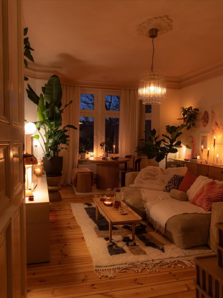
These ideas run from a quick coat of paint to a built-in bar with recessed lighting and a small refrigerator, and the right one depends on whether you rent or own, how much floor space you have, and whether the room gets real daylight or just a north-facing gloom.
1. Fill Up the Room
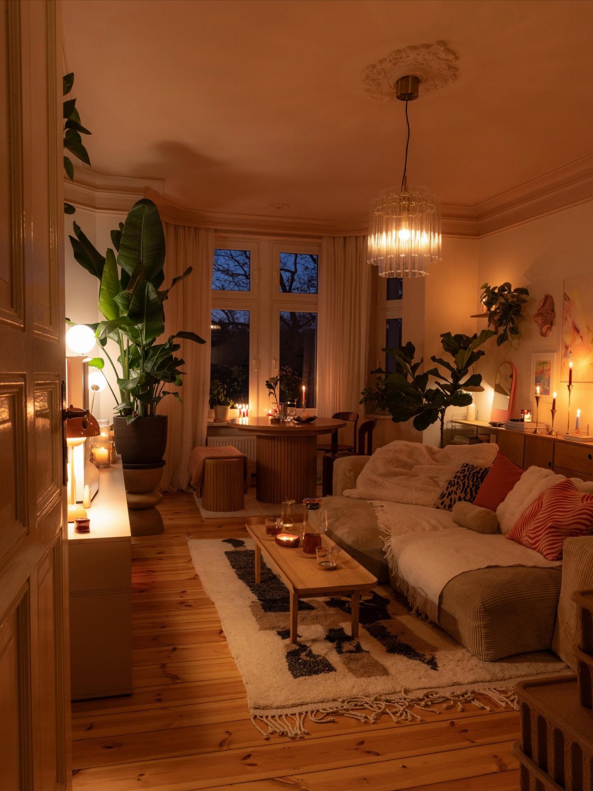
A living room that actually feels finished usually has one thing in common: nothing was added to fill a gap. The pieces came in because they earned their spot.
Lucite coffee tables work in tighter quarters because they carry structure without the visual weight of wood or metal; the room keeps its breathing room.
Layering helps too, oatmeal linen against woven fibers underfoot, soft curtains that match the wall color so the eye travels without stopping. I would start with the largest piece, the sofa, and build outward.
The mistake is buying a set and calling it done. Mixing old and new, smooth and rough, gives the room the feel of something collected over time rather than purchased in an afternoon.
This approach suits someone who plans to stay put for a while. A finished room built this way takes seasons, not weekends.
2. Powdery Pinks and Soft Neutrals
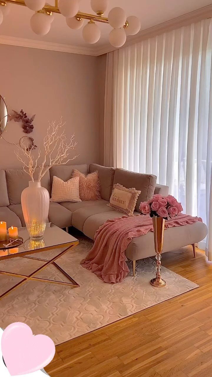
Powdery pink reads as neutral once it is on the wall, not sweet, not childish, just warm enough to soften a room that can feel stony with gray alone.
Carrying the color over baseboards and chair rails adds height by removing the horizontal line that normally chops a wall in half. Pink works as pillow and accent, but on the walls it becomes atmosphere.
I would test two or three samples before committing; paint shifts dramatically under afternoon light versus morning. A plush area rug in wool or silk does similar work underfoot, lending a homey feel to even industrial-leaning spaces.
The rug and the wall color do not need to match. They need to agree on temperature, warm with warm, cool with cool.
Best for rooms with good natural light. In a north-facing space, the same pink can turn muddy.
3. Great Living Room Wall Decor Ideas
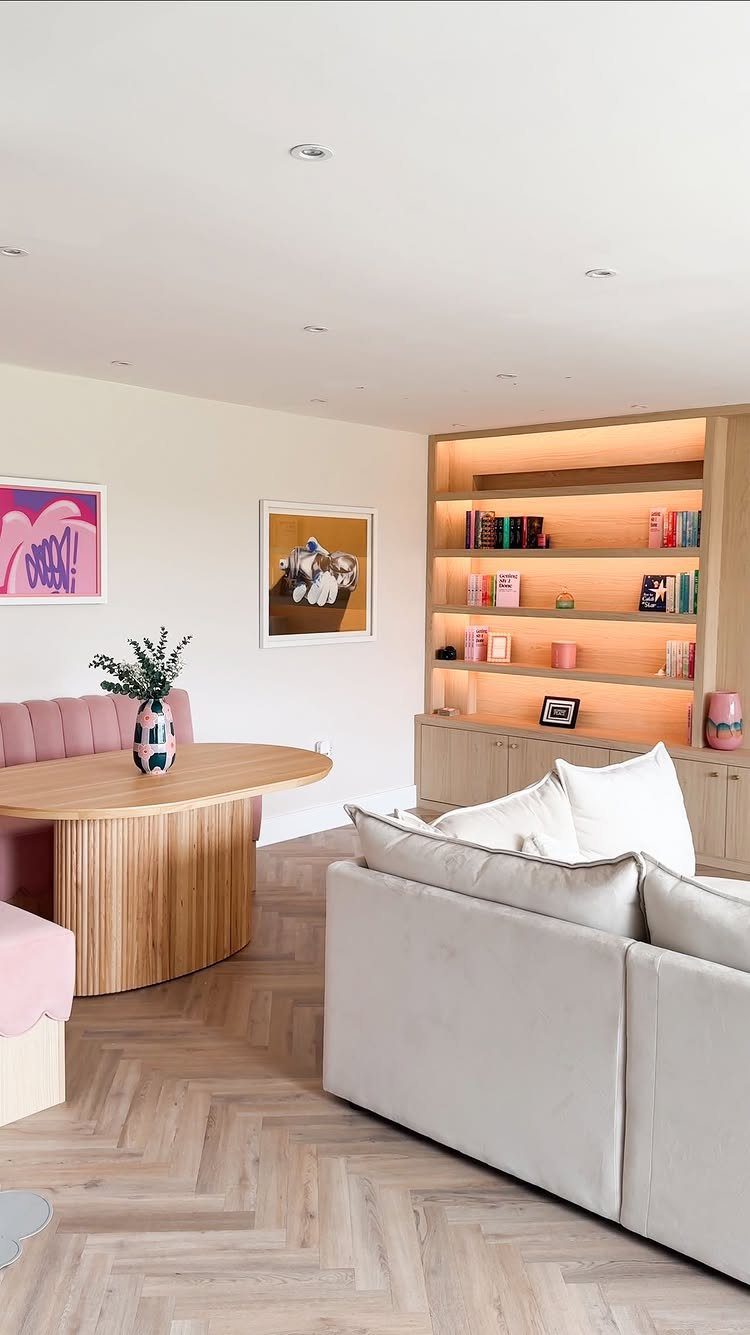
Wall decor is where most living rooms go either too safe or too cluttered. The middle ground is a mix of scales: one large piece that anchors the eye, smaller frames or objects that invite closer inspection.
Wallpaper functions as art in small spaces, especially a bold geometric that redefines the room rather than merely decorating it. Framed prints or an illuminated bookcase works as the large anchor, but not both competing.
I would choose one statement per wall and let the rest support. Quality wallpaper with actual texture, not flat digital print, adds depth that paint cannot.
The pattern should be bold enough to energize, soft enough that you do not tire of it quickly.
This works best when you rent and cannot change architecture, or when you own and want to avoid another renovation.
4. Small Displays
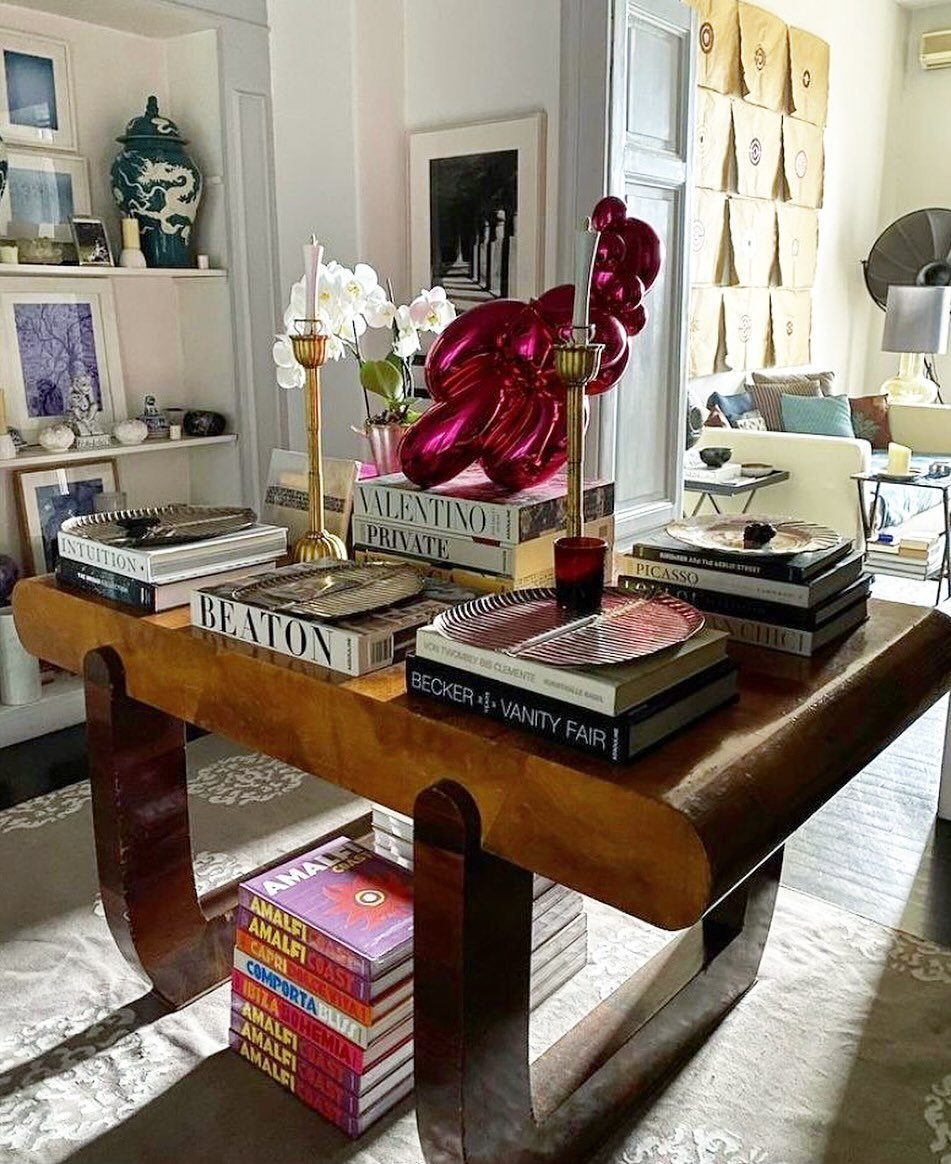
A good vignette looks accidental and never is. A console holds books, candlesticks, a single orchid, one sculptural object in a color that surprises.
The restraint is what makes the grouping readable: the palette stays calm, the mix of heights and textures brings life.
I would limit each surface to a handful of objects and vary their purposes, something vertical, something low and heavy, something organic. The books are not random; their spines create a color block that grounds the arrangement.
More is more only when curation stays tight. The tradeoff of this approach is dusting and editing; a vignette left alone goes stale in a month.
Small spaces benefit most. Every surface works harder, so intention matters more.
5. Airy Fabrics and Light Hues
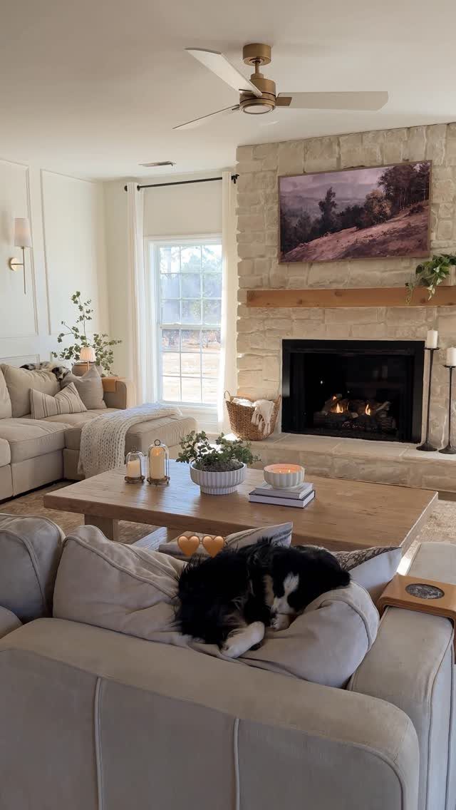
Light hues do not expand a room; they expand the perception of it, which is what matters. A stone fireplace and light sofa create a room that reads as larger than its footprint because nothing juts forward to claim attention.
Sheer curtains filter light rather than blocking it, and that diffusion matters more than most people realize. I would choose linen or a loose weave that moves with air currents; stiff fabrics read as institutional.
The dog asleep on the cushion is not decoration, but it proves the room functions. A space this calm can handle one darker piece for grounding, a coffee table in walnut or iron, without losing its airiness.
This suits rooms with limited square footage and decent natural light. The risk is sterility; without texture, pale becomes bland fast.
6. Built-in Bar
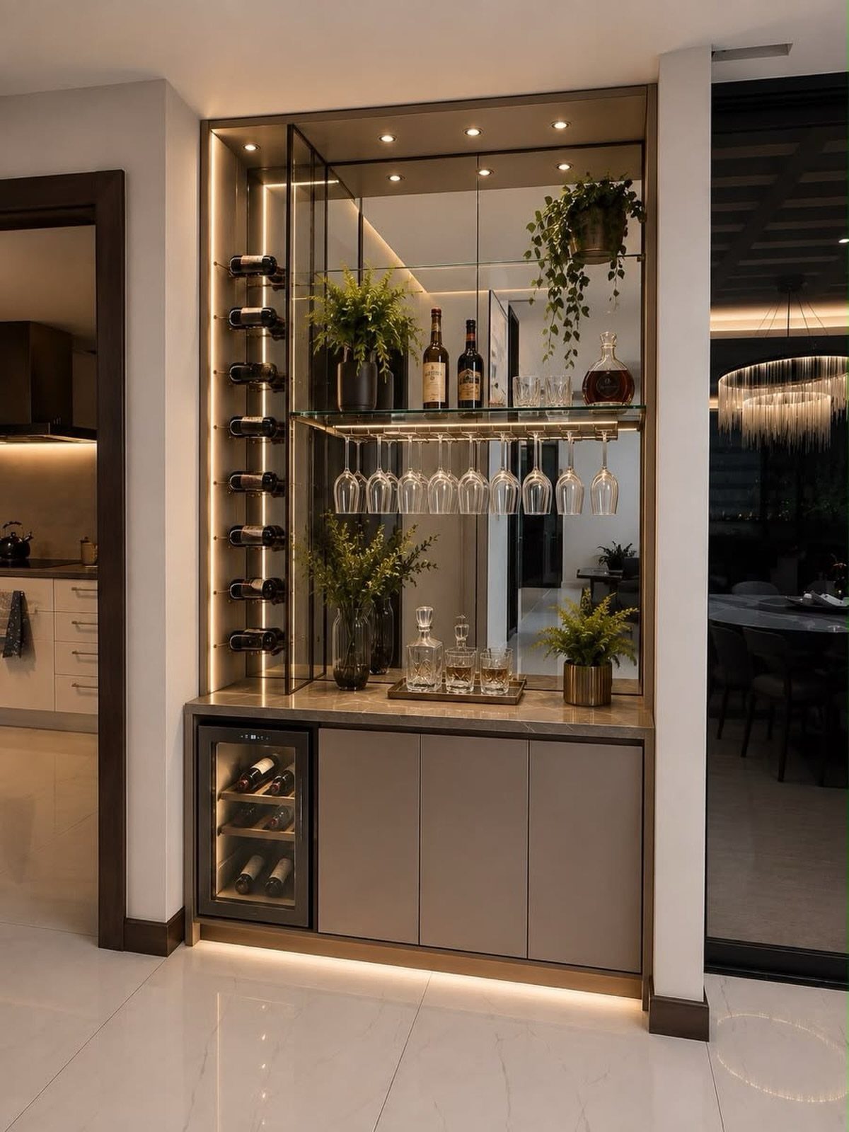
A built-in bar turns a living room into a destination, not just a pass-through. Recessed storage, mirrored backing that doubles the sense of depth, integrated lighting that makes glassware sparkle without demanding overhead fixtures.
I would put the bar where guests naturally gather, near seating but not blocking circulation. A saturated paint color on the interior, deep blue or emerald, recedes visually and lets brass or copper fittings pop.
The mirrored back is worth the cost; it turns a shallow niche into something that reads generous. A small refrigerator keeps the setup self-contained, so you are not running to the kitchen for ice.
This investment pays off for people who entertain monthly or more. A rolling cart might serve better when floor space is tight.
7. Cohesive Color Palette
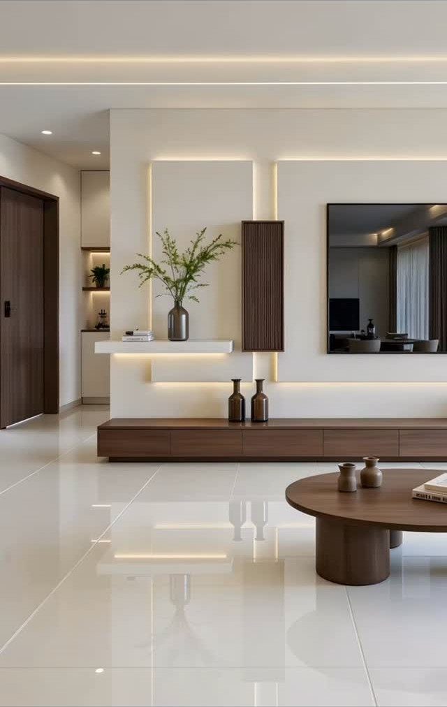
A cohesive color palette keeps a small living room from feeling busy or cramped. Pick two or three colors that sit near each other on the wheel, or go all-in on one shade and let its variations do the work.
LED strips behind panels or shelving are cheap and stretch a palette into the architecture itself. A mirror bounces those tones back, which matters when the space is tight.
If you rent and cannot change cabinetry, paint the wall behind the console in the darkest color of your scheme and keep everything else lighter.
This suits renters and owners equally; every new purchase needs to pass the color test, which slows impulse buys.
8. Large Art Pieces
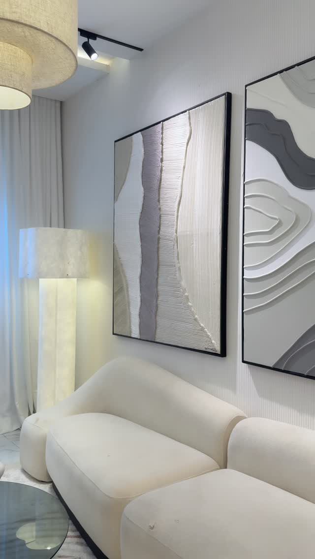
One oversized piece beats a crowded wall when the room is small or the furniture is simple. Two large abstracts, neutral enough to live with for years but textured enough to hold attention from across the room, anchor the wall.
Hang it low enough that the bottom edge sits just above the sofa back, not floating in open wall space.
If the piece is heavy, use a French cleat rather than a single hook; drywall anchors strong enough for the job are cheap at any hardware store.
For renters, leaning a large canvas on a console against the wall avoids holes entirely and reads as intentional in a casual room.
The risk is choosing art too small for the wall, which makes the whole room feel tentative. When in doubt, go larger and simpler.
9. Bank on Bookshelves
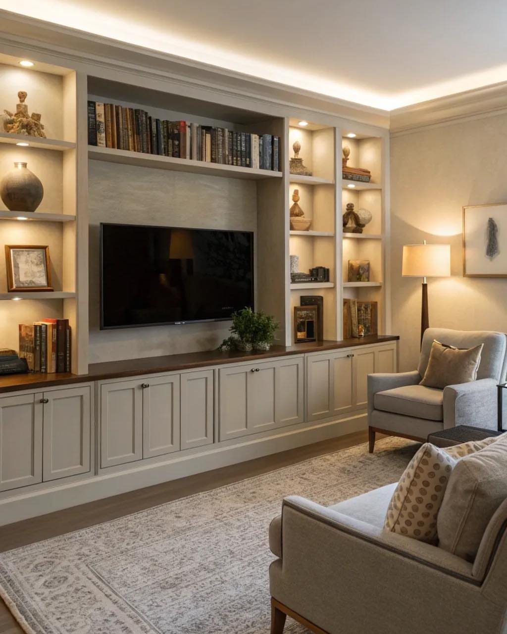
Built-ins turn a television wall into storage that actually looks designed. Shelves flanking and above the screen, filled with books and objects rather than electronics, give the wall a job beyond the television.
That arrangement works because the shelves are deeper than the TV mount, so the screen reads as one rectangle among many.
If you are adding shelves rather than renovating, measure your tallest book and add a little clearance; standard depth leaves oversize art books tilting forward.
Warm cabinet lighting, the kind that strips in easily, keeps the display readable after dark and separates the wall from the black rectangle of a powered-off screen.
This rewards anyone with a collection worth showing. The cost is dusting and editing: open shelving demands curation, or it becomes clutter with better carpentry.
10. Wood, Stone, and Textiles
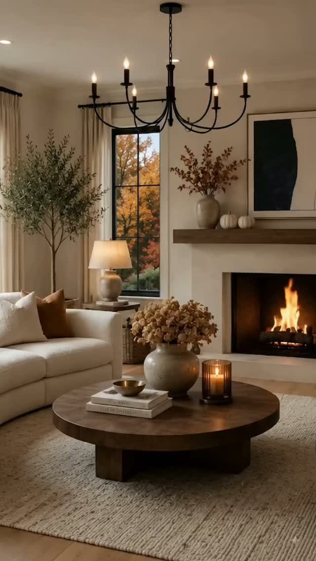
A room with wood, stone, and textiles underfoot and overhead feels grounded in a way painted drywall alone cannot manage.
A fireplace wall in stone or brick, a wood mantel and coffee table, and a sofa and rug layered in woven texture give the room its bones. Each material reads as found rather than manufactured.
Start with the largest surface you can change: the floor, a mantel, or a coffee table. Textiles come last and cheapest: a wool or jute rug, linen curtains, a throw in something nubby.
The mix matters more than the price of any single piece.
This approach suits cold climates and old houses especially. In a rental, focus on textiles and one good wood piece; leave the stone for the next place.
11. Earthy Colors
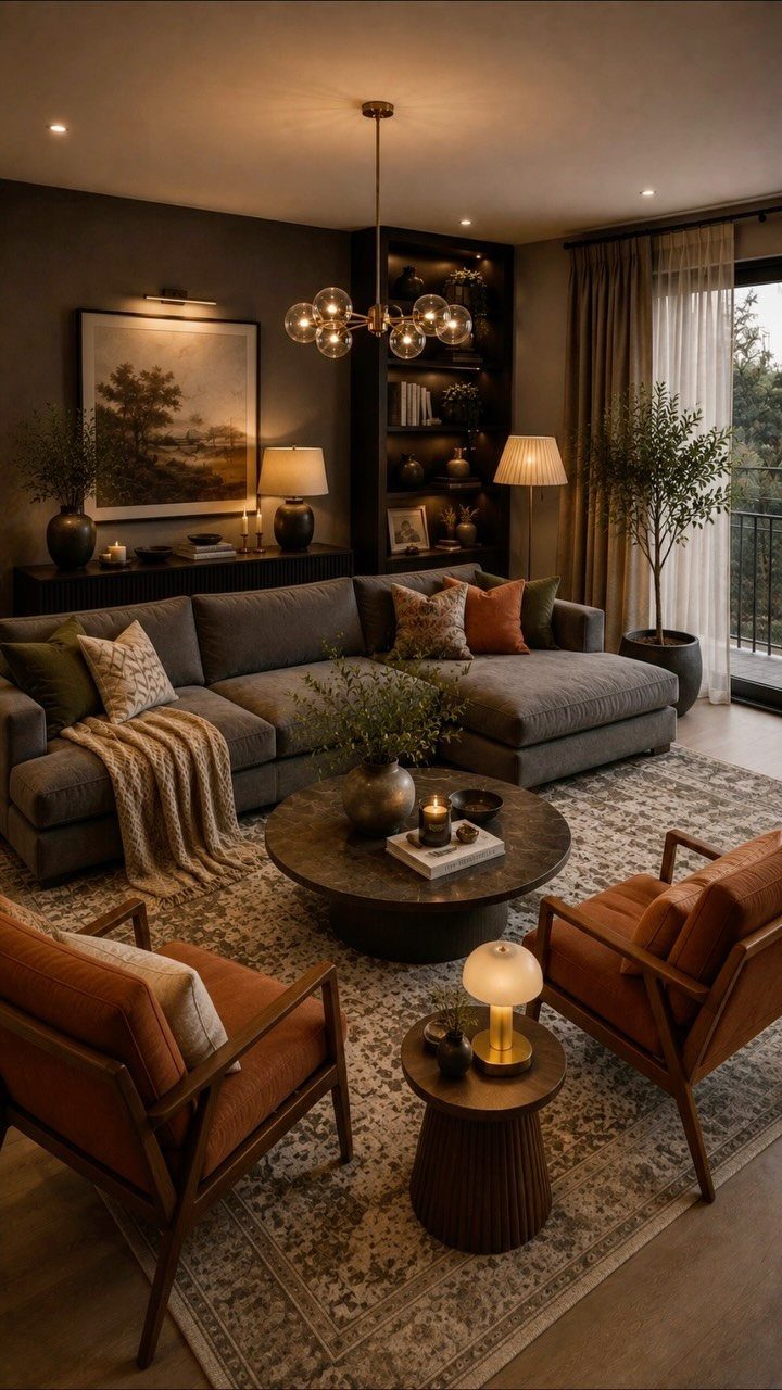
Terracotta, olive, warm brown, and stone grey pull a room toward the ground and away from the ceiling, which makes high walls feel less empty and low ceilings less pressing.
A grey sectional, terracotta chairs, and wood and plants filling in between give the room its warmth.
Farrow & Ball’s stronger tones, Hague Blue or London Clay, work on walls that get good daylight; in dim rooms they flatten to near-black by evening. Test a patch and live with it across several days before committing.
For paint-shy renters, terracotta in upholstery and ceramics carries the palette without a brush.
Earthy colors forgive wear and hide dust better than cream or white. They also limit your accent options; bright red or electric blue will fight rather than pop.
12. Let Nature in
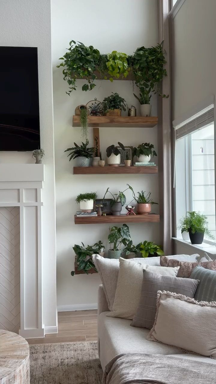
Plants soften corners that furniture cannot reach and add color without committing to a painted wall. Floating shelves that hold pots at varying heights keep the arrangement from reading as a grocery-store lineup.
A tall window nearby gives the lower plants enough light to survive.
Start with three plants at different heights: one trailing, one upright, one broad-leafed. Pothos, snake plant, and a small rubber tree cover those shapes and tolerate the dry air of forced heat.
Wall-mounted shelves with a lip keep pots secure; command strips will not hold wet soil for long.
This suits anyone who remembers to water weekly and has one window that gets indirect light. If you travel often or kill succulents, dried branches in a tall vase give the same vertical accent without the maintenance.
13. Living Room Furniture Ideas
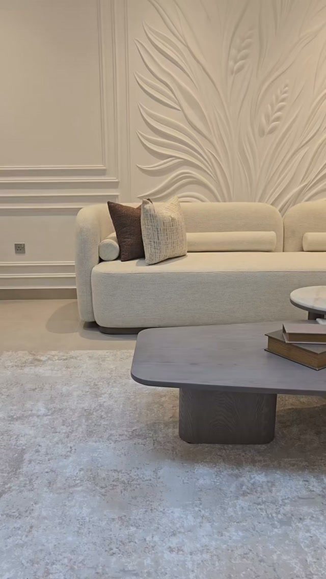
A curved sofa works harder than a straight one in a small space because the arc leaves walking room at the corners. Neutral upholstery keeps the shape quiet, while a low stone coffee table keeps sight lines open.
Mixing materials is where the interest comes from: leather against wood, glass against something hand-woven. I would check the scale of every piece against the room’s width before buying, not after.
An ottoman that stores blankets earns its floor space twice.
This suits renters who can take pieces with them and homeowners who want the room to shift without a full redo.
The risk is collecting single-purpose items; if a side table cannot hold a lamp and a drink, it is too small for the job.
“Putting a large sofa in a small space might seem counterintuitive at first, but in this living room, it was exactly what was needed,” says Los Angeles designer Francesca Grace, who chose the furnishings for this Samaha Studio project.
14. Colorful Decor Items
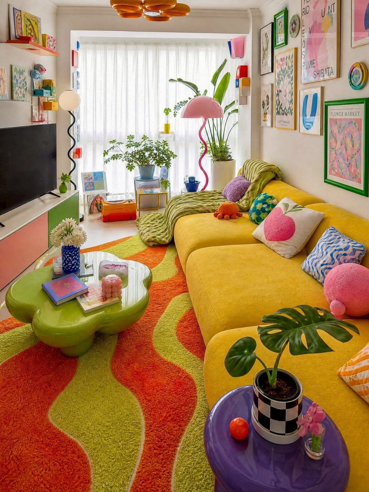
Yellow, orange, and lime together in one room only hold because the saturation levels match; a pastel yellow beside a screaming green collapses. A rug and sofa that share the same brightness let nothing shout over anything else.
Start with one anchor color, usually the largest piece, and add two others at half the dose. Cushions move in and out cheaply, which makes them the safest experiment.
I have kept a sofa for years and changed its character several times just by switching covers.
This works best for someone bored by beige but scared of commitment. Bold items date faster; plan to rotate the small pieces every few seasons while the bones stay neutral.
15. Modern and Vintage Pieces
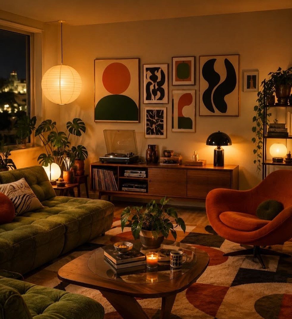
A 1970s Mario Bellini sofa beside a new, sculptural table sounds like a clash until you see the shared curves.
The photo pairs a green velvet tufted piece with an orange retro chair, and the common thread is both look hand-shaped, not machine-stamped.
Match weight, not era. A delicate mid-century credenza dies next to a overstuffed modern sectional; both need to feel like someone chose them on the same day.
I would put money into one vintage statement and build around it with cleaner, newer pieces.
This takes patience at flea markets and estate sales, not a single afternoon online. A room that mixes periods well does not read as a showroom; the risk is collecting orphans that never speak to each other.
16. Bold Light Fixtures
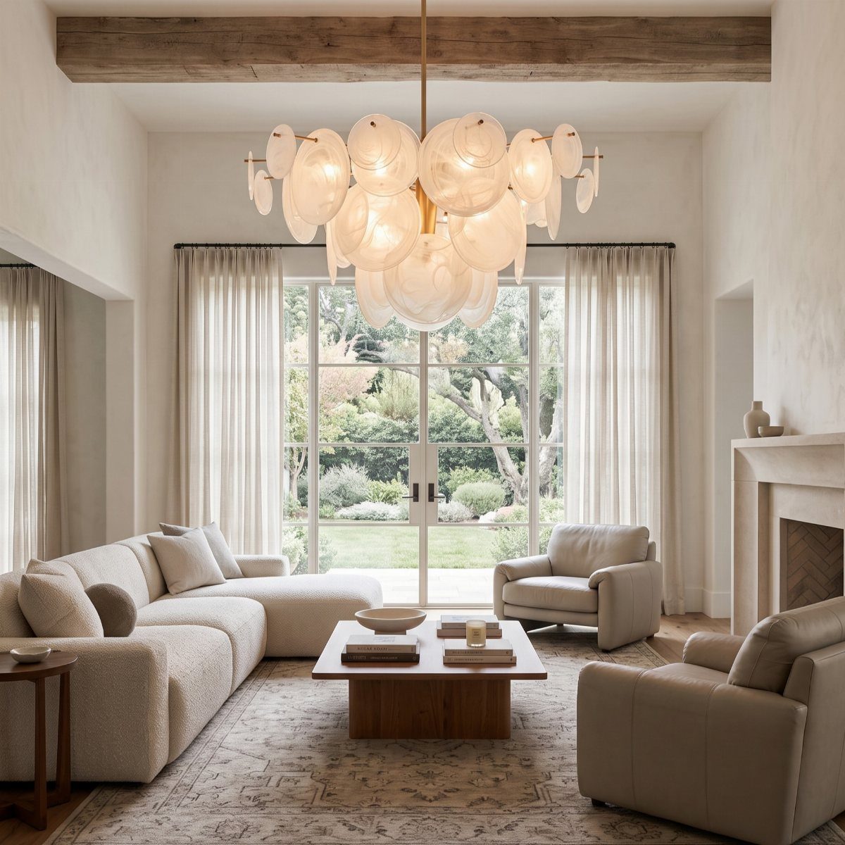
A sculptural chandelier replaces art in rooms with no wall space. A disc fixture draws the eye upward and makes the ceiling feel higher, which matters more in standard construction than in lofts.
Scale is the hard part. Measure the room’s length plus width in feet; that sum in inches is your maximum fixture diameter.
A 12-by-14-foot room tops out at 26 inches across. I ignored this once and spent a month bumping my head.
This suits minimal rooms that need one drama piece and traditional rooms ready for a jolt. A statement fixture often needs an electrician and a reinforced box, not just a swap.
17. Layer Different Rugs
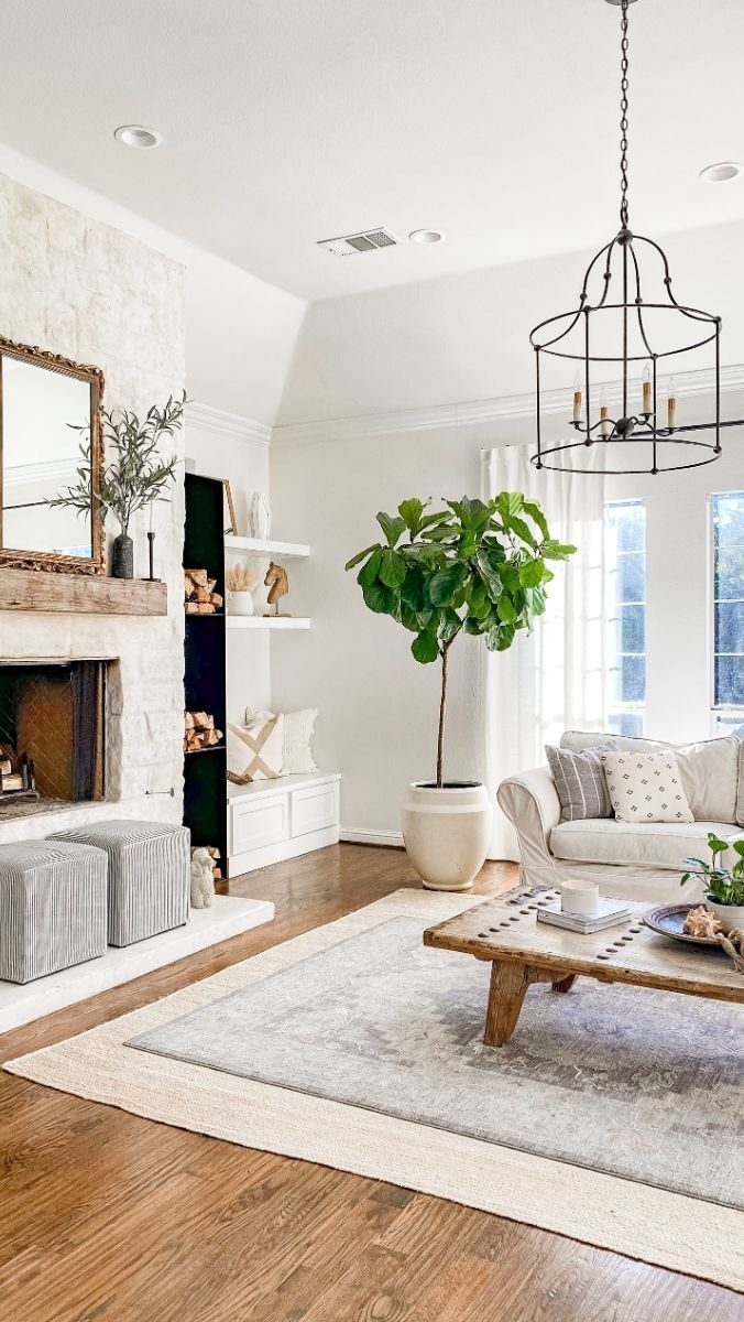
A flat-weave base with a smaller vintage piece on top solves two problems: the cheap rug covers the floor, the good one stays safe from heavy traffic.
Center the top rug under the coffee table, not the room, which keeps the arrangement purposeful.
The bottom rug should be clearly larger on every side, or the look reads accidental. Texture matters more than pattern; a smooth jute under a shaggy wool reads intentional, two thin flat-weaves just look like a mistake.
This is the fix for inherited hardwood you cannot refinish yet, or for renters covering bad tile. The downside is tripping; tape the layers down, and accept that vacuuming takes longer.
18. Green Velvet Seating
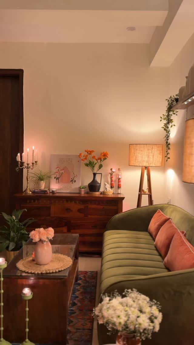
Olive velvet reads as neutral in some lights and jewel-toned in others, which makes it more versatile than charcoal or navy.
A green velvet sofa against warm wood picks up pink cushions without competing; the velvet’s sheen does the blending work.
This fabric shows every mark, so the household matters. Cat claws, popcorn fingers, and casual red wine drinkers will leave evidence.
I would budget for professional cleaning regularly, sooner if the piece faces afternoon sun, which fades the pile unevenly.
Best for a formal-ish living room that sees actual use on occasion, not the daily crash spot. The alternative is cotton velvet, which sacrifices some depth for survivability.
19. Bright Yellow Statement Sofa
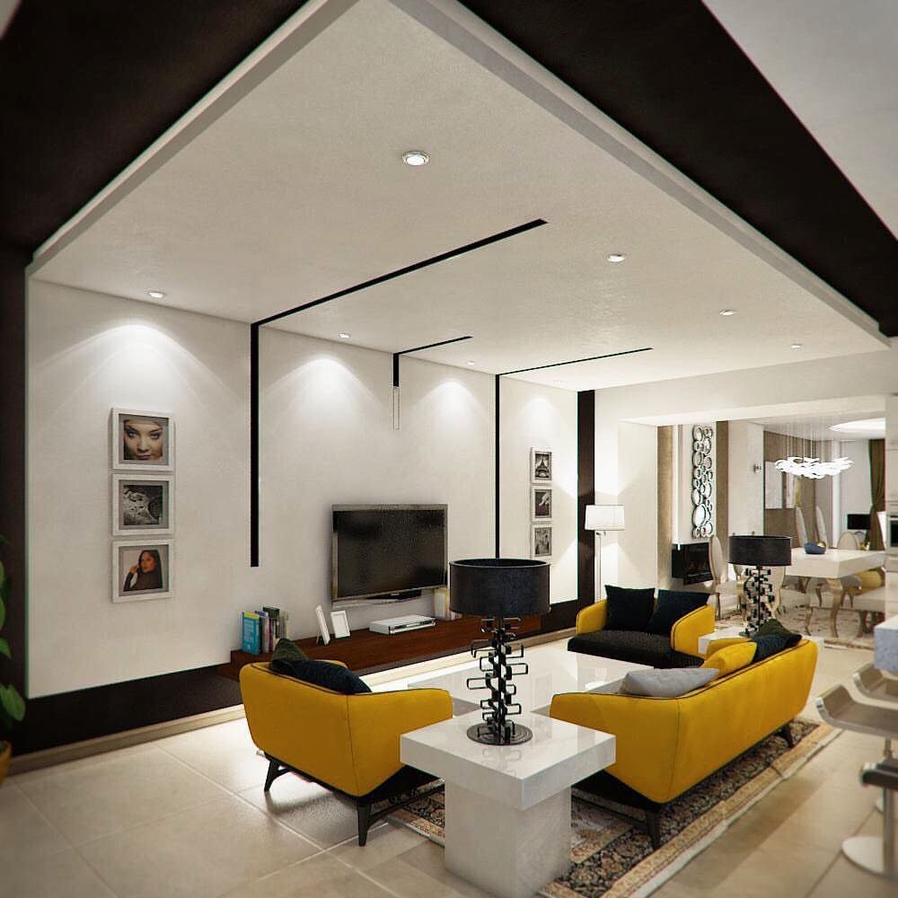
A bright yellow sofa turns the living room into the house’s most awake space without touching a wall.
I would only try this in a room that gets real daylight; in a dark corner the same yellow goes flat and sour.
White walls and black lines keep a yellow sofa from reading as playful, which matters if you want to live with it past the first month.
Pair it with a dark wood or black metal coffee table, not another light piece, or the whole room starts to float. Leather holds the color better than linen if you have pets or small children.
Velvet looks richer but collects dust that shows.
This suits renters who can take the sofa when they leave, and homeowners who want one bold move instead of many small ones.
20. Bold Lime Green Walls
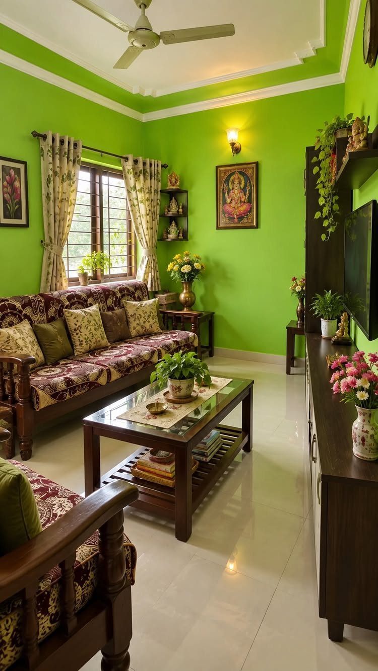
Lime green walls work when dark wood furniture weighs them down; pale oak would let the color run wild.
I painted a bedroom a similar green once and learned that north-facing light turns it toward mint, which is a different mood entirely. Test your sample in afternoon light before you commit.
Patterned cushions and floral arrangements do more work than they look like: without them, the room would feel like a stage set. Layer several textures to keep the walls from becoming the only subject.
This is cheaper than buying a statement piece and harder to undo, so it suits someone settled enough to live with a strong choice for a good stretch.
21. Cozy Bouclé and Warm Neutrals
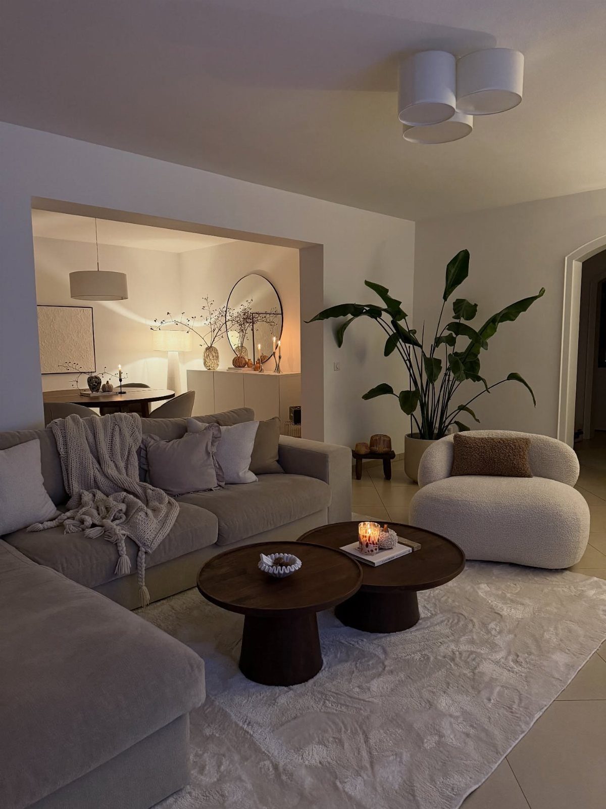
Bouclé reads as cozy because the nubby surface catches light unevenly, which softens the whole silhouette.
The white chair would stain fast in a house with children under ten or a dog that climbs; the same shape in oatmeal or grey is the safer order.
The grey sectional and dark round tables give the texture somewhere to land. Without that contrast, bouclé can look like a mistake from decades past.
The large potted plant matters too: organic shape against all those right angles.
This is the safest entry point into texture for someone who has played color-safe for years. It costs more than a standard upholstered piece, but the chair size keeps the damage contained.
22. Traditional Red Upholstery and Patterns
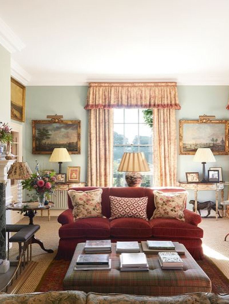
A red sofa with patterned curtains and a plaid ottoman is the most traditional choice on this list, and it only works if you commit to the full arrangement.
Pale blue walls do the cooling; with cream or beige the room would turn overheated fast.
The tailored curtains are not optional here. Bare windows or simple panels would leave the sofa looking like an inheritance you have not dealt with yet.
I would add the books on the ottoman too; they break up the pattern and give guests somewhere to look.
This suits someone who already owns a piece in this family, inherited or bought secondhand, and needs to build around it without starting over.
Furniture Arrangement Tips
Two facing seats, close enough to pass a drink without leaning, make a conversation area that actually gets used.
The mistake is lining walls like a waiting room; pulling furniture inward, even a foot or two, changes how voices carry and how the room feels occupied.
One sweeping anchor reads intentional; three small pieces filling the same footprint read as clutter.
Incorporating Plants
Soft greys and off-whites read as finished only when something living breaks them.
A tropical houseplant, a simple vase of cut stems, even a floral wallpaper with enough scale to hold the wall; the green does the work that more grey cannot.
An exotic plant on a glass coffee table, or a single stem in a vase on an end table, adds color without demanding a painted wall or a new sofa cover.
One plant per surface is enough to be the pop; two compete and three read as a greenhouse.
Botanical touches work because they shift with light and growth, not fixed like paint. A plant that drops a leaf reminds you the room is alive; a static scheme does not.
Creating a Cozy Atmosphere
Throws and blankets earn their keep on chilly nights, and their colors do more than the thermostat to make a room feel pulled together.
I would pile pillows and keep a basket of wool or cotton within reach of the main seat; the invitation to snuggle matters more than the perfect fold.
Strong, grounding tones envelop in the way powdery hues only soften. Red Earth on a wall, or carried through in upholstery, turns a room into a place you move toward rather than pass through.
The warmth is in the pigment, not the temperature.
Ottomans that take your feet up and seat an extra guest when needed do double duty that single-purpose furniture cannot match.
A leather sofa against a painted wall, wood and glass mixed nearby, gives the hand something to notice while the body rests.
Frequently Asked Questions
What’s trending for living room decor?
Bold colors, natural materials, and multifunctional furniture are showing up most. Powdery pink on walls reads as neutral and warm rather than sweet, while earthy terracotta and olive pull the room toward the ground.
Lucite coffee tables and curved sofas work harder in tight spaces because they keep sight lines open. Layering textures, oatmeal linen against woven fibers, gives the collected-over-time feel that a matching set cannot.
How do I make my living room look nice?
Start with the largest piece, the sofa, and build outward with intention rather than buying a set and calling it finished.
Add one statement per wall, whether that is a large art piece, textured wallpaper, or a framed bookcase, and let everything else support it.