These 21 living room accent wall ideas run from a gallon of paint and an afternoon to stone that needs structural support and an electrician’s budget.
The right one for your wall depends on whether you are adding a surface layer or changing what sits behind it.
1. Wallpaper Accent Wall
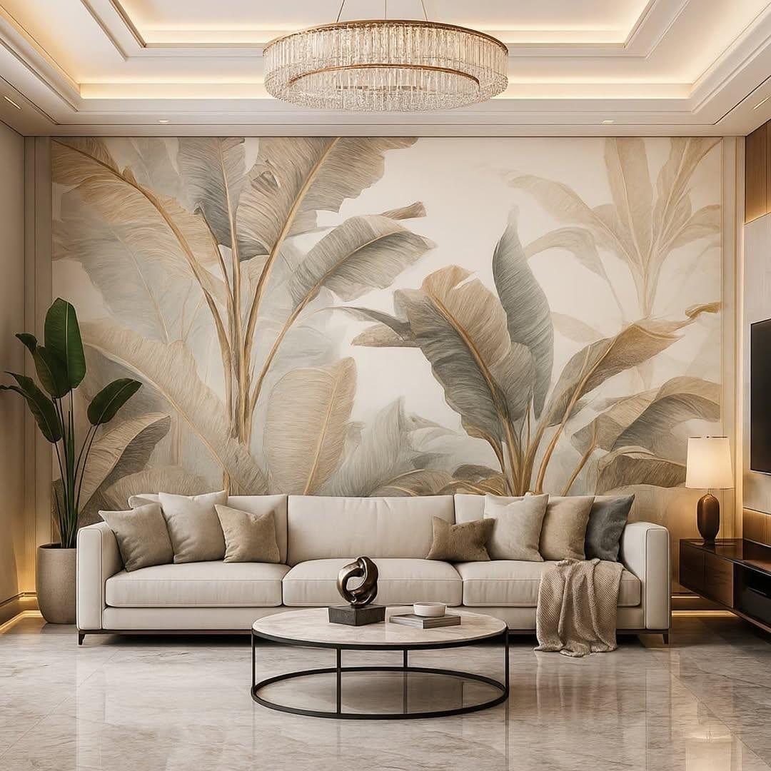
A wallpaper accent wall is the fastest way to bring a room to life without buying a single piece of furniture. What makes it succeed is restraint.
Let the paper carry the room; keep furniture light, shapes simple, and competing patterns out.
If you rent, removable prints in faux grasscloth or geometric designs peel off when your taste shifts. For a framed effect, line only the center portion of the wall.
I’d start with a bold botanical or a mural-style print in a small space, where the drama feels intentional rather than overwhelming.
2. Gallery Wall
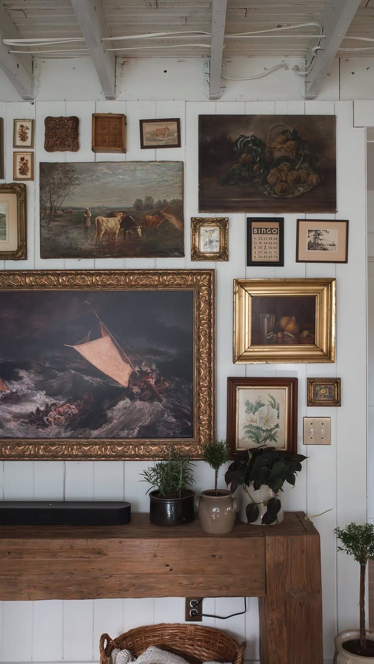
A gallery wall turns your own accumulated pieces into the accent, which means it costs only what you’ve already spent on frames and art. Treat the arrangement as one shape rather than nailing up frames one by one.
Lay the whole grouping on the floor first, moving pieces until the balance feels right, then photograph it for reference.
Gold tones against white paneling reads warm, but black, natural wood, or a deliberate mismatch all work. Some pieces can lean on a ledge at the bottom for a casual layer.
This suits renters and anyone whose collection changes, since nothing is fixed permanently. Keep the subject matter consistent, boat scenes with boat scenes, for a calmer look; mix everything for more energy.
3. Painted Accent Wall
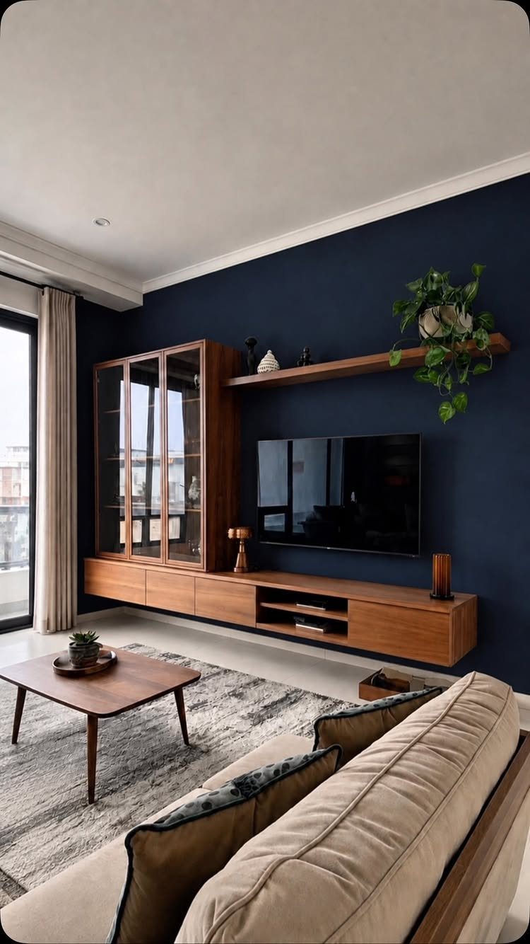
One wall in a saturated color is the cheapest, fastest accent you can make. A gallon of paint and an afternoon, and the room has a new center of gravity.
Pair it with minimal decor on that wall itself so the color does the talking. This is where I’d send a first-timer, or anyone in a rental who can paint back later.
The cost is low enough that repainting when you tire of it hurts less than most mistakes.
Whether you’re a minimalist who gravitates toward neutral paint colors, a maximalist who loves making a bold statement, or fall somewhere in between, there are plenty of accent wall ideas for everyone.
4. Wood Paneling
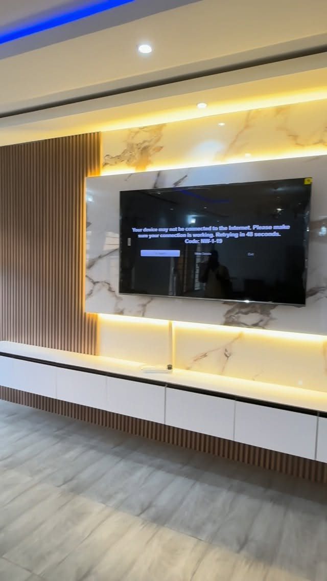
Wood paneling brings in warmth that paint alone cannot, and vertical slats keep it reading modern rather than cabin. Reclaimed wood or shiplap suits a rustic room; painted or natural finish shifts the same boards toward Scandinavian or coastal.
The backlit detail in this version, warm LED strips above and below the TV area, turns the paneling into a subtle light source after dark.
That integration is worth planning for if you’re building from scratch; retrofitting it means chasing power and hiding transformers. I’d use reclaimed wood for texture with history, or clean vertical slats like these for something more current.
Either way, the material does the work, so keep the rest simple.
5. Textured Paint
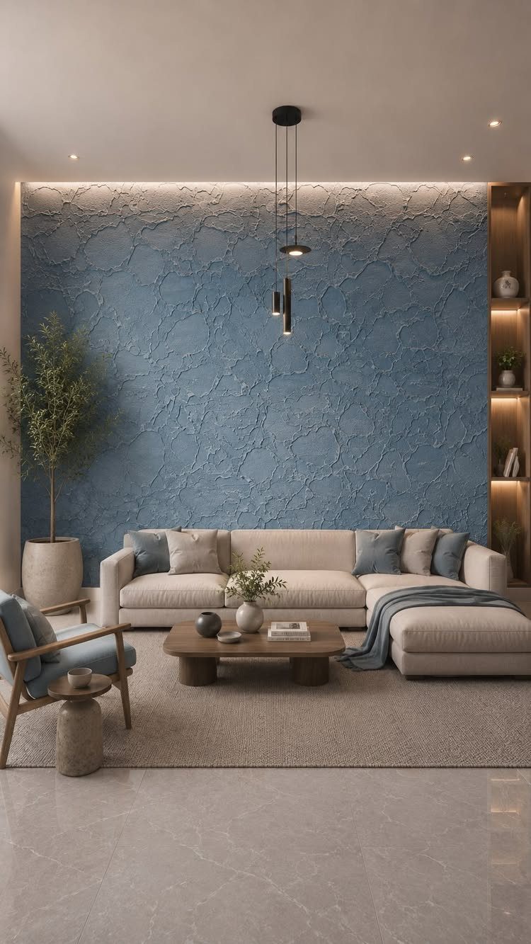
Textured paint gives a wall dimension without adding any material at all. A swirling plaster finish catches light differently across the day, so the color seems to move.
Stippling or sponging build that depth with ordinary paint and simple tools, no plasterer required.
A single textured wall behind a sofa or bed carries enough presence that the other three walls should stay flat and quiet. Blue works with neutral furniture, but the technique suits any color.
Cost runs about a gallon of paint plus a few hours of patient application. This is for someone who wants the wall itself to be the artwork, not a frame for it.
6. Geometric Wood Trim
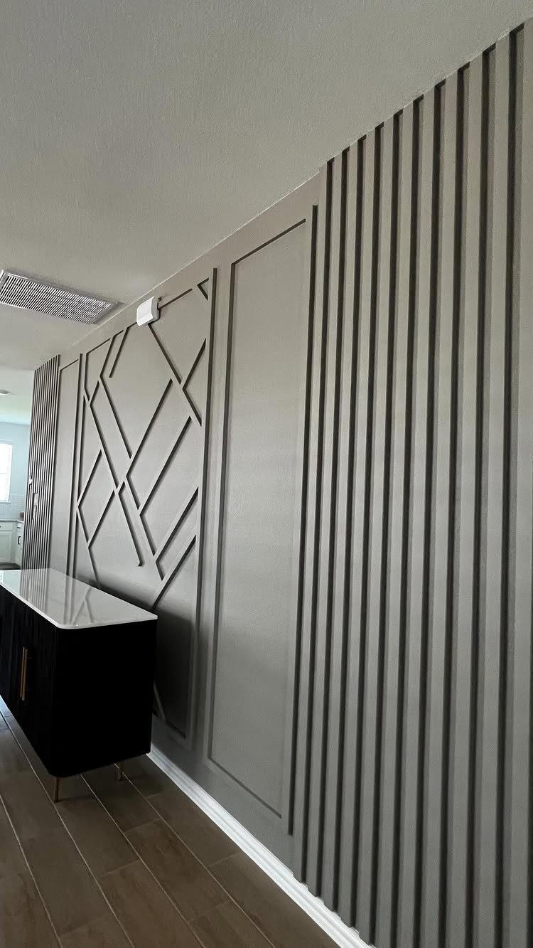
Geometric wood trim is board-and-batten’s bolder cousin: diagonals, asymmetric grids, or intersecting lines that break the wall into sculptural panels. Vertical slats, rectangular frames, and crossing diagonals in one grey-painted composition, with a black console grounding the lower edge.
You can paint the trim to match the wall for subtlety, or stain it for contrast and warmth. Brass hardware against dark moody paint, as I’ve used in entryways and offices, reads elevated without feeling showy.
The construction is simple, 1×2 or 1×3 boards and a miter saw, but the layout matters more than the cutting. Sketch the pattern full-scale, tape it out on the wall, and live with it for a day before attaching anything.
This suits a room where you want architecture without renovation.
7. Stone Accent Wall
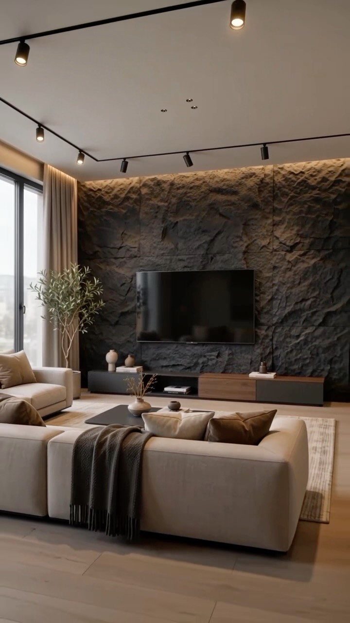
A stone accent wall brings in what paint cannot: actual depth, actual weight, actual variation from one piece to the next.
Real stone runs expensive and needs structural support; faux panels from a home center give the same visual punch for less, and one person can lift them. The choice depends on your wall’s condition.
A flat, sound surface takes either. Uneven drywall or old plaster pushes you toward real stone with its lapped installation, or toward a pro.
Charcoal stone reads modern and anchors a room with light furniture. Lighter limestone opens up a smaller space instead.
Check whether your studs can handle the load before you fall in love with a stack of slate.
8. Hand-Painted Murals
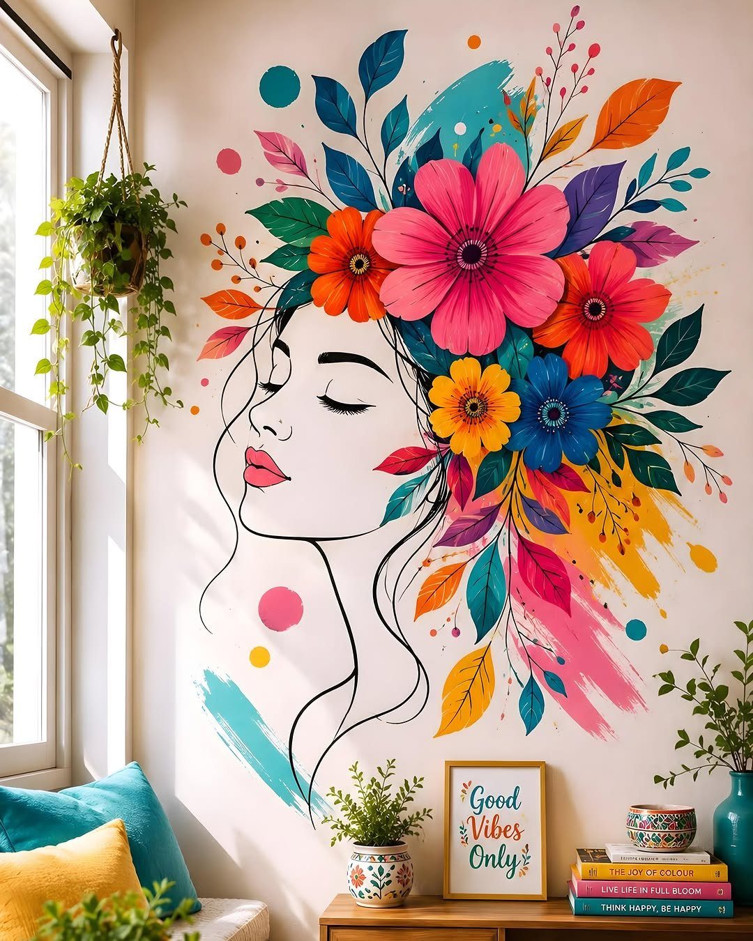
Hand-painted murals sound like they belong to someone with an art degree, but the current approach is closer to washing a wall with color than to fine art.
Two or three shades from the same family, a roller, and a wet sponge for blurring the edges: that is the whole technique.
The mural above the console shows a face and florals, but your own version could be stripes, clouds, or nothing recognizable at all. A smeared, imperfect finish is the goal, not the accident you fear.
This suits renters who can paint over it later, and anyone who wants a wall no one else has.
9. Mirror Wall
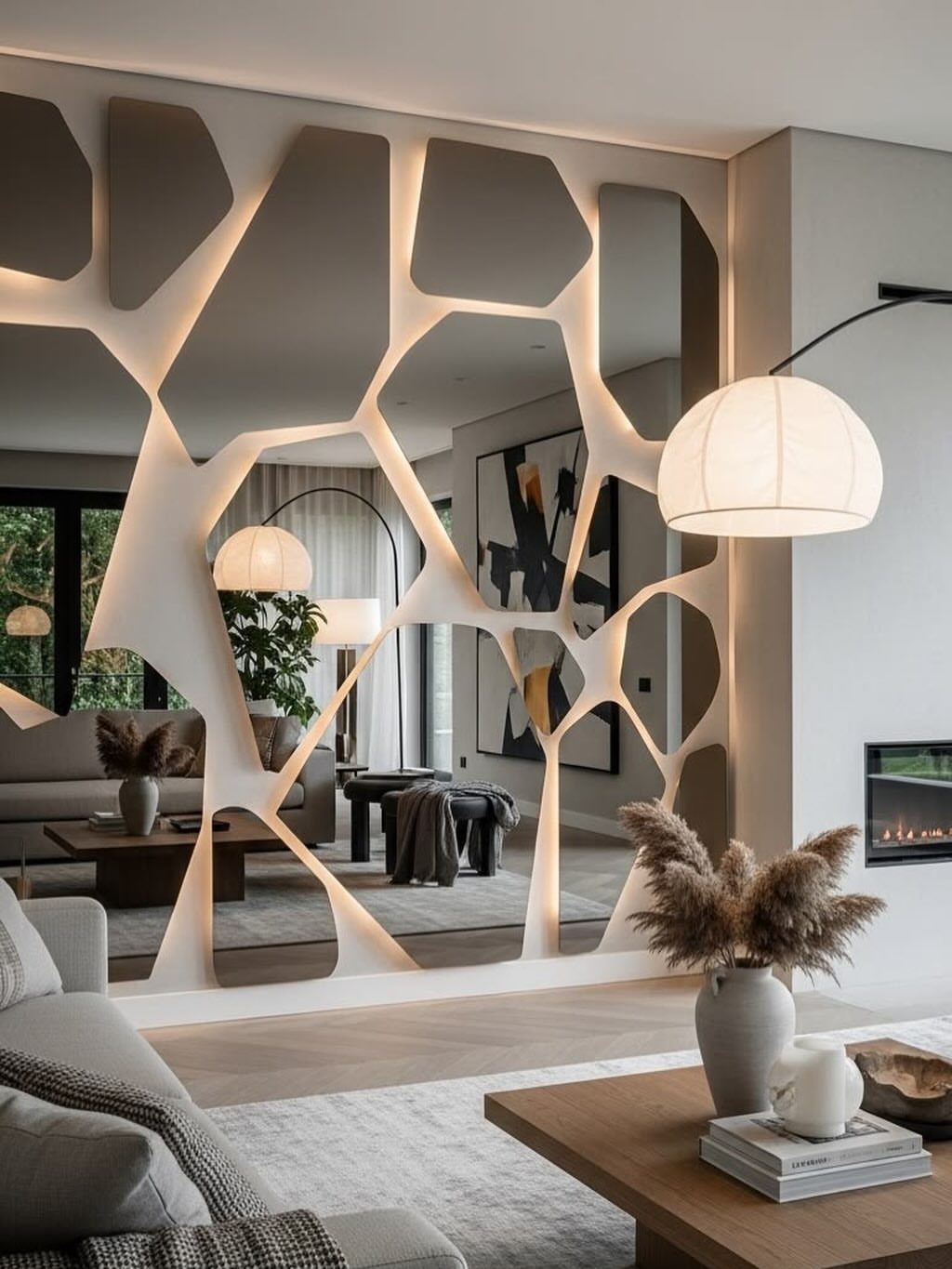
Mirrors do two jobs at once: they bounce light into dark corners and they double the visual space without moving a wall. A single oversized mirror leans modern and clean.
A cluster of mismatched shapes and frames reads collected over time, more interesting, and easier to build from flea-market finds.
A row of round mirrors above a sofa gives a similar effect, or lean one tall panel against a wall painted deep blue or charcoal so the glass jumps forward.
Full mirror walls work best opposite a window, not opposite a blank hallway you will see doubled forever.
10. Concrete Wall
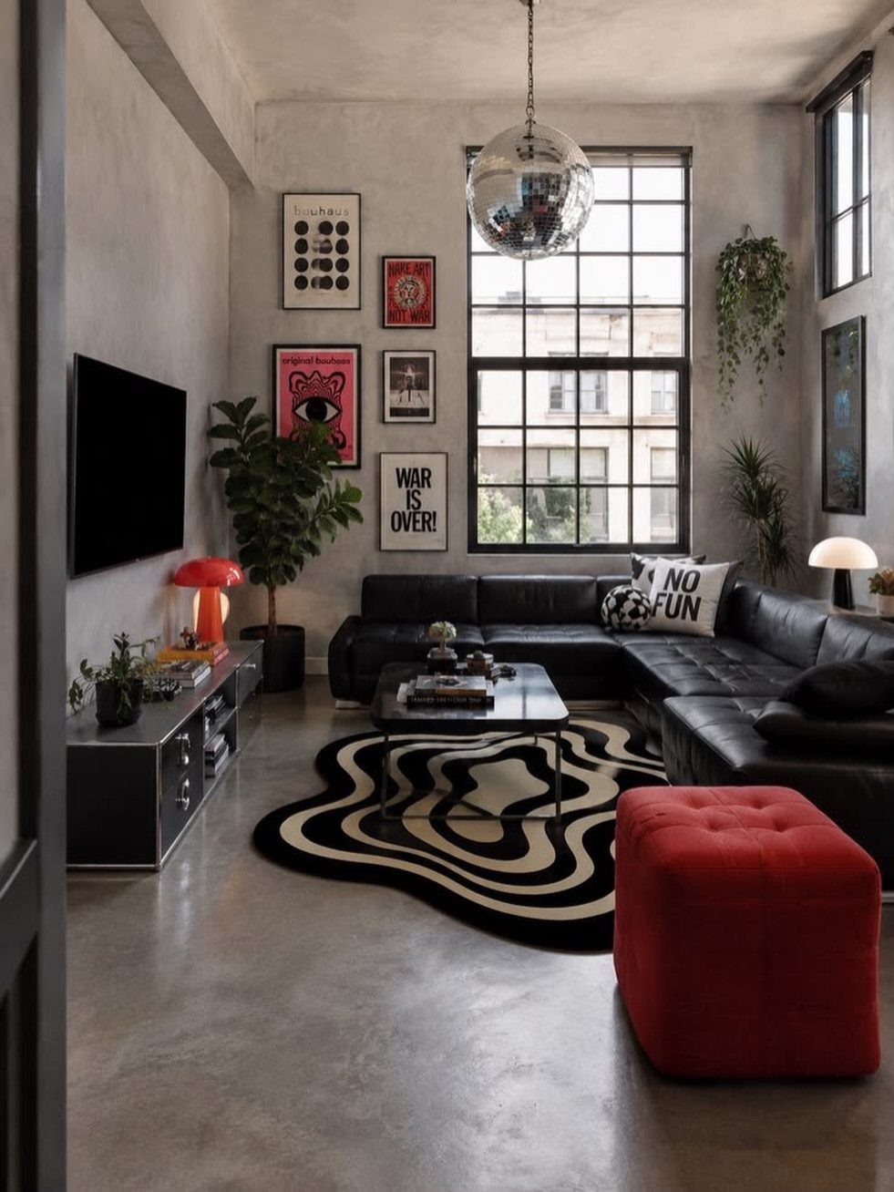
Concrete reads cold until you see it against leather, wood, and the warm chaos of actual living. Smooth-finished concrete, not raw block, is what gives the wall its look; the surface matters more than the material.
Poured concrete is permanent and pricey. A skim-coat of concrete-look plaster over existing drywall gives the same visual for a fraction, and you can DIY it over a weekend.
The industrial edge needs softening: add a rug with some pattern, plants that trail, books with worn spines. Without those, the room stays a showroom.
This idea trades coziness for clarity. Concrete is not your wall if you want a space that feels hugged-in.
11. Basket Wall Decor
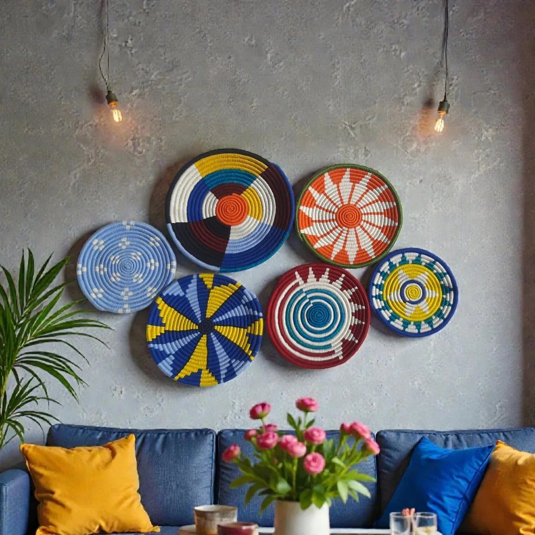
Baskets on a wall solve the problem of large blank space with objects you probably already own. The arrangement above the blue sofa mixes sizes and weaves, but keeps to a warm palette so it holds together as one shape.
Flat-backed baskets hang on a nail like a picture; deeper bowls need a small hook or a loop of wire. Start with your largest piece slightly off-center, then build outward in a rough triangle rather than a grid.
Thrift stores and estate sales turn up the best ones for a few dollars each, and a faded patina beats factory-fresh every time.
12. Accent Shelving
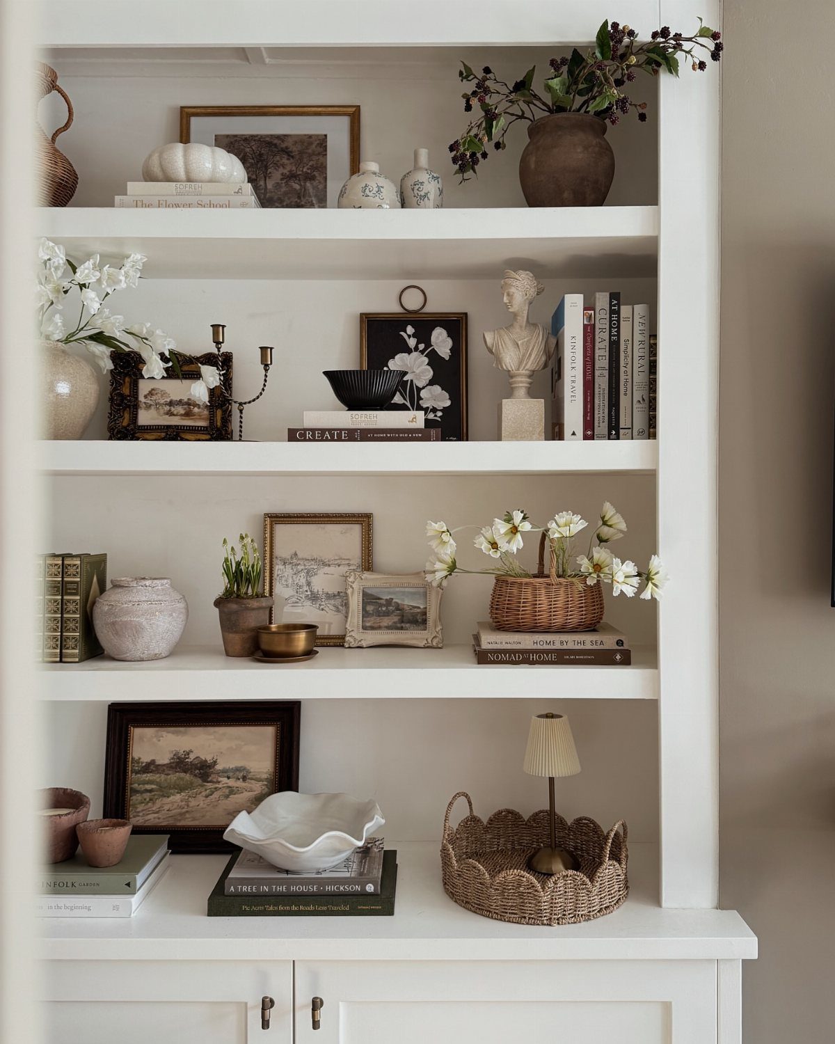
Built-in shelving turns a whole wall into a display without surrendering floor space. Keep the contents spare: books stacked both ways, a small lamp, a single bust, dried flowers in a narrow vase.
A painted back panel in a saturated color makes the objects read as collected, not cluttered.
If you are adding shelves rather than inheriting them, floating ledges in a dark stain against pale walls give a similar effect with less commitment.
Leave breathing room between items; every object needs its own pocket of air to register as intentional. This idea suits collectors, readers, and anyone who rotates their display seasonally.
13. Oversized Art
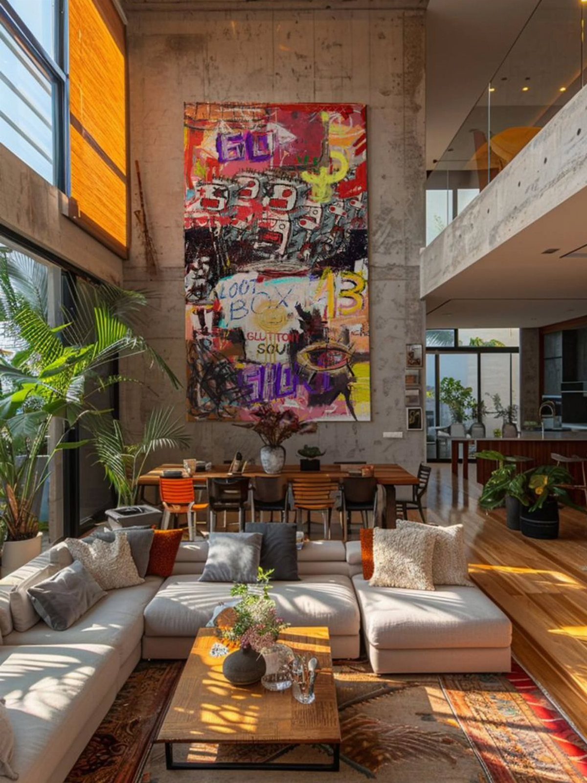
A single canvas stretching two-thirds the width of your sofa turns the whole wall into a gallery. A single oversized painting owns the concrete behind it when nothing else competes for attention.
I like a wrapped edge on a large print; it reads finished from the side even in an open room. Keep the frame simple or skip one entirely.
Surroundings stay minimal: one neutral sofa, one wood surface, green things. The art does the work.
Best for renters who can take it when they leave, or anyone who changes their mind often. The downside is storage; a canvas that large needs a closet to match.
14. Accent Wall with Lighting
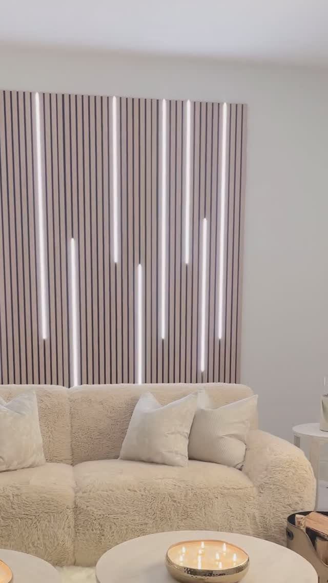
Vertical slats with LED strips behind them turn the wall itself into a lamp. Strips set at varying heights let the glow break up rather than outline a solid rectangle.
Junction boxes drop into open framing; fishing wire through finished slats means holes you did not want. If you are already drywalled, plug-in sconces with cord covers or battery puck lights work, though they need hiding.
A partial wall behind just the sofa defines a zone in open plans without building anything permanent. Picture lights above art or sconces flanking a piece do the same job on a smaller wall.
This one asks for an electrician unless you are comfortable with low-voltage strips. The cost jumps fast when pros get involved.
15. Living Plant Wall
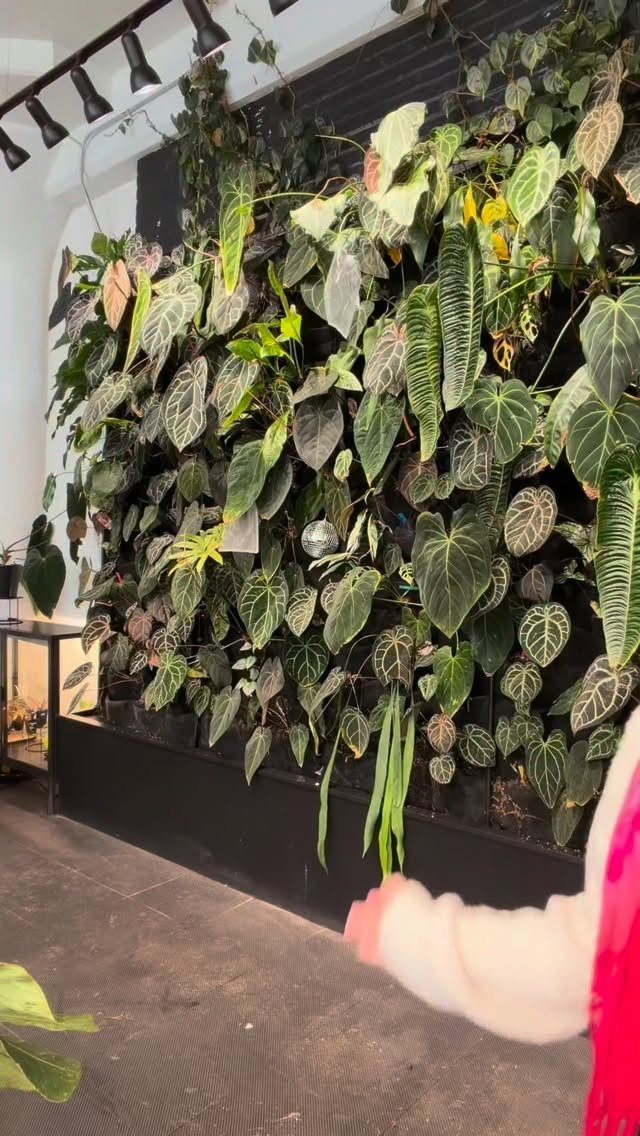
Real plants on a vertical frame bring humidity and something alive into a room that reads otherwise flat. Aroids and trailing plants tolerate the lower light of most living rooms, with track grow lights compensating overhead.
A frame or floating shelf mounted first, then planted around, gives the layered look without a full irrigation system.
Mosses and ferns handle misting; succulents want more sun than most living rooms offer and less water than a shared wall wants.
Artificial versions skip the grow lights, the drip lines, and the occasional replacement plant. They also skip the air quality bump, which is half the reason I like this idea.
One weekend builds the beginner version. The full living wall with irrigation is not a beginner project.
16. Bold Color Blocks
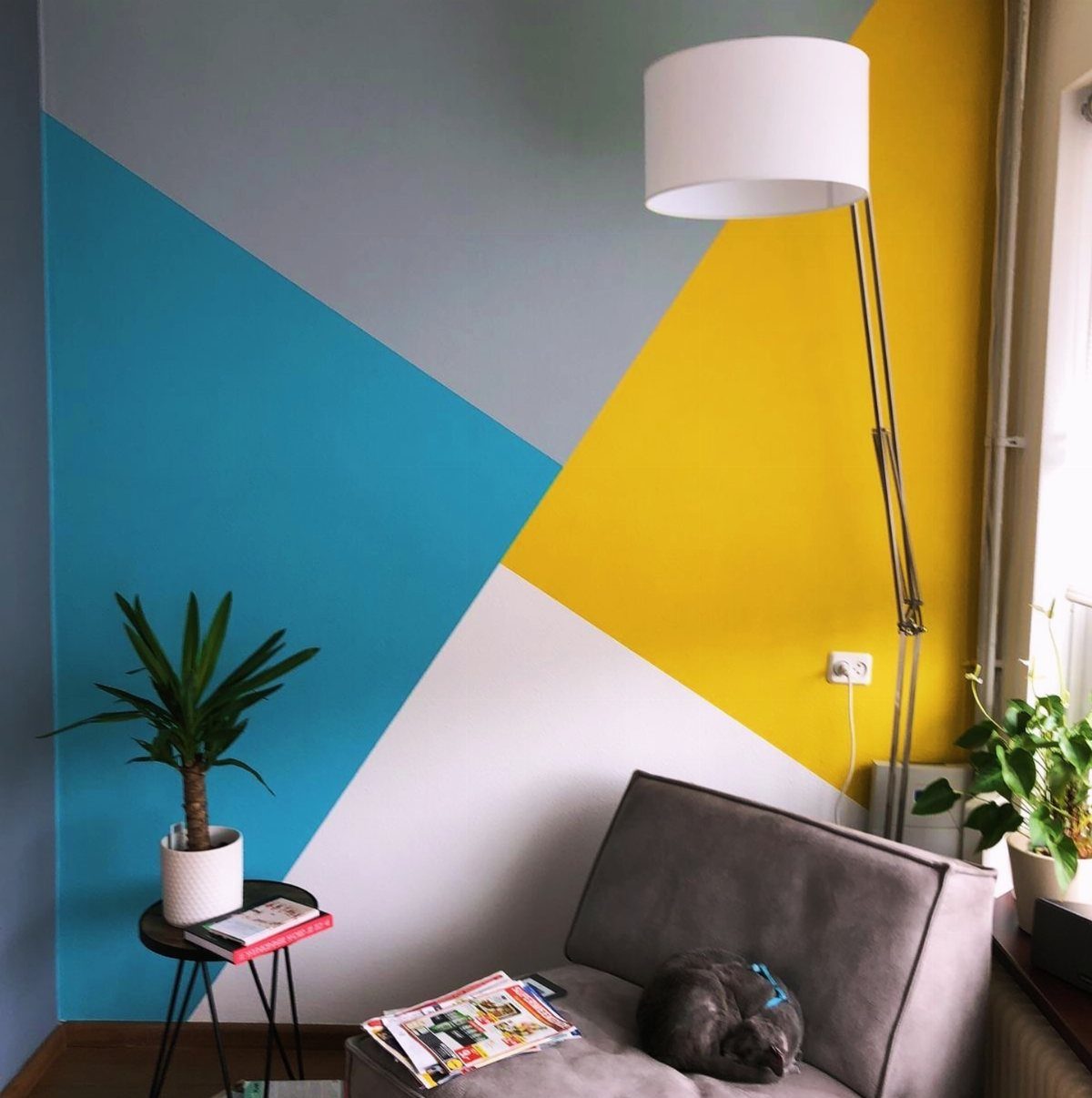
Painter’s tape and a handful of colors turn a flat wall into geometry. Blocks at different scales, some running floor to ceiling, others stopping at chair height, let the wall read as built rather than just painted.
Clean lines come from pressing tape edges with a putty knife before rolling; bleed-under ruins the whole effect.
I like a grey or white as the ground, then two or three colors that already live in your sofa, a rug, or art you own.
Raspberry red or coral makes the wall the warmest thing in the room. Emerald or charcoal does the opposite, pulling the space in and down.
This one rewards steady hands and patience. Rushed tape removal or cheap tape that pulls paint means starting over.
Best for a Saturday when no one needs the room until Sunday night.
17. Pastel Toned Wall
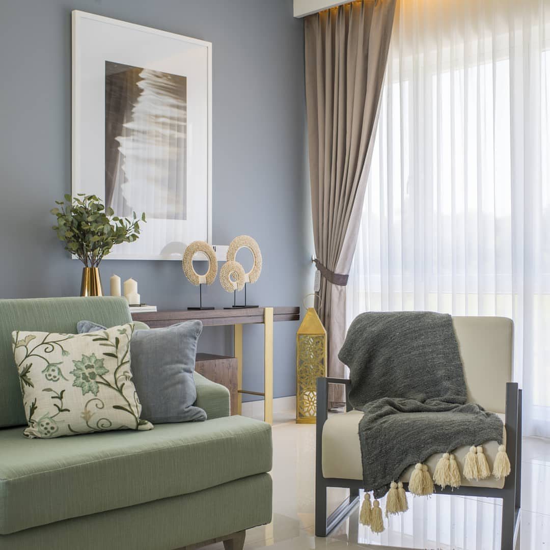
Soft blue-grey reads as color without shouting. A muted green wall sets sofa and chair into quiet territory, the kind of room that does not fight you after a long day.
Pastel works when you want the architecture to recede and the people or furniture to advance. It suits minimal rooms where every piece was chosen and nothing shouts for attention.
I find these colors need texture somewhere else, a woven throw or a grainy ceramic, or the whole space goes flat. Sheer curtains help, catching light and moving it.
The risk is nursery; avoid pink or baby blue unless you want that association. Greyed-down versions, sage or dusty rose or this blue-grey, carry the calm without the cutesy.
Best for south-facing rooms that already get enough warmth from the sun. North light can turn pastels chilly.
18. Exposed Brick Wall
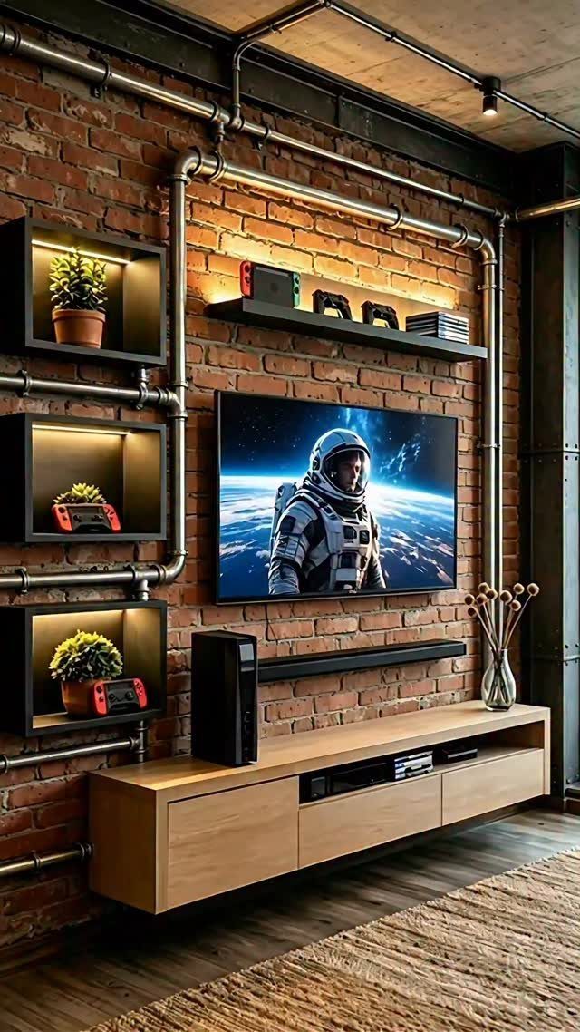
Real brick with the mortar still rough carries history even in a new build. Exposed conduit and floating shelves add industrial notes that keep brick from reading as country fireplace.
Faux panels or heavy wallpaper get the look without structural weight or the dust that real brick sheds. Painted white, the same texture goes Scandinavian; the raw red stays industrial or old-city.
Metal pipes as conduit, not hidden, make the utilities part of the design. That choice limits you to styles that own the industrial label; mix it with too much polished chrome and the room argues with itself.
I like this best in spaces with some age already, or in new builds that need character fast. The cost split is wide: faux panels run a few dollars per square foot, real brick installed can hit several times that.
19. Marble Accent Wall
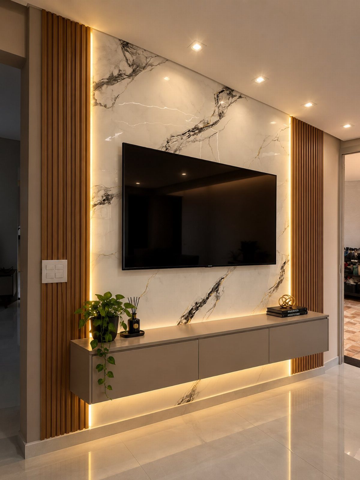
A marble slab wall turns the television into something worth looking at even when it is off. The veining does the work of art without competing with what is on the screen.
Real marble is priced by the square foot installed, but porcelain slabs that photograph nearly identical cost far less.
I would check the slab in person under store lighting and again near a window; the same stone reads green or grey depending on the source.
Vertical wood slats on each side add warmth and a place to hide LED strips for glow without glare. Keep the slats narrower than the slab so the stone stays the hero.
This suits renters only if they are willing to invest in a statement they leave behind.
For a temporary version, a single large porcelain panel leaned against the wall and flanked by freestanding slatted screens gives most of the effect with a truck to move it out.
20. Built-In Fireplace Wall
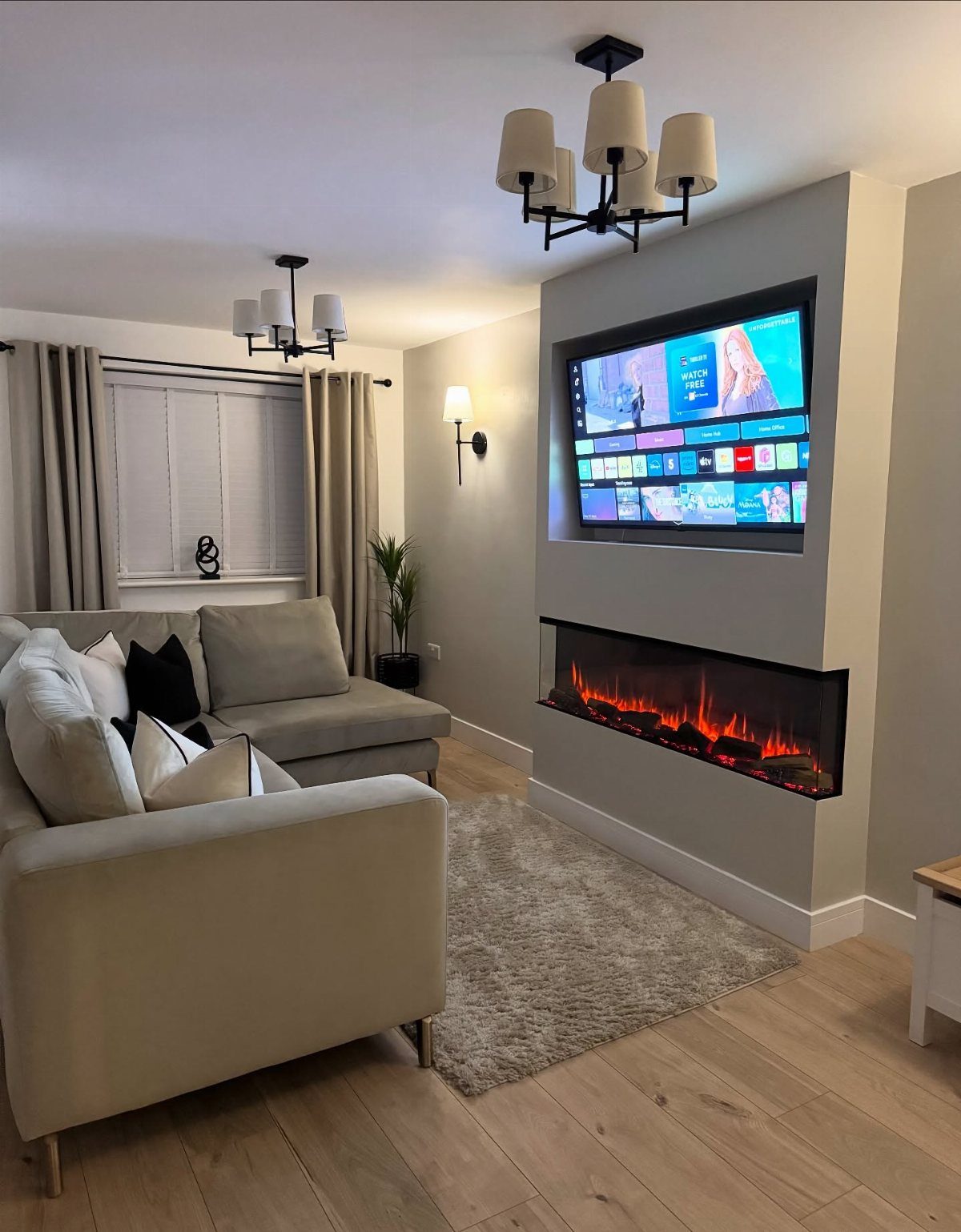
An electric fireplace built into the same wall as the television solves the problem of two focal points competing for the same spot.
The linear flame sits low, below eye level from the sofa, so the screen above it keeps its proper place.
Paint the wall a flat light grey so the fireplace and shelving read as one installation rather than two objects hung on a wall. I would run the same paint onto any surrounding trim so the bump-out disappears.
Stone or tile from floor to ceiling on the fireplace column gives the flame something to flicker against. Small-format tile with tight grout lines reads contemporary; stacked stone reads cabin.
Either way, carry the material to the ceiling or stop it at a deliberate height with a clean edge, never midway with a visual shrug.
This trades the smell and sound of wood for switch-on convenience and apartment-friendly installation. If you are chasing lodge atmosphere, a rock or stone wall with the fireplace recessed into it wins over the sleek version every time.
21. Classic Picture Frame Molding
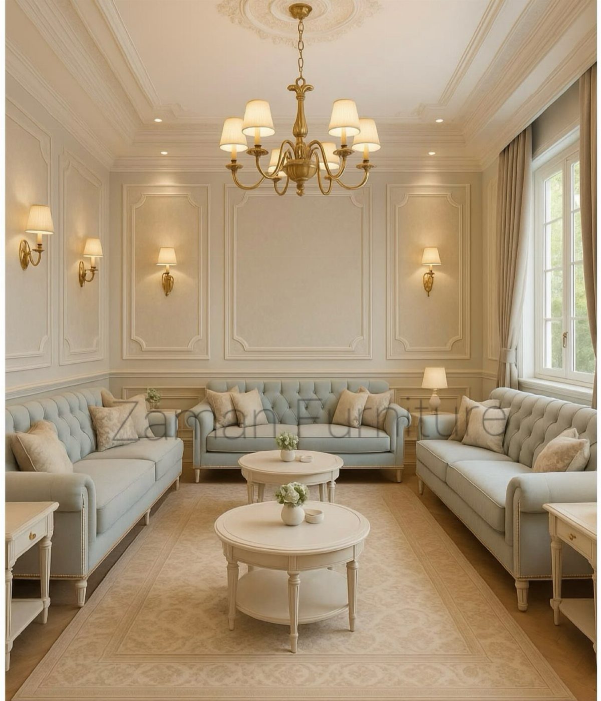
Picture frame molding is the cheapest way to convince a room it was built with more care than it was.
The boxes break up a large wall into human-scale pieces that catch light and cast small shadows even in a flat paint.
Wood trim is cheap by the linear foot; a whole wall lands well under the cost of a single statement chair in material.
Install with mitered corners and construction adhesive if you are patient, or hire out if you are not.
Paint the molding the same color as the wall for quiet texture, or contrast it in navy or tangerine if you want the frames to read as deliberate pattern.
Center sconces in their boxes during layout, not wherever the wiring happened to land. Plan that before you cut anything.
This works in rooms with some height; in a low-ceiling box the frames can feel like a lid pressing down. For those spaces I would skip the molding and spend the money on one good lamp.
Choosing the Right Wall
The wall behind your sofa or fireplace is usually the right one because your eye lands there first. Walk through your doorway and notice where your gaze settles; that is your accent wall.
A short return wall, the kind that interrupts a longer plane, reads as an afterthought no matter what you put on it.
Symmetry matters. Center the accent on the axis of the room, aligned with a coffee table or the midpoint of a seating group, so the whole layout feels anchored rather than pulled to one side.
Light changes everything. Soft, indirect light shows off color and texture at its best.
A wall that sits in deep shadow will swallow a pale tone whole; that is where richer, darker colors earn their place. Check your wall at morning, afternoon, and under lamps before you commit.
Color Considerations
Contrast builds drama: a charcoal wall in a pale room stops the eye and gives furniture something to push against.
Tone on tone quiets things down, a navy accent against softer blue walls lets the shape of the room read as one continuous thing.
Warm hues pull a space inward and make it feel held. Cool hues open it up and settle the air.
Match the temperature to what the room lacks, not to what it already has in surplus.
Finish is half the decision. Matte paint swallows up drywall seams, and it reads as modern without trying hard.
Satin holds up to cleaning and carries a soft gleam. Limewash moves like fabric under light, never quite the same color twice.
Gloss-on-matte stencils glimmer when lamps come on, subtle enough to miss at noon, present enough to notice at eight.
Peel-and-stick wallpaper, thin stone or brick veneer, fabric panels, and photo tiles all add color through texture rather than through paint alone.
DIY Tips
One gallon, one afternoon, and the wall is done. Wood panels, faux concrete, and peel-and-stick wallpaper come after you have a finished project behind you.
Preparation matters more than the application itself. Clean the wall, prime it, and let it dry fully.
Paint over dust or grease and the finish fails within a year.
Measure twice for anything with seams: wood slats, stone veneer, wallpaper panels. A gap at the corner or a slat that runs short reads as a mistake because it is one.
Buy more material than the wall measures out to. You will misjudge a cut, flip a board wrong side up, or pull a piece with grain that runs the wrong way for that spot.
Frequently Asked Questions
What wall should be the accent wall in a living room?
Your eye goes straight to the wall facing the door or the one behind the sofa, so either one carries the accent without fighting the room.
A wall that already centers the room’s layout, like one framing a fireplace or television, anchors the space instead of fighting it.
Skip short side walls or returns that feel tacked on; the treatment needs a surface the room already orients toward.
What is trending for accent walls?
Geometric designs and bold color blocks are showing up more than the single painted wall of a few years back.
Textured finishes like plaster or concrete-look skim coats add dimension without extra material, and wallpaper in large-scale botanicals or murals replaces the small repeats that used to dominate.
What is the rule for accent walls?
Choose a wall your eye goes to first, then let the treatment do the work without competition from the rest of the room.
That means keeping furniture simple, patterns elsewhere minimal, and the wall itself free of clutter when the texture or color is the point.
There is no law against breaking this, but a competing accent wall and a busy rug will argue with each other until neither reads.