
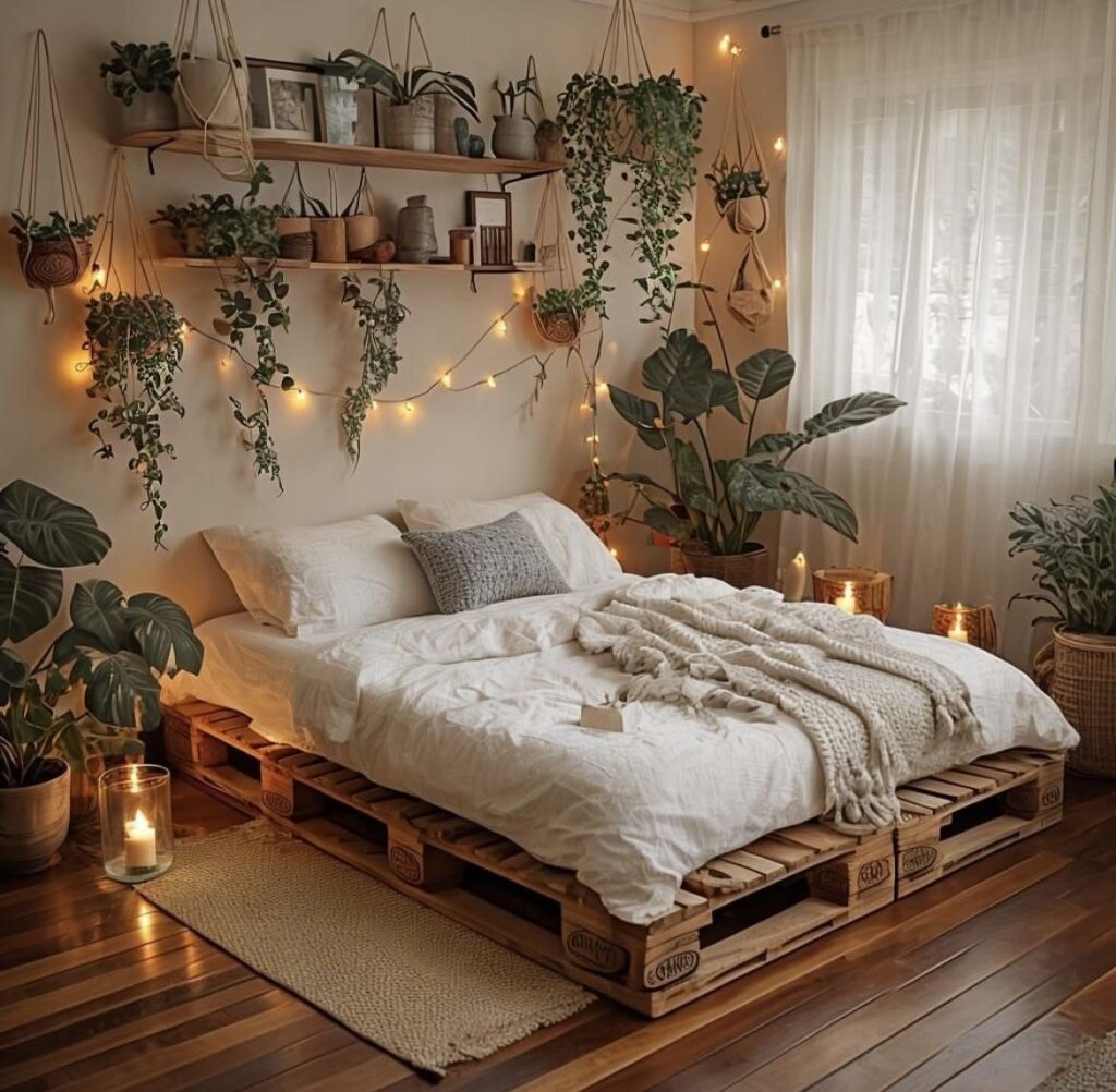
Some of these take nothing but tape or a hook; others need a drill, a stud finder, or an electrician’s ceiling box.
Battery fairy lights and a pinboard on a single hook work for a dorm; floating shelves, a bold headboard, or faux beams with a cleat system need a drill and the landlord’s okay.
The ghost wax warmer, found for $9.99 after Halloween stock cleared, sits on a desk or bedside table and trains the brain to mark work time or sleep.
1. Fairy Lights
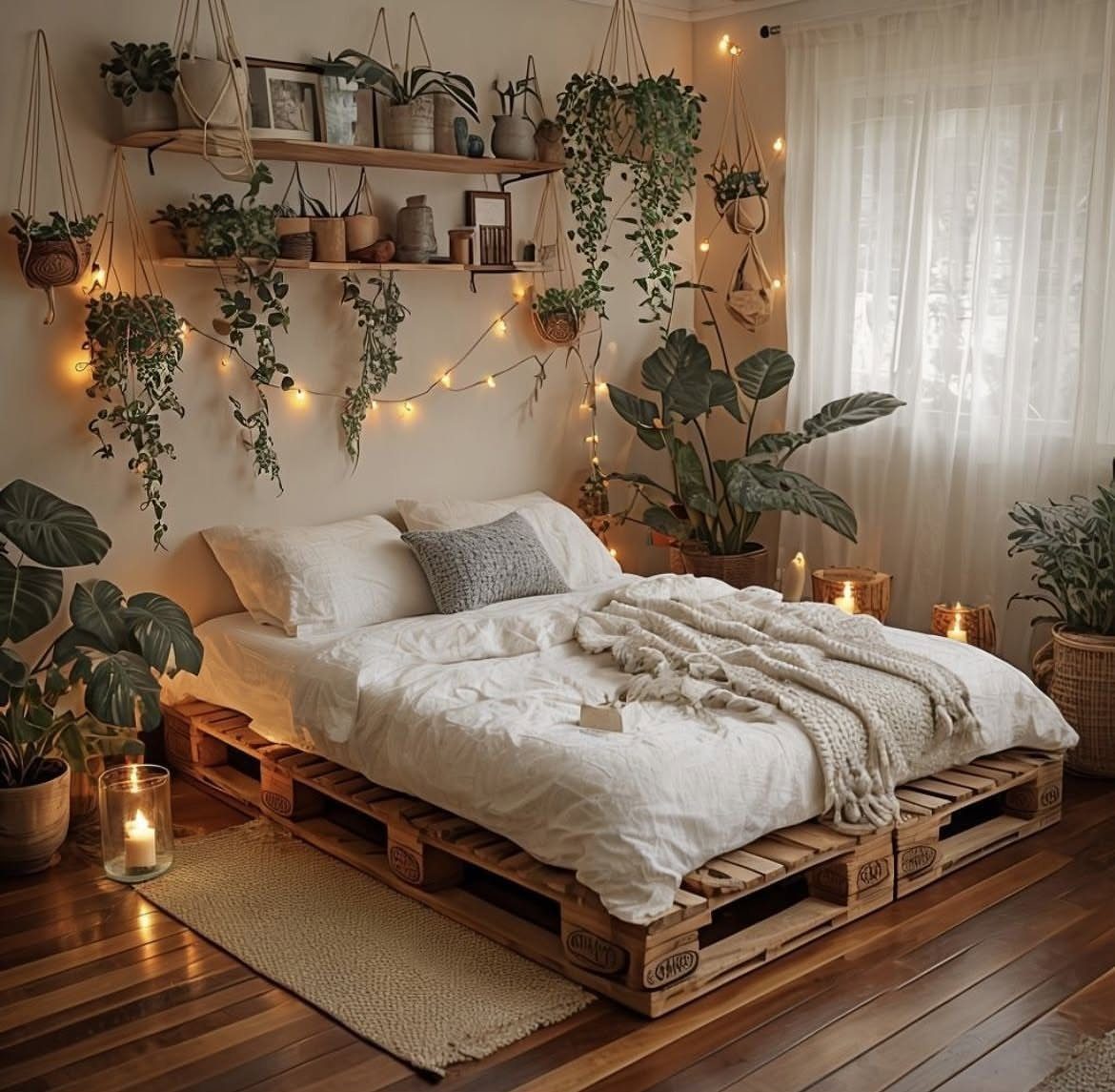
Fairy lights turn a wall into a soft glow you can dim with a flick.
I string mine behind sheer fabric so the bulbs read as texture, not hardware, and I keep a second strand on a dimmer switch for evenings when I want less light, not more.
Battery-powered clips work for renters; plug-in strands suit anyone with an outlet near the bed. Density matters more than total count: too sparse and you see gaps, too tight and the wall looks like a circuit board.
I string bulbs along a zigzag path, step back to look for shadows, then fill in where the light pools thin.
2. Install Floating Shelves
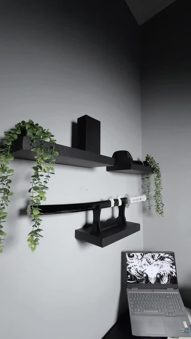
Floating shelves eat no floor space, which matters in a dorm or a room where the bed already claims most of the square footage.
I mount mine at sitting-eye level above the desk, not higher; anything above shoulder height becomes storage you forget about.
The brackets hidden in the shelf itself need studs or heavy-duty drywall anchors, and I check the wall material before I buy, not after I drill.
Weight limits are real: a shelf that holds a paperback row fails under a potted succulent in wet soil. I keep the heaviest items at the wall end, where the support sits.
3. Bed Canopy
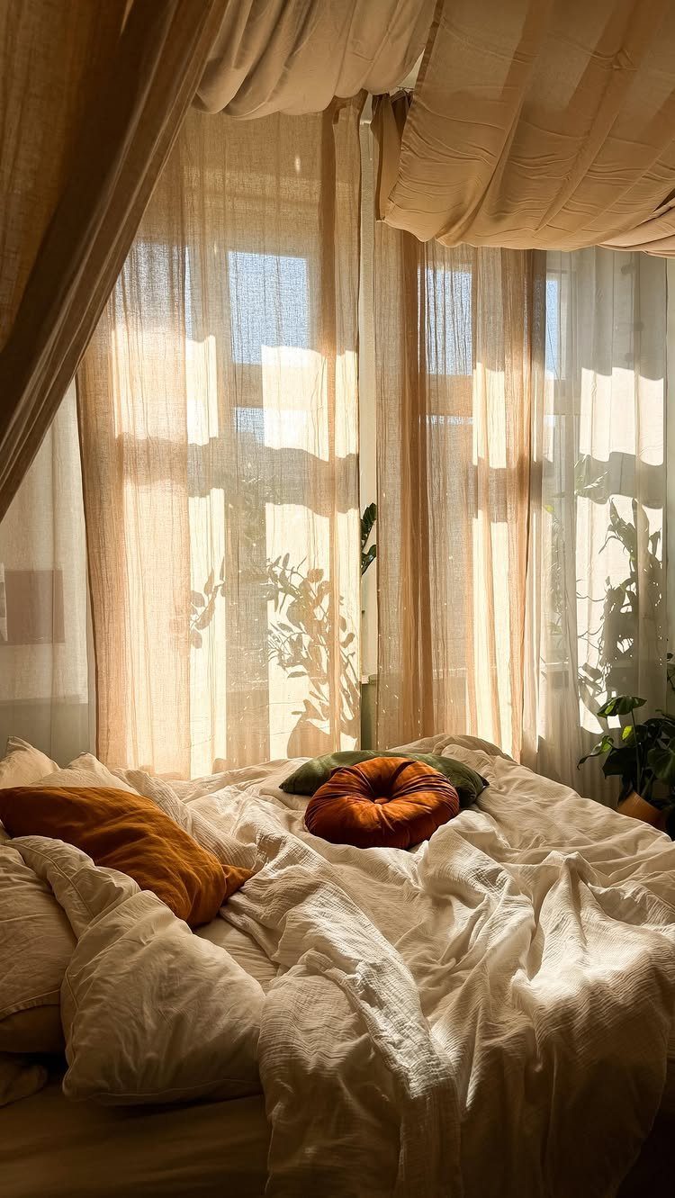
A canopy frames the bed as its own room within a room, which helps when the bed also serves as sofa, desk, and dining table.
I hang mine from ceiling hooks screwed into a joist, not drywall, with the fabric pooling on the floor at the corners for weight. Sheer cotton or linen diffuses morning light; velvet or canvas blocks it for late sleepers.
A loose, asymmetric drape saves a canopy from looking like a mosquito net; keep it casual, not tent-like. I wash mine twice a year; dust collects in folds faster than you’d think.
4. Vintage Rugs
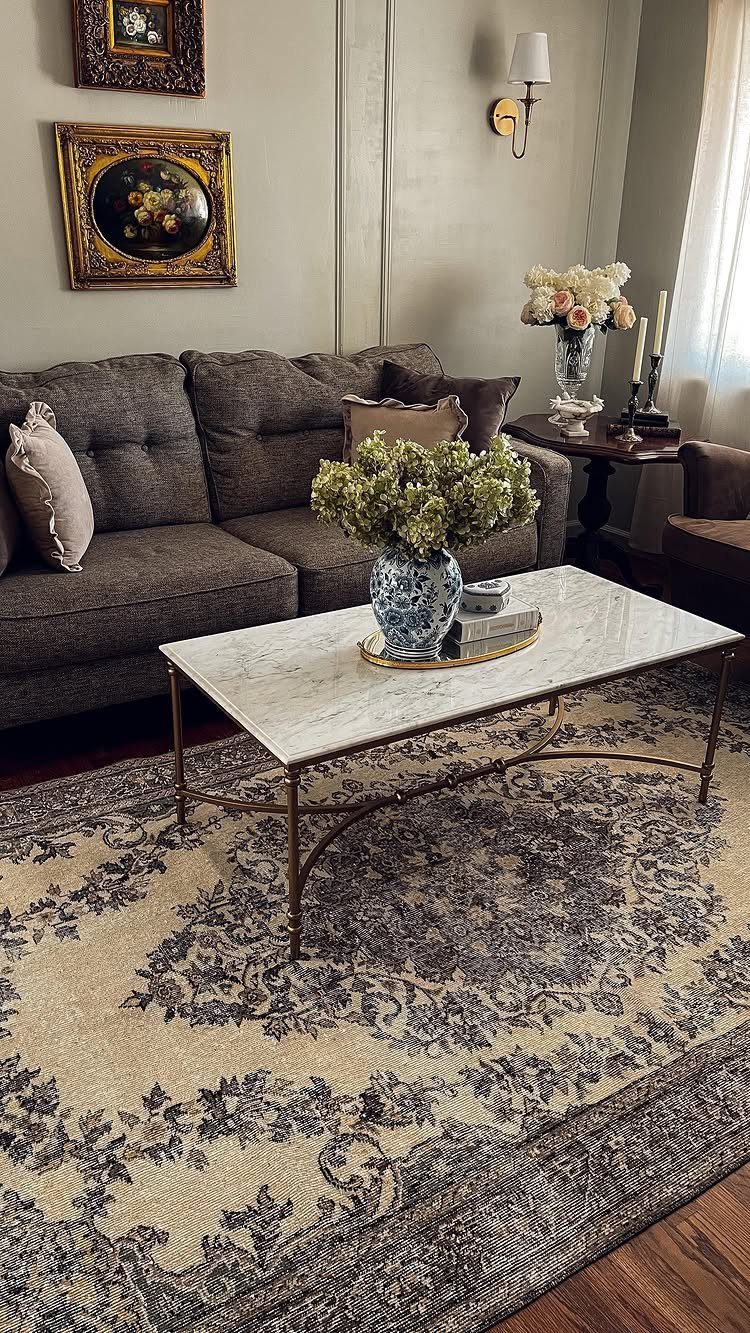
Vintage rugs hide floors you didn’t choose and add warmth that new construction often strips out. I look for worn pile in the center with intact edges, which means the rug lived a real life but won’t trip me.
A floral reads traditional; a geometric or faded overdye suits cleaner-lined furniture. Size is the decision that matters: too small and the rug floats like an island, too large and you pay for pattern the sofa hides.
I measure the exposed floor around the rug and buy when that border looks even on every side.
5. Statement Drapes
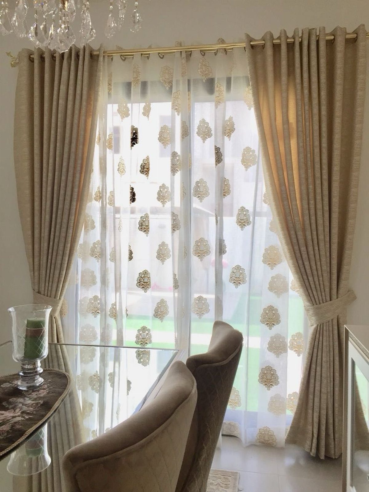
Statement drapes finish a window the way shoes finish an outfit: they signal that someone made a choice.
I layer mine, sheer against the glass and heavy fabric on the rod, so I can pull back the room-darkening panel and leave the translucent one for daytime privacy.
Mounting a rod high and wide makes the window read larger; I measure my own frames and add plenty up and out if the wall allows.
Fabric weight matters more than pattern: cheap polyester hangs like a shower curtain, and no print fixes that.
6. Plants on Windowsills
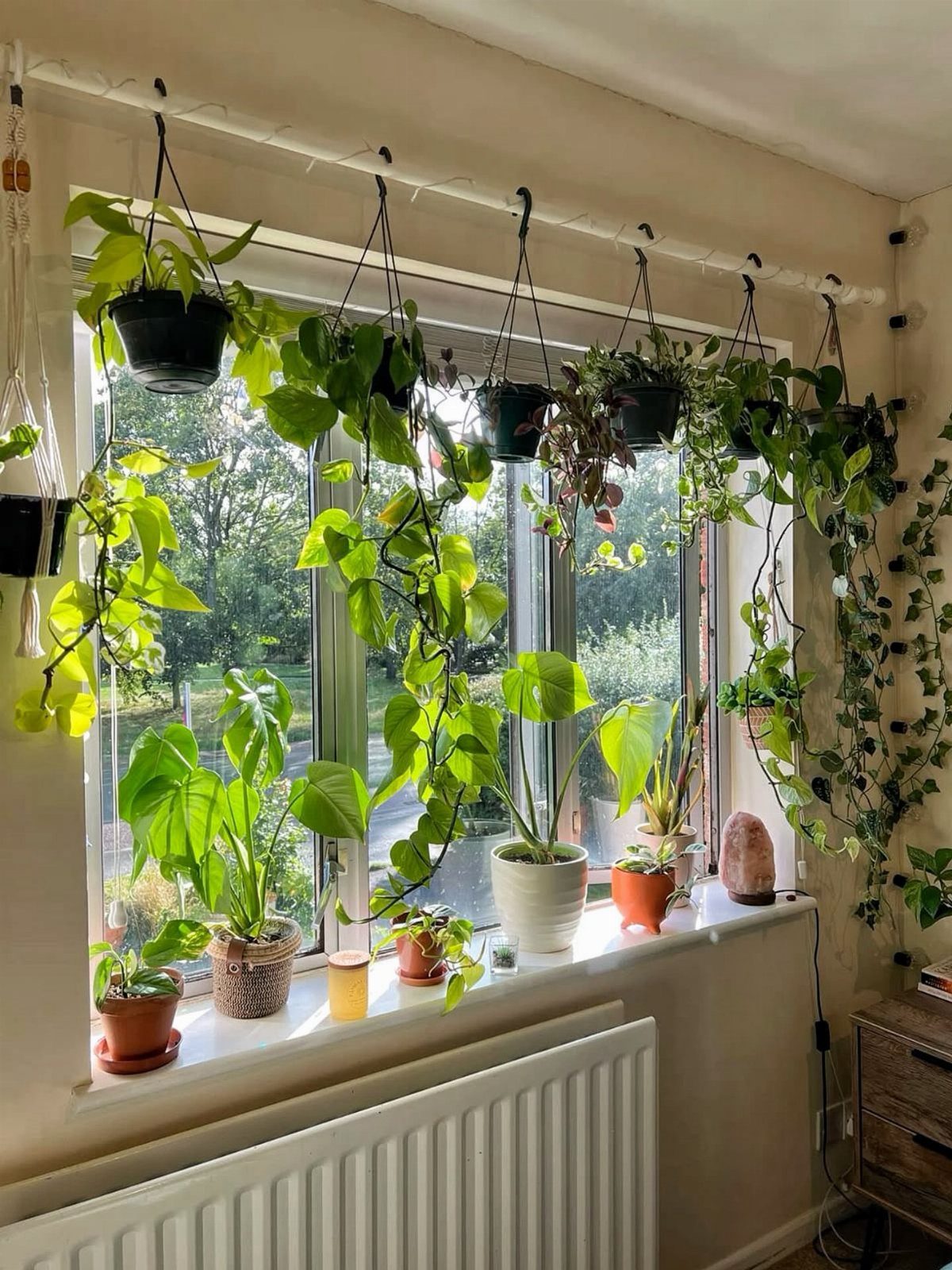
A windowsill is the only shelf many renters get, and plants turn it from dead ledge to living thing. I cluster mine in odd numbers, varying height and leaf shape so no two compete for the same visual space.
South-facing sills cook succulents in summer; north-facing ones starve tomatoes.
I match the plant to the light I actually have, not the light I wish for, and I rotate pots a quarter turn weekly so growth doesn’t lean toward the glass.
Faux plants work on sills that get no sun at all; the best ones mix real dried moss around the base so the fakery isn’t total.
7. Chunky Knit Throw
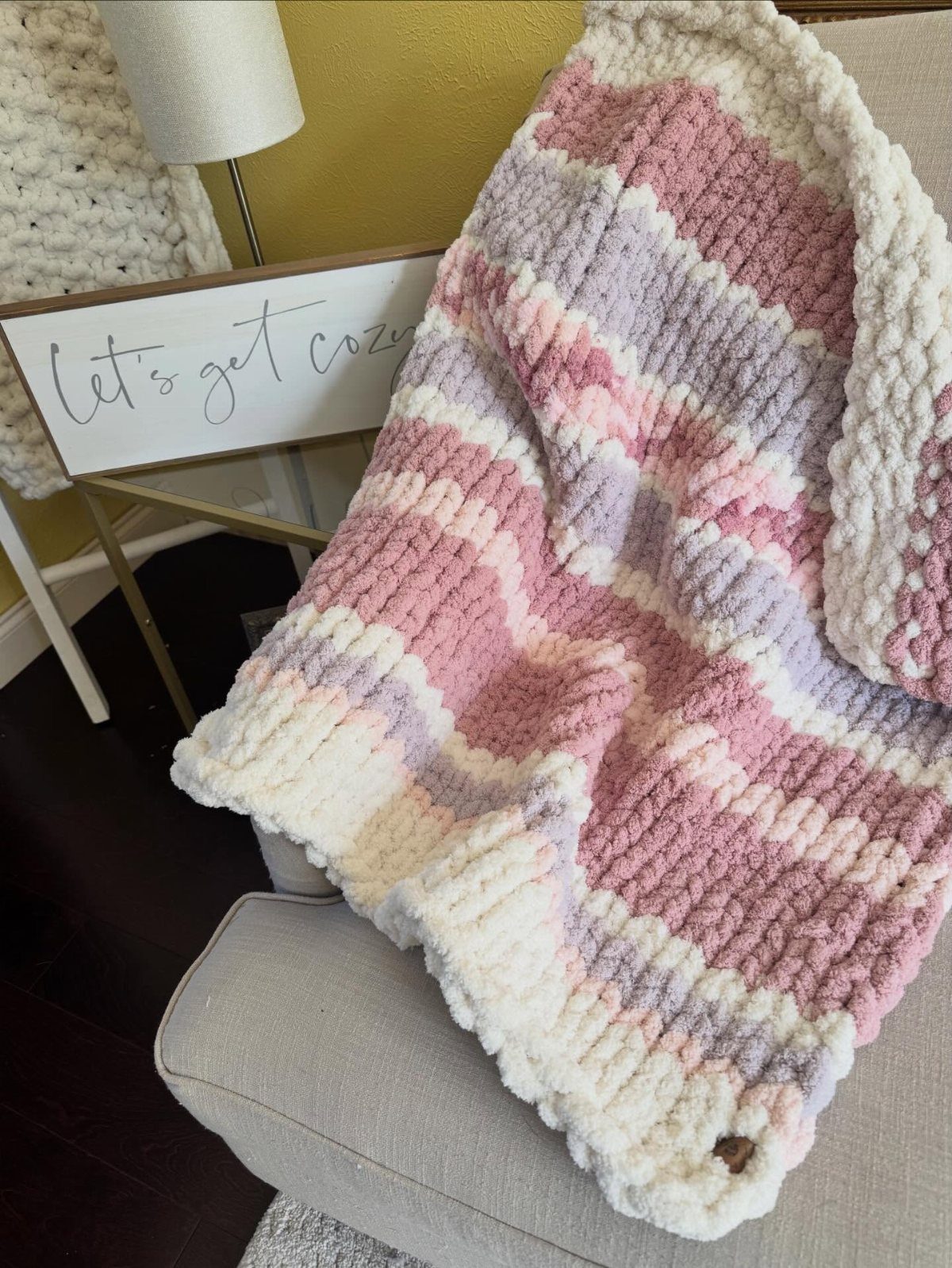
A chunky chenille knit in pastel stripes turns any chair into the seat everyone fights over. The weight matters more than the color: yarn thick enough to hold its shape brings that hand-knitted texture even in a store-bought piece.
Drape it loose, let it pool on the floor a little, and it reads as intentional rather than tossed.
Wool or faux fur layered underneath adds depth for winter, though one good throw usually covers three seasons. I keep two around, one for the bed and one that migrates between desk chair and reading spot.
The chenille pills eventually; expect regular use to wear it before it looks tired.
Best for renters and dorm rooms where you cannot change the furniture itself.
8. Reading Nook
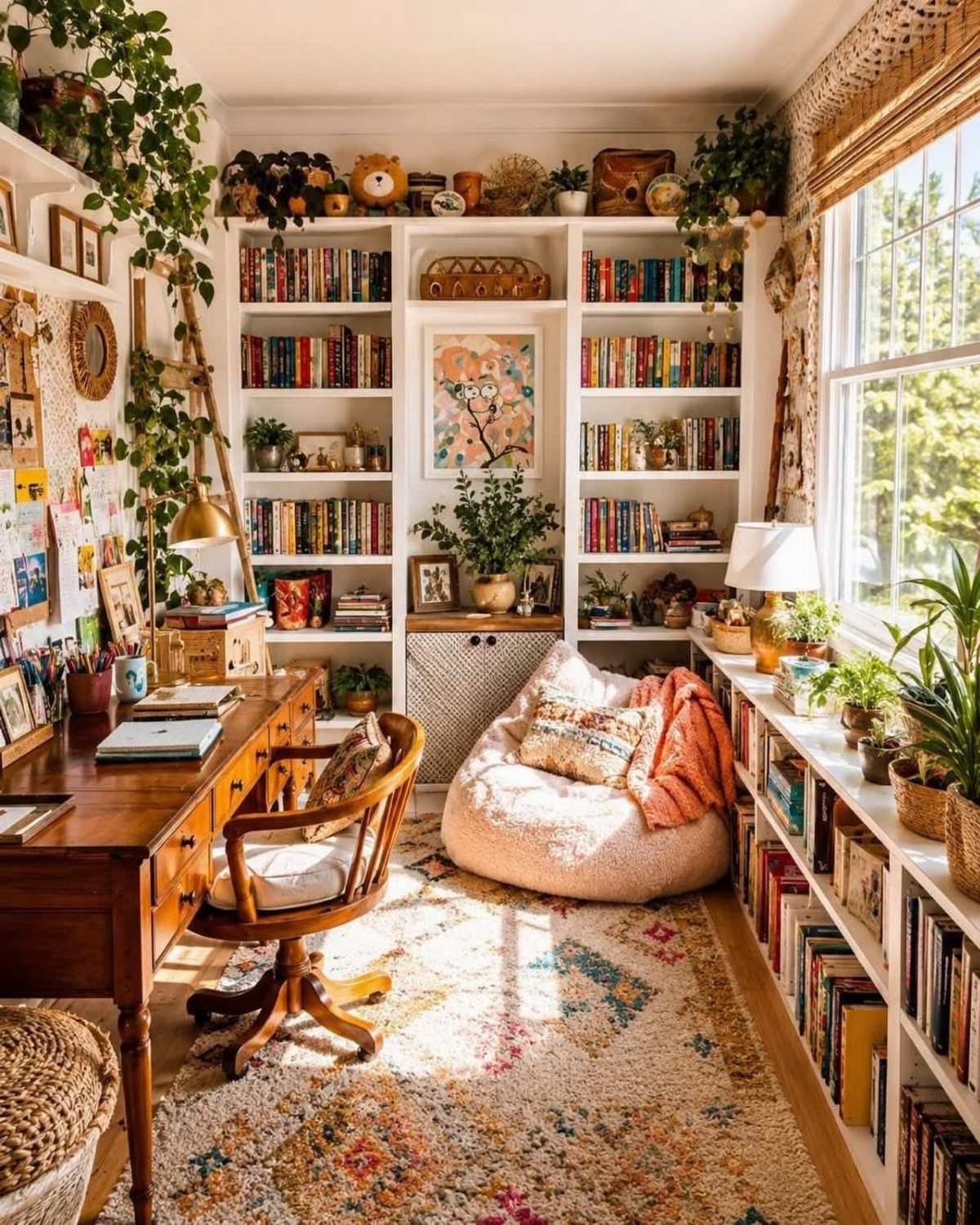
The beanbag in that corner is doing more work than the shelves. A reading nook fails when the seating is almost right; the body stays tense, the book goes down early.
Start with whatever lets you sink: a saucer chair, a floor cushion stack, even a mattress corner with enough pillows to prop against the wall.
Light comes second. The window side wins in morning, but afternoon readers need a lamp close enough to reach without standing.
A small shelf within arm’s reach saves the walk across the room that breaks concentration. Throw blankets live here permanently; the bedroom ones stay on the bed.
Teens and anyone in a studio gain a separate headspace without adding walls.
9. Use Mirrors Creatively
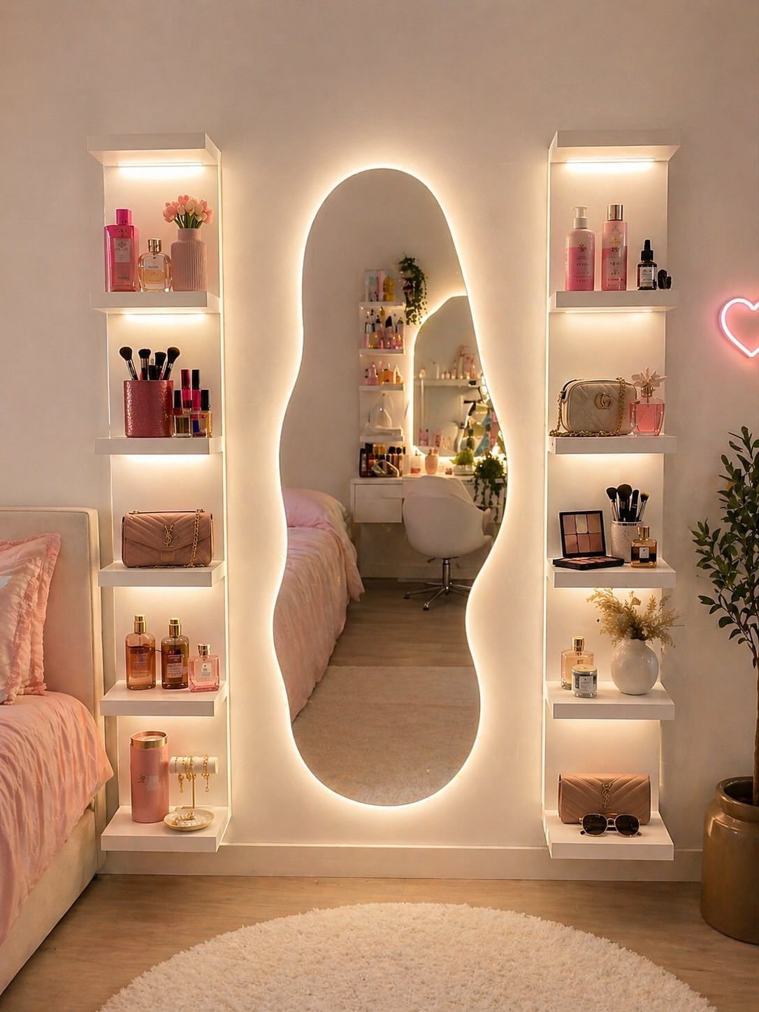
That wavy, backlit mirror is doing two jobs: reflecting what light the room gets, and becoming the light source itself. Full-length mirrors behind doors or leaning against walls multiply daylight in ways overhead fixtures cannot match.
The irregular shape here turns the mirror into wall art, which matters when floor space is tight and every piece must earn its place.
String lights framed around a standard mirror borrow the same trick for little cost. Two smaller mirrors hung asymmetrically work in corners where one large piece won’t fit.
Check what the mirror faces; a dark closet door reflects back as shadow, a window doubles the glow.
Renters in small bedrooms or basement units feel the difference immediately.
10. Neon Signs
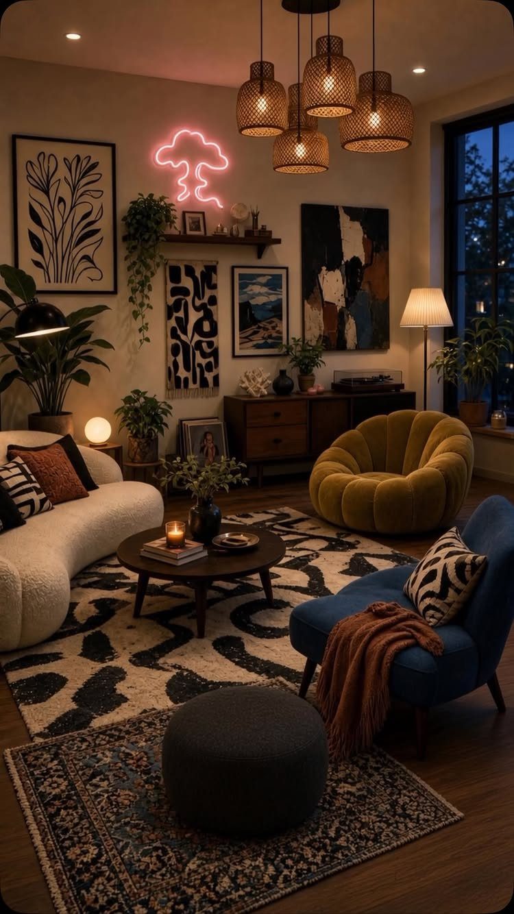
A neon cloud after 8 pm says the room has a second personality. The maker of that piece chose a cloud because serious rooms go flat once evening tasks end; the sign switches the mood without moving furniture.
LED strips under the bed frame or behind the desk do similar work invisibly, but the neon sign claims wall space like art.
Custom phrases run expensive; ready-made shapes from music or weather symbols cost far less. Either needs a wall outlet and some cord management.
A pink glow flatters skin tones; cooler white or blue reads harsher in a bedroom meant to unwind.
Best for night owls whose rooms serve as both workspace and sanctuary.
One thing’s for sure: A truly aesthetic room should be a reflection of its occupant and their unique tastes—whether it’s via muted tones of dreamy pink, a showstopping light fixture, or a maximalist array of objects.
11. Floor Cushions
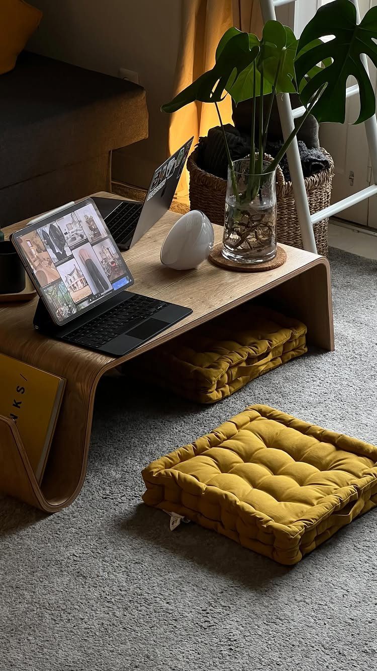
Floor cushions solve the seating math in small spaces without demanding a wall of furniture. Two tucked under a coffee table pull out when friends stay late; stacked against the wall, they read as color blocks rather than clutter.
The tufting keeps them from looking like dog beds, which untextured squares can resemble.
Match one cushion color to something permanent, the sofa or a rug, and let the second contrast. Ottoman-style pieces with storage inside hide spare bedding or off-season clothes in dorms where closet space is measured in inches.
I put one by my bed as a step stool to a loft frame; it served as seating, storage, and ladder in rotation.
Ideal for first apartments and any room that hosts both studying and hanging out.
12. Textured Wall Hangings
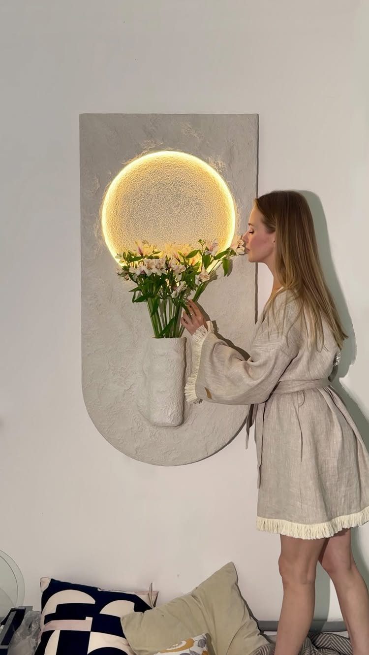
That arched piece with its lit circle is wall art that replaces a bedside lamp. The texture catches morning light differently than evening, which keeps a small room from feeling static.
Metal versions with geometric or botanical cutouts cast shadow patterns that shift through the day; this one glows from within instead.
A DIY version starts with any heavy textile stretched in a frame, with puckering or knotting for shadow play. Weight matters: lightweight pieces sway on cheap hooks and read as temporary.
Check the wall type before hanging; textured plaster needs different anchors than drywall, and rental-friendly adhesive strips fail with anything heavy.
Suits renters who cannot paint but need the wall to stop looking blank.
13. Oversized Plants
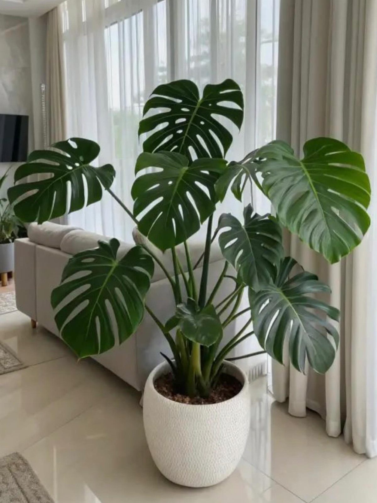
A single oversized plant does what a cluster of small ones cannot: it anchors a whole corner by itself.
Monstera, fiddle-leaf fig, or bird of paradise all work if you have the ceiling height and a few hours of indirect light.
The pot matters almost as much as the plant; a clean white or terracotta vessel keeps the focus on the leaves rather than competing with them.
Watering is less forgiving than with a windowsill herb; the soil needs to dry between drinks, but not for so long that the lower leaves yellow.
This idea trades floor space for impact, so it suits rooms where one bold gesture beats many small ones.
If your square footage is tight, hang a trailing pothos or philodendron from the ceiling instead; it draws the eye upward without taking up a footprint.
14. Use a Pinboard
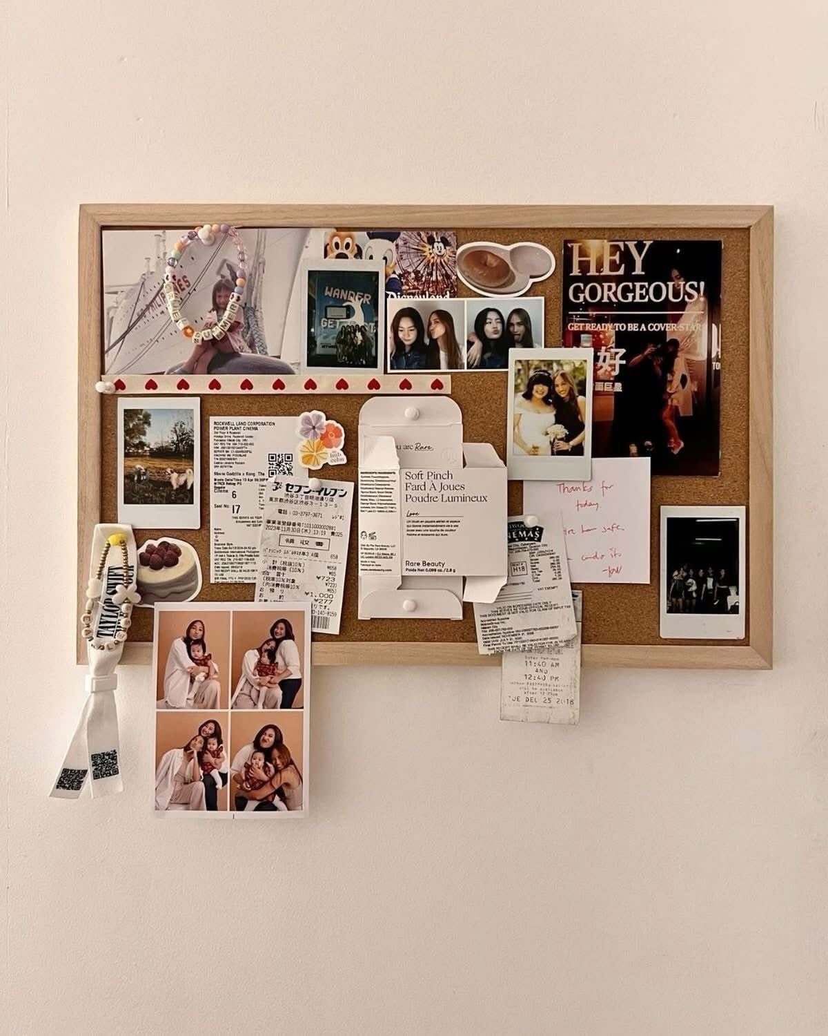
A pinboard turns the wall above your desk into working memory rather than decoration. A cork pinboard with a light wood frame reads warmer than plain fabric or metal; the texture itself softens a white wall.
Pin polaroids, ticket stubs, the beaded wristlet from a concert, whatever marks actual months rather than aspirational ones. String lights draped along the top edge add evening glow without the clutter of another fixture.
The board fills fast if you let it; I limit mine to items from the current season and move the rest to a box.
This suits renters and dorm rooms where nails are scarce, since most boards hang on a single hook. A cloth version above a desk works the same way with less weight.
15. Bedside Table
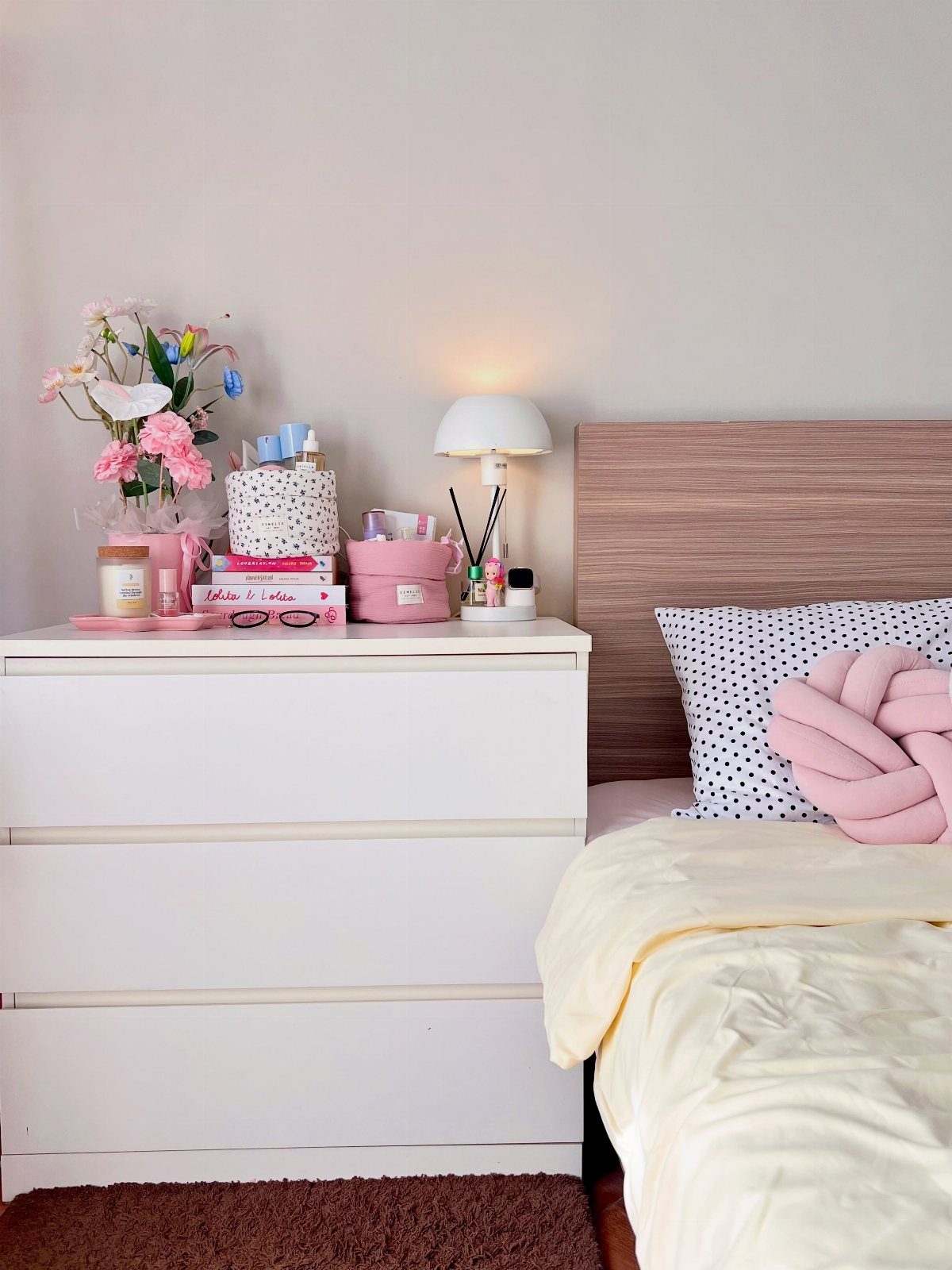
A three-drawer chest beside the bed holds more than a slim nightstand, and the surface still leaves room for a lamp, a small vase, and the stack of books you mean to finish.
Floating nightstands save floor space in a tight room, but they force you to choose between a lamp and a glass of water.
I prefer a piece with drawers for the clutter I do not want to see: charger, lip balm, the notebook I reach for late at night.
This idea trades minimalism for function, and it suits anyone whose bedtime routine involves more than a phone.
16. Monochromatic Colour Scheme
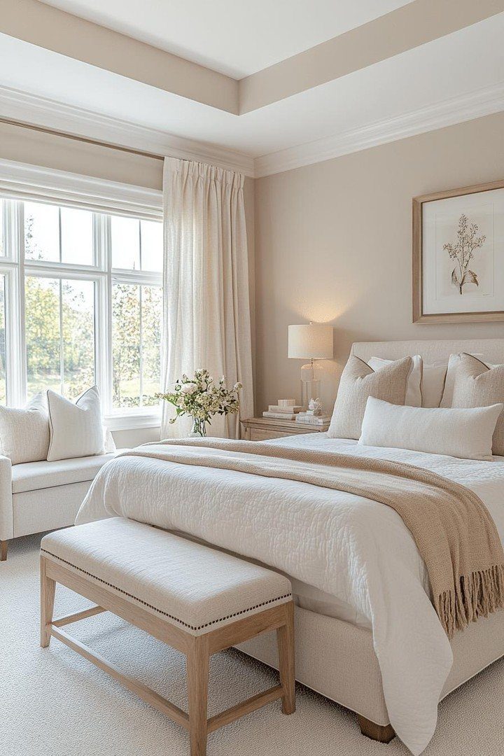
The risk is flatness; the fix is texture. A nubby throw, a linen curtain with slub, a bench in slightly deeper tone than the wall: these variations keep the eye moving without breaking the calm.
In a room without that borrowed view, a single plant or a black-framed print adds enough punctuation. This suits renters who cannot paint, since the coherence comes from what you bring in, not from the walls.
It asks more discipline than mixing, and it fails if every piece is the same exact shade.
17. Statement Lampshades
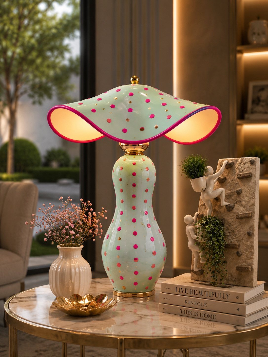
A lampshade with a wavy edge and polka dots turns a table lamp into a piece you notice even when the bulb is off.
Mint and pink reads playful; a pleated neutral or a hand-painted pattern would shift the same shape toward grown-up.
The shade is the cheaper half of the lamp to swap, so this is a low-stakes place to try a color you are not sure about.
Beaded trim, fabric paint, or a glued-on border of ribbon can remake a plain shade you already own. This suits a bedside or desk where the lamp is at eye level and the detail earns its place.
A sunset lamp, casting gradient light on the wall, is a different mood entirely; choose between them based on whether you want the object or the glow to be the point.
18. Bold Headboard
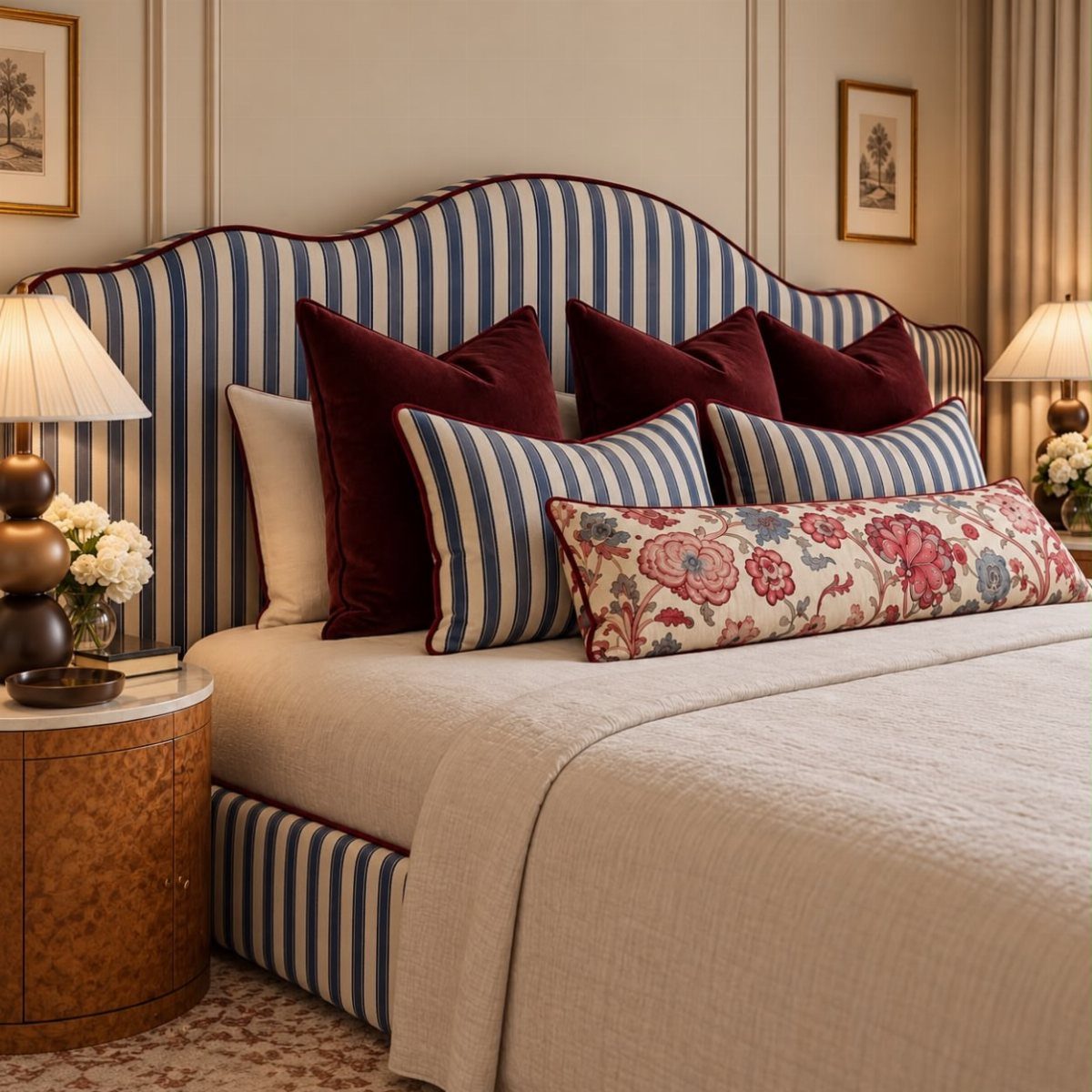
A headboard with a curved top and vertical stripes becomes the architecture of the room, not just a finish.
Blue and white, piped in burgundy, reads nautical without being literal; the same shape in velvet or raw linen would feel entirely different.
Upholstery lets you lean against it to read; a wood frame does not, so the choice depends on whether you sit up in bed.
Sconces mounted on or beside a tall headboard replace the bedside lamp and free the table surface. This idea trades simplicity for presence, and it suits rooms where the bed faces the door and needs to hold its own.
A minimalist wooden frame, as an alternative, still adds structure without the visual weight; I would choose that in a room already busy with pattern elsewhere.
19. Soft Bedding
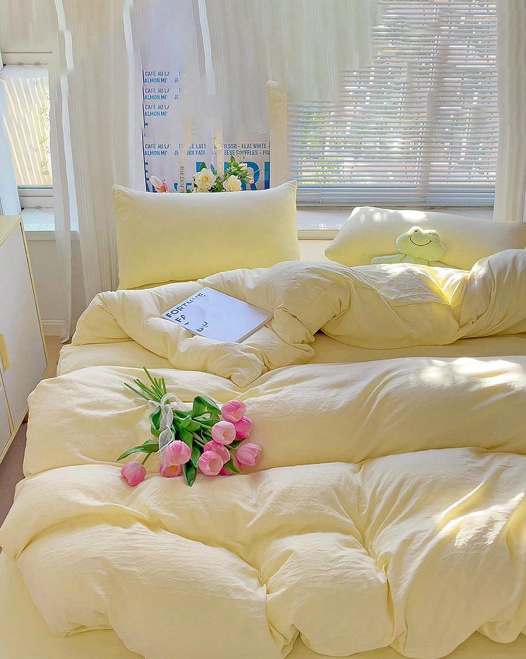
Soft bedding turns your bed into the room’s center of gravity without spending on furniture. Pastel yellow sheets and a fluffy duvet read as intentional rather than leftover, and the texture does the work of pattern.
Cotton percale in a neutral tone softens with washing and holds up well enough to outlast trendier prints. Two matching pillowcases keep the look pulled together; a third throw pillow in a different texture adds depth without clutter.
Maintenance is the real cost: percale wrinkles and needs a warm iron if that bothers you. Light colors show coffee spills and mascara marks fast, so this suits someone who washes weekly or owns a spare set.
For a dorm or first apartment, I’d still pick it: the coziness is immediate and the replacement cost is low when something better comes along.
20. Statement Chandelier
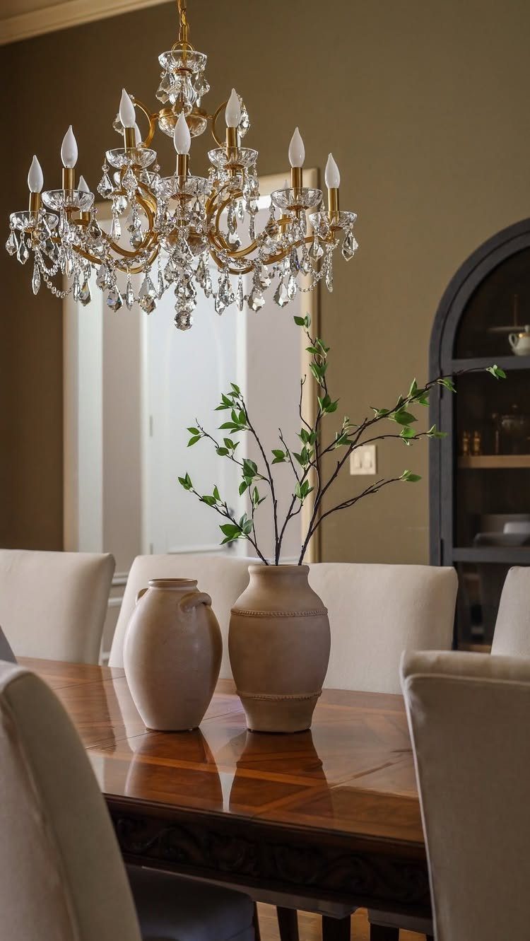
A brass and crystal chandelier over a bed or seating area reads as collected rather than installed, even when you bought it last month. The weight of glass and metal gives a room history it hasn’t earned yet.
Scale matters more than price. A piece too small for the ceiling height looks apologetic; one too wide crowds the sightlines.
Lower ceilings need smaller fixtures; scale the diameter to the room height so you don’t duck around your own light.
Higher ceilings can take more, but measure your floor space too: the chandelier should not overlap the edges of the bed or table beneath it.
Installation needs an anchored ceiling box rated for the weight, not just a swag hook. If you rent, skip this one.
A plug-in pendant with a decorative bulb gives some of the same vertical interest without the electrical work or the landlord conversation.
21. Wood Beams
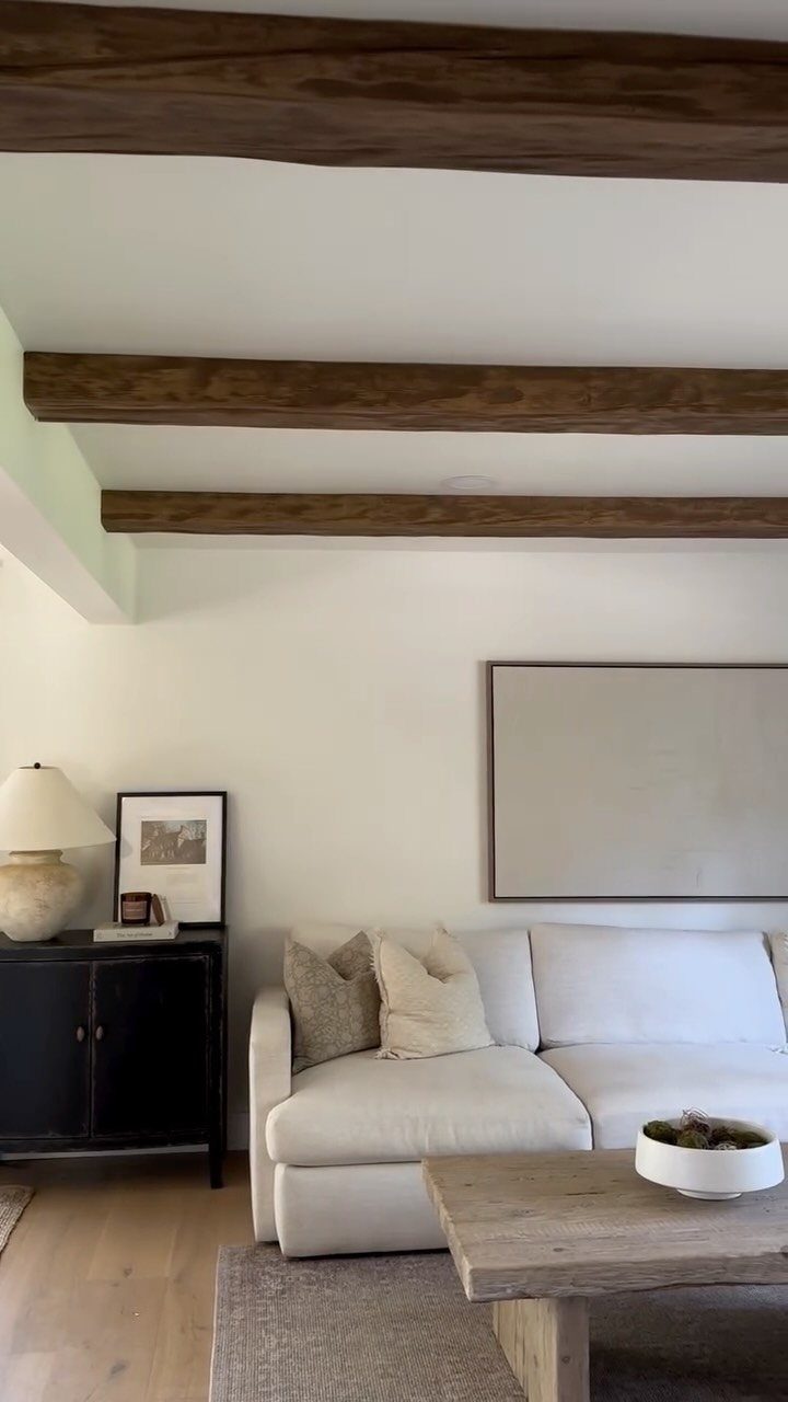
Exposed beams give a room bones. In a space with flat drywall and standard height, they add the vertical rhythm that makes a ceiling feel considered rather than merely finished.
Dark stain against white walls reads from the doorway because the contrast is sharp enough to carry across a room. Lighter wood disappears against pale paint; paint the beams first and hold the sample against the ceiling before you commit.
Hanging a trailing pothos or a macrame planter from a beam adds life at the room’s upper edge, where most people leave dead space. Use an S-hook rated for the plant’s wet weight, not a nail bent open.
The beam carries the load, but the hook carries the plant, and a full terra cotta pot with soaked soil weighs more than it looks.
This idea needs either existing beams or a landlord who does not inspect closely. Faux beams in hollow polyurethane install with a cleat system that does not touch the structure, which matters in rentals or anywhere you can’t modify framing.
The look is there; the history is not.
22. Coffee Station
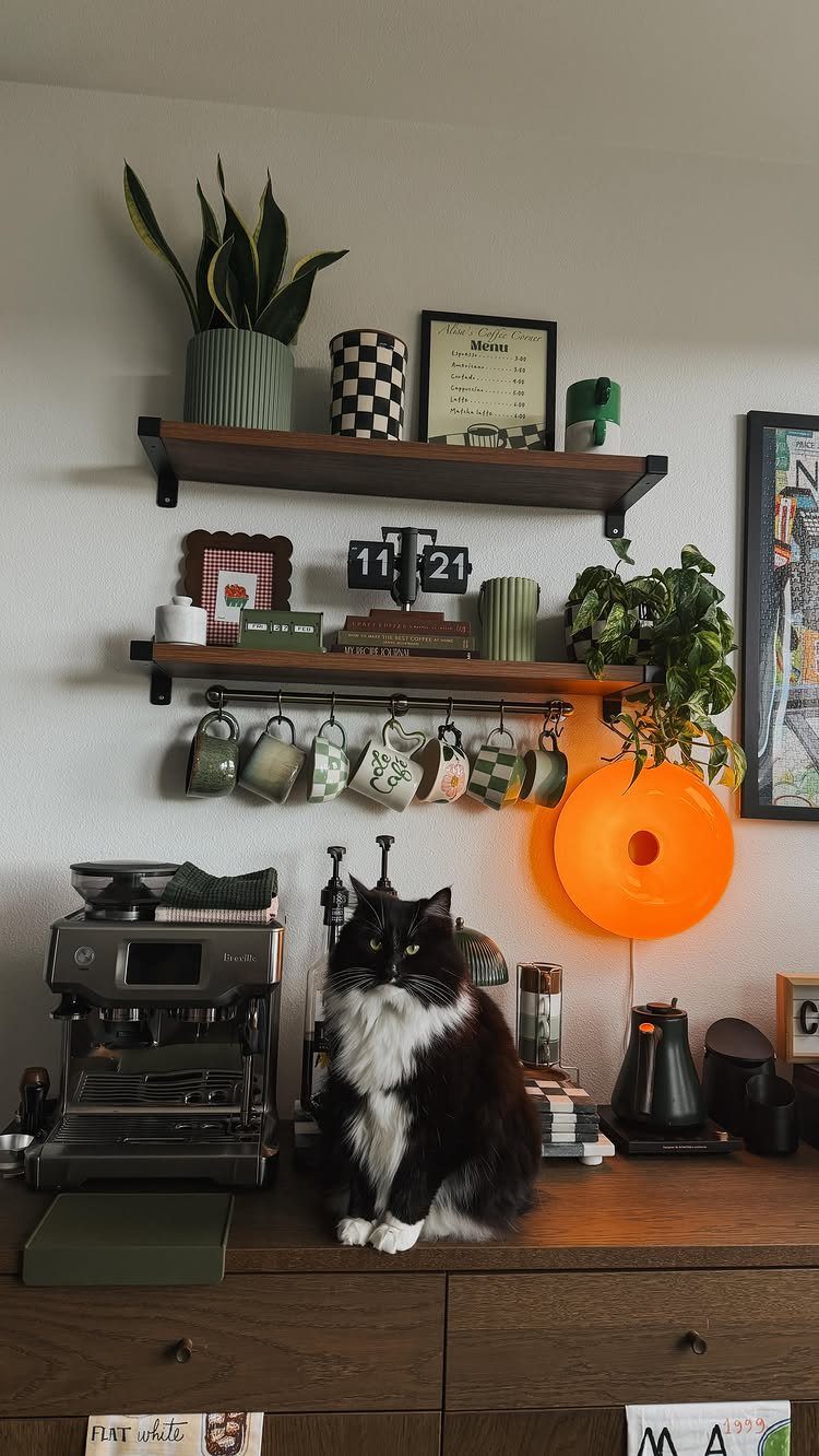
A coffee station on a sideboard or narrow console gives a morning routine a fixed address.
Floating shelves above hold the overflow: extra mugs, a book or two, the vinyl you haven’t played yet. The key is keeping the work surface clear enough to operate on.
Shallow counters stack equipment front-to-back and turn every morning into shifting pieces to use pieces; plan for enough depth to line things side by side.
A drawer organizer for pods or filters keeps the small stuff from drifting. If you use syrups, a shallow tray corrals them and lifts out for cleaning.
The cat is optional. The warmth is not.
23. Wax Warmer

A wax warmer on a desk or bedside table gives scent without the open flame that dorms and many leases prohibit.
Placement matters more than design. Near a bed, the warmth and the scent both signal sleep; on a desk, they mark work time.
The same warmer moved between locations trains the brain less effectively than two dedicated spots, but one warmer and two locations is cheaper.
Scented wax throws fragrance for hours and the cost per use stays low enough to switch scents with the season or your mood.
Vanilla and lavender read as safe choices because they are; for a room that already leans pink and soft, a citrus or green fig cuts the sweetness.
The maker of this ghost piece found it for $9.99. Shop off-season for shapes like this, after Halloween when the stock clears.
24. Faux Brick Wallpaper
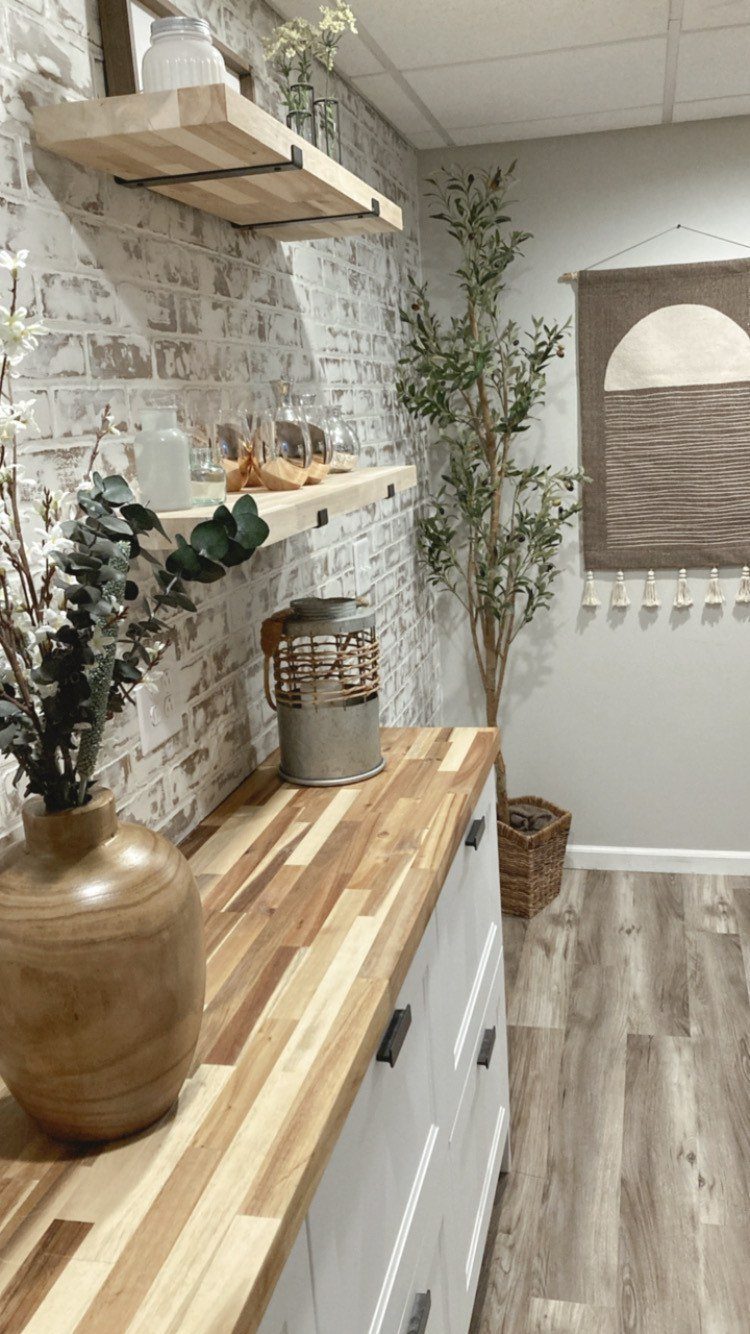
Faux brick wallpaper gives one wall the texture of age without the mortar dust or the structural load.
Peel-and-stick application works for renters and the commitment-shy. Clean the wall first with a degreaser, not just a damp cloth; the adhesive fails on residue you cannot see.
Start from a corner and work out, smoothing bubbles with a plastic card as you go. A second person helps at the top, where the paper wants to fold onto itself.
An accent wall behind a bed or beside a desk needs more rolls than the square footage suggests; buy extra for pattern matching and mistakes, especially with any offset brick design.
Remove it before you move, and the wall is intact. Leave it, and the next tenant has your taste.
25. Hanging Photo and Vine Display

A branch from the yard, cleaned and drilled, becomes the spine for this photo hanger.
Faux ivy wraps the wood to soften the hardware store look; vertical twine drops at even intervals, each strand ending in a clothespin sized for instant film. The whole thing hangs on two ceiling hooks and goes up fast.
Cost stays low if you already own a Polaroid or Instax. The real decision is whether you want memories mixed with greenery or kept clean.
Faux vines need no water and no light, so this works on a wall that gets none of either.
For renters, the ceiling hooks are the only commitment. Command strips on a narrow shelf ledge work instead; the branch rests on top and the strings hang from drilled eye screws in its underside.
26. Rope Lattice Plant Divider
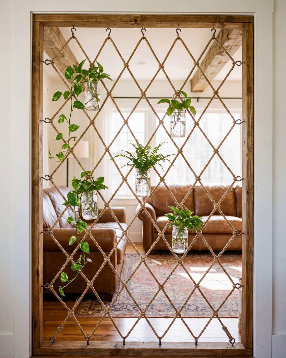
Rope lattice works as a room divider because it stops the eye without stopping air. The diamond pattern is a simple over-under weave on a wooden frame, the kind of weekend project that needs only a staple gun and patience.
Glass jars hang at the intersections with wire or leather cord; small pothos or philodendron cuttings root directly in water.
The jars matter. Mason jars are too heavy for a single rope junction; spice jars or small hexagonal honey jars balance better.
Change the water weekly or algae builds fast in glass.
This divider suits open floor plans where you need a visual boundary, not soundproofing. The plants want bright indirect light, so placement near a window on one side is non-negotiable.
A dark hallway kills this idea fast.
27. Lighted Corner Plant Shelf
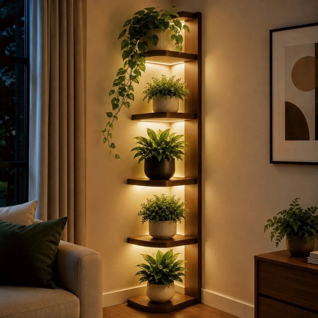
Corner shelves waste less space than flat against the wall, and the integrated lighting in this unit means you are not running cords down to an outlet you probably do not have in a corner.
The warm LEDs sit under each tier, upward-facing, so the plants read as silhouettes against their own glow rather than lit from a room ceiling.
Wood tone should match what is already in the room. This one is pale oak; a darker space wants walnut or a painted finish.
The shelves are shallow, so root balls need to stay small. A standard nursery pot fits if it is small enough.
Check that the light is hardwired or plug-in before you buy. Hardwired means an electrician; plug-in means a cord to manage.
For a rental, plug-in is the only sane choice.
28. Patterned Shadow Wall Light
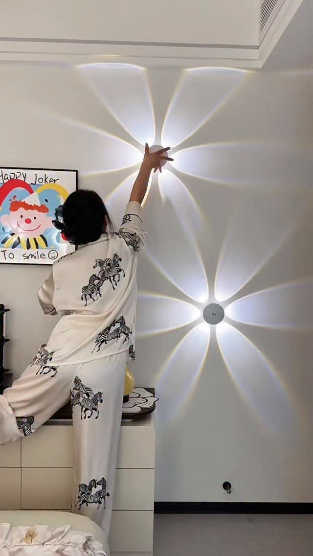
The sconce throws a flower pattern because its shade is cut, not printed; light passes through negative space in metal or plastic and lands on the wall as shadow. This is not a projector.
It is a wall light with a patterned face, and the effect only works when the wall is pale and the rest of the room is dim.
Placement is everything. Too high and the pattern stretches and blurs; too low and it falls on furniture instead of wall.
Eye level when standing, measured from floor to center of fixture, is the starting point. Two, symmetric, doubles the pattern and the wiring.
Battery-operated versions exist if you lack a junction box. They are dimmer and need regular battery swaps, but they also mean no drywall repair later.
29. Anime and Manga Collection Display

Shelves built to the ceiling, filled spine-out with manga and interleaved with figures, turn a collection into architecture. Framed posters above complete the wraparound effect; the room reads as a single statement rather than storage with decoration added.
The risk is visual noise. Group by series or by color, not both, or the eye has nowhere to rest.
Figures need dusting weekly in open air; glass cabinets trade some impact for sanity. Low seating like a beanbag works in a room where the walls do the talking.
This suits someone with years of accumulation, not a starter collection. A dozen volumes look sparse on shelves this scale.
Start with floating shelves in a smaller cluster if your collection is still growing; upgrade to built-ins when you own enough to fill them.
Choosing a Color Scheme
A monochromatic scheme lives or dies in its texture, not its hue. One blue, three ways: navy velvet against slate linen against a pale, chalky wall.
The eye reads them as related but not flat.
Analogous colors sit next to each other on the wheel, and they shift a room through the day without jarring.
Blue into green, or amber into rust, keeps the calm of a single family while adding just enough movement to stop boredom.
I would test this with paint chips laid on the floor, viewed in morning and evening light, before committing to yards of fabric or a painted accent wall.
The risk with any scheme is the showroom effect: everything purchased at once, everything too matched. A single found object, a darker or lighter than the plan allows, breaks that dead coherence.
Mixing Styles
Stockholm minimalism and raw industrial share a love of clean line; the difference is warmth. Add wood grain and a single trailing plant to industrial metal, and the cold edge softens without becoming something else entirely.
Japandi asks for restraint in quantity, not in material quality. A single linen throw, a single ceramic bowl, each chosen for surface and weight, outweighs three cheaper pieces that fill the same shelf.
I would not mix more than two dominant aesthetics in one room. Three compete; two, if they share a single principle, negotiate.
Scandinavian function plus bohemian texture works because both forgive daily life. Maximalist pattern plus minimalist emptiness fights for the same eye and fatigues.
Proportion matters more than label. A spacious room breaks into zones with rugs or shelving; a small room keeps to lighter colors and furniture that serves more than one purpose.
Incorporating Personal Items
A wall of framed photographs reads as autobiography, not decoration, when the frames vary in size and the images include the imperfect ones: the blurred birthday, the overexposed beach. Uniform frames and professional prints look like a hotel corridor.
DIY pieces carry weight because the irregularities show. A hand-tied macrame wall hanging, a canvas painted in one afternoon, a shelf arranged by trial and error: these mark time in a way purchased objects do not.
The cost is hours, not dollars, and the result is specific to the room it lives in.
William Morris’s rule, useful or beautiful, still holds. I would rather one small object with a story than a cluster of things that merely fill space.
A concert wristlet pinned to a board, a wooden map of a city once visited, a single plant cutting from a friend: each earns its place by memory, not by matching the scheme.
Creating Zones in a Room
A single room serving morning coffee and midnight reading needs two light systems, not one dimmer struggling at both jobs.
A floor lamp with a warm bulb at the chair, LED strips behind the desk, candles for the hour between: layering lets each zone keep its own time.
Rugs divide without walls. A woven texture under the seating area, bare floor or a flat weave at the desk, signals where one activity ends and another begins.
The eye reads the boundary before the foot reaches it.
Open shelving between zones stores what each side needs: notebooks toward the desk, the current novel toward the chair. The shelf itself becomes a partial screen, enough to separate focus without blocking light or conversation.
Plants mark transitions well. A tall specimen between lounging and working areas softens the edge and adds the humidity that heated rooms lose.
I would place it where both zones see it, so it serves as common ground rather than belonging to one side.
Frequently Asked Questions
How do I make my room aesthetic?
Start with a color scheme you can live with, then build in texture through bedding, throws, and wall hangings so the eye has somewhere to travel.
Fairy lights behind sheer fabric or a statement lampshade on a lamp you already own add atmosphere without a full redesign.
The pieces that make a room feel personal are the ones that mark real months, not aspirational ones: ticket stubs on a pinboard, a plant you’ve kept alive, a rug with actual wear.
What are the golden rules for bedroom design?
Mount shelves where you’ll actually reach them, not above shoulder height; match the plant to the light you have, not the light you want; and check the wall material before you drill, not after.
Scale matters with every piece, from chandelier diameter to rug border, and texture saves a single-color scheme from going flat.