
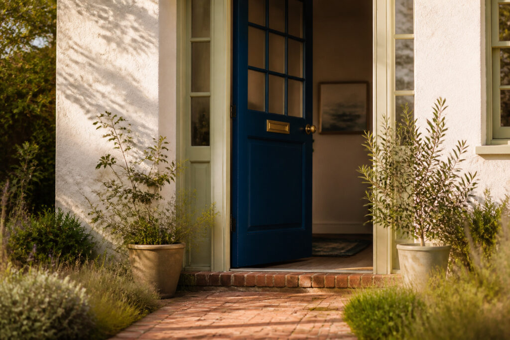
Blue front door colors are specific paint shades chosen to make a home’s entry point stand out or settle in, depending on the surrounding light and materials. The same navy that reads near-black in north-facing shade turns rich and lively on a south-facing door, a shift dramatic enough that Hale Navy, the most-backed color across four separate sources, demands testing on the actual door rather than a handheld swatch. Brass hardware warms it; black keeps it formal. The trim matters too: pair it with Benjamin Moore’s Pale Oak and the entry stays soft; choose wrong and the gray undertone stacks until everything flattens.
1. Hale Navy
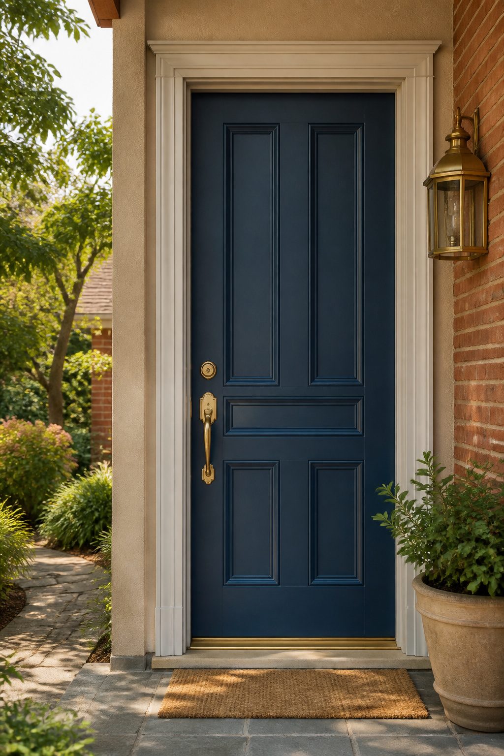
Hale Navy by Benjamin Moore (HC-154) sits at the deep end of blue front door colors, a navy so saturated it can read near-black on the swatch until sunlight hits it. Four separate mentions across the sources made this the most-backed color in the whole list, which caught my attention while I was sorting through what actually holds up outside.
The complexity is in the gray undertone. South-facing light pulls the blue forward and keeps it rich and lively; north-facing exposure flattens it toward charcoal, almost somber. I would not put this on a door that gets no direct sun unless the goal is deliberately shadowed.
Brick and neutral stucco both take it well. The sources paired it with BM Pale Oak trim in their examples, which gives you a soft, warm boundary that keeps the navy from going too cold or too maritime. Brass hardware warms it; black or chrome keeps the mood more formal. If your siding is already cool-toned, test carefully, the gray in this color can stack until the whole entry feels flat.
What convinced me, reading through the comparisons, was the south versus north demonstration. Paint that shifts that dramatically demands a preview on your actual door, not just a brush-out on cardboard held at arm’s length.
2. Naval
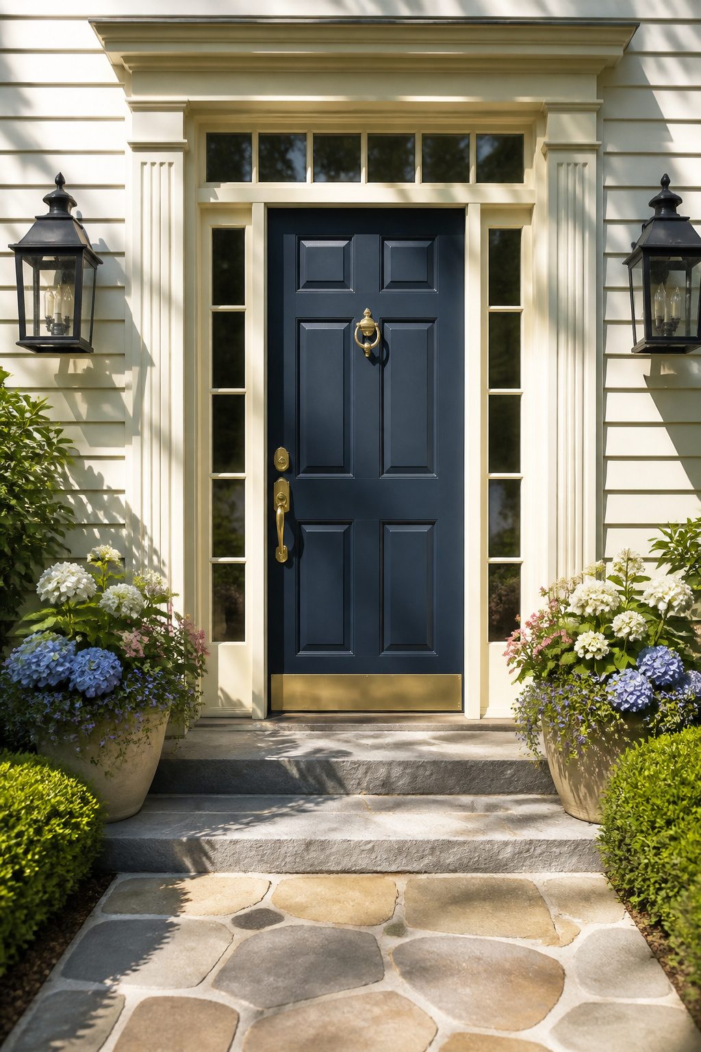
Sherwin-Williams Naval (SW 6244) sits at the deep end of navy without tipping into black. The sources describe it as timeless and grounded, a color that adds contrast without overpowering a traditional facade. That restraint matters on a front door, where you want presence but not a shout.
I have seen it compared to Hale Navy, and the difference is worth knowing. Naval carries a slightly cleaner, more restrained base. It reads as architectural rather than cozy, which suits colonial, craftsman, and Georgian exteriors especially well. Natural light reveals its true depth; sources note that seeing it in daylight convinced them it would hold up as strongly on a door as it did on interior cabinetry.
For trim, creamy off-white keeps it from feeling institutional. Black hardware sharpens the contrast further. The combination reads as deliberate, not default.
Naval has the advantage of longevity. Sources single it out as a shade that avoids trendiness, a practical concern when a front door repaint runs you a weekend and a gallon. If you want one blue that will not date your house by 2030, this is the safe bet that still feels like a choice.
3. Aegean Teal
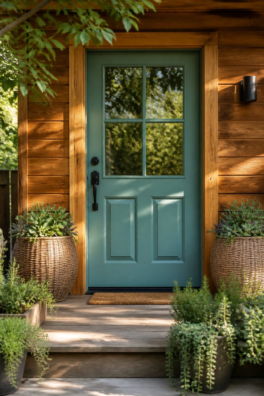
Aegean Teal (2136-40) by Benjamin Moore sits right in that quiet space where blue and green refuse to pick a side. On a front door, the green undertone tends to emerge in bright midday sun, especially against warm brick or cedar siding where the wood’s own amber pulls the teal toward sage. North-facing entries and homes clad in cool gray or white trim quiet that same green, letting the blue read clearer and more coastal.
The color carries enough gray to stay sophisticated rather than pastel. That gray keeps it from competing with natural accents, which is why wicker, clay planters, and rough-textured doormats settle in so comfortably beside it. The blend reads as intentional, not indecisive.
Some of Benjamin Moore’s most popular front door paint colors include the intriguing blue-green Aegean Teal 2136-40
What that popularity signals for your own door: this is a tested choice that walks up to bold without crossing into whimsical. If your exterior leans farmhouse or coastal already, the color completes the thought rather than announces itself.
4. Blue Note
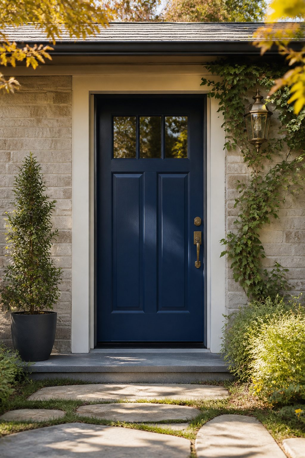
Benjamin Moore Blue Note (HC-166) reads as a near-black navy that sits close to charcoal in shadow and opens into something more legibly blue only when the sun hits it directly. That split personality is what makes it useful for a front door. Morning light on a north-facing entry keeps it restrained and formal, almost architectural. Afternoon sun on a southern exposure pulls out the midnight undertone and keeps it from reading as pure black, which is the risk with anything this desaturated.
The brick-and-white pairings that show up in renderings work because the door functions as a void rather than a color statement. On a modern ranch with a neutral palette, the same hue reads as subtle visual weight that anchors the façade without competing with it. Blue Note is not a compromise between black and blue; it is a blue that understands when to disappear.
What keeps it practical is its durability in the darker range. Covered porches with limited sun exposure still hold their depth, and the pigment density resists the fade that can turn a rich navy to dusty in two seasons. If your trim is warm white, test it on thejamb itself, not a swatch card. The color shifts enough by context that a paper sample lies.
5. Moscow Midnight
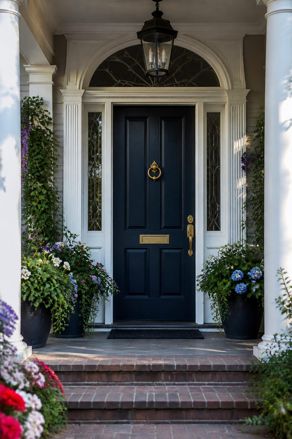
Sherwin-Williams Moscow Midnight (SW 9142) carries an LRV of 5, which flatters it in two ways: the surface reads as near-black in shadow and as a saturated sapphire when direct light hits it, the green undertones winking through only at certain angles. That shifting quality is what gives it the jewel comparison; the color does not sit still.
Against white porch trim and window casings, the effect sharpens. The contrast reads intentional rather than theatrical because the trim provides the light and the door supplies the depth. Polished hardware in brass or oil-rubbed bronze extends the gem idea more than brushed nickel would; the warmer metals pick up the hidden green and keep the whole entry from tilg into a nautical cliché.
I would not carry this blue to accent shutters or garage doors unless the house is small enough to read as one mass. On a larger façade, Moscow Midnight belongs to a single focal point so the eye knows where to land.
6. Santorini Blue
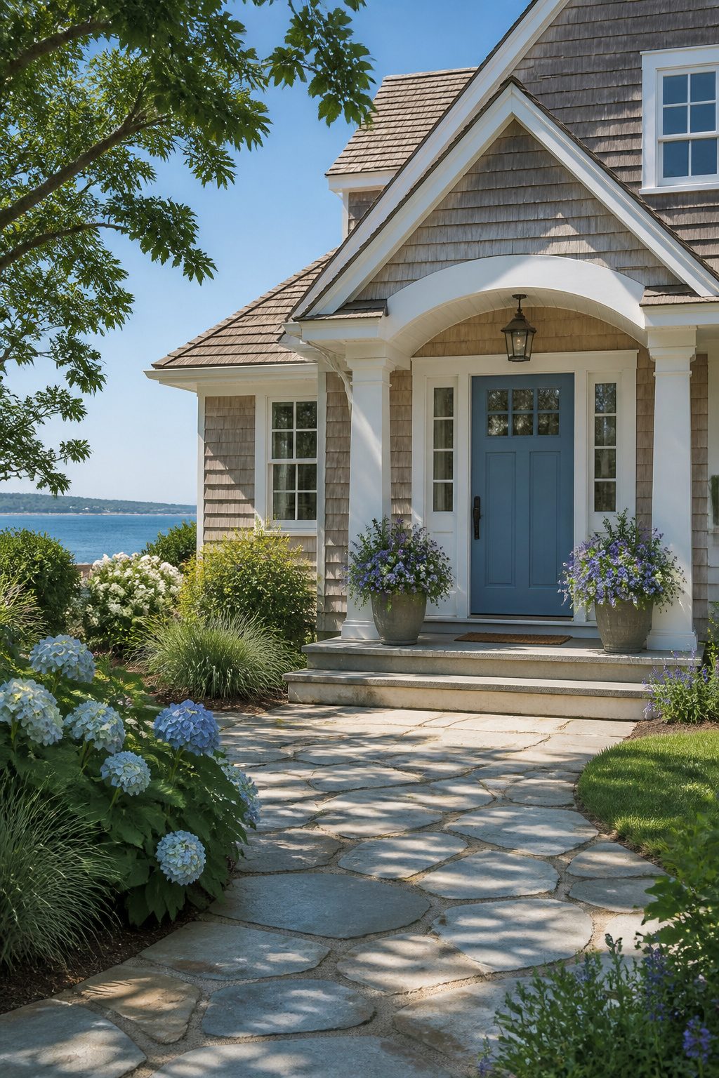
Benjamin Moore Santorini Blue (2136-40) sits somewhere between a sky blue and a weathered shingle, and that gray undertone is what keeps it from reading like a beach-house novelty. It cools the color down just enough to feel grown-up, so the door looks intentional rather than playful. On my own porch, I’ve watched it shift from a soft slate in morning overcast to something almost cerulean by late afternoon sun; the gray base catches shadows differently than a cleaner primary blue would.
This is a coastal blue that works inland, which is rare. The muted quality pairs with white trim without shouting, and it softens the transition if your siding runs warm, like a beige or greige. I would not use it against cool gray siding; the color can disappear into the background and look washed out. A high-gloss finish brings out the depth, though it will show every handprint and seasonal grit. Satin hides more, but you lose that wet-looking richness that makes a front door feel finished.
7. Slate Blue
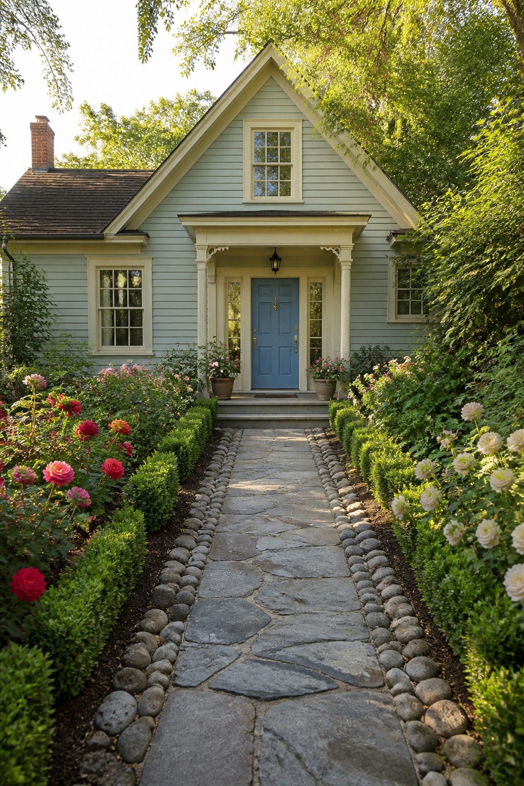
Slate Blue (HC-162) reads lighter than it sounds on the chip. Benjamin Moore puts it in their Historic Color collection, but this is no colonial heavy. It floats, a dusty sky with enough gray to keep it from looking like a swimming pool on your door.
I noticed the difference when I set it against Hale Navy and Naval in the same afternoon light. Those two swallowed the trim. Slate Blue stepped back and let the hardware show, which matters if you paid for a decent brass knob.
The risk is exactly that airiness. On a house with pale siding, it can wash out to near-white at midday. I saw this on a clapboard cottage in Portland where the owner had to repaint two years in, not because the color failed but because it refused to read as blue. Against charcoal or deep green, though, it becomes the single calm note a busy facade needs. Brick does this too, the red and the slate working like old roof tiles.
Where it falls flat is shadow. A porch that gets two hours of sun turns Slate Blue to dishwater gray by four o’clock. North-facing doors need the deeper values. South or west exposure earns the benefit of that freshness without the collapse.
8. Galapagos Turquoise
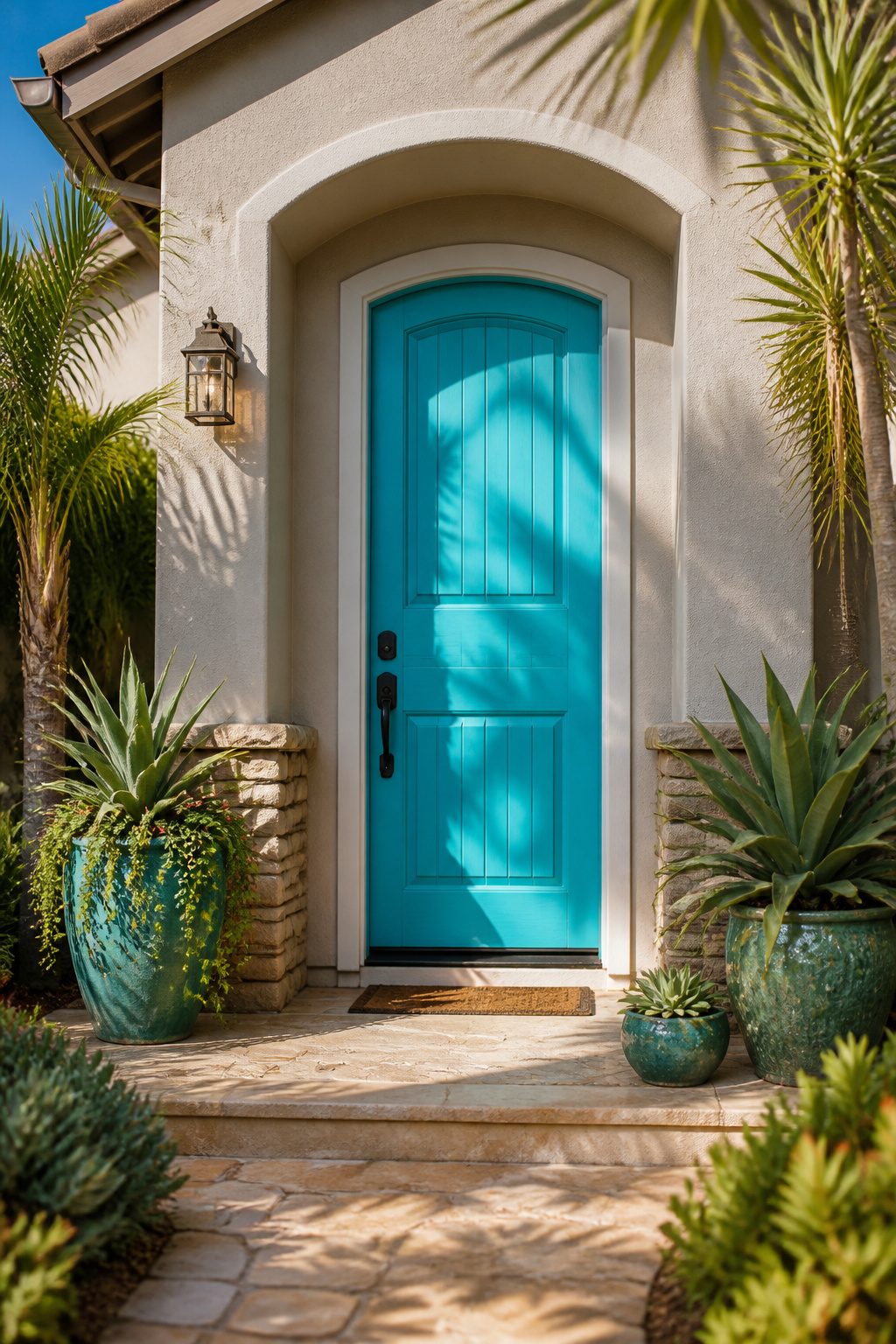
Benjamin Moore Galapagos Turquoise (2138-40) is the color you paint when you want the mail carrier to notice your house from three doors down. Against neutral stucco or brick, it reads as straight turquoise, not quite navy and nowhere near pastel, which is exactly what makes it hard to ignore. Brick & Batten pairs it with black trim for that contrast, though in my reading the real question is whether you want to live with that much statement on a Monday morning in February when the light is flat and the garden is dormant.
This hue belongs to gardeners who already treat the front stoop as part of the landscape: someone with potted palms or succulents flanking the entry, maybe a natural fiber mat scraping the mud off boots. Mindful Hues calls it playful, and I think that is the honest read, not aspirational. It reads beach-house cheerful, which is either a relief from your street’s sea of greige or a mismatch with your actual roofline and foundation plantings. After a season or two gardening, most of us know whether we are the type to pull off one bold move. This is the paint equivalent of a bird of paradise in a terra cotta pot: gorgeous, but it asks the rest of the yard to keep up, or at least not to argue.
9. Distance
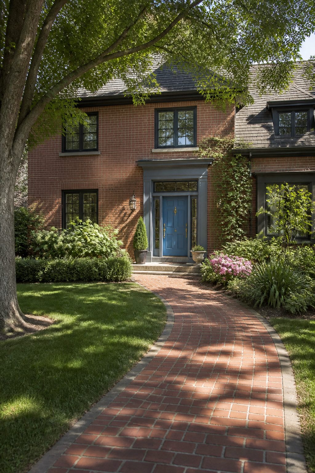
Sherwin-Williams Distance (SW 6243) sits in that useful middle space between sky blue and gray. It reads as a soft, muted denim with enough warmth to avoid the coldness that can make a front door feel standoffish.
What convinced me, reading through the comparisons, was how it handles warmer exteriors. A house wrapped in red brick, cedar siding, or stone with orange undertones fights a true cool blue; Distance absorbs some of that warmth rather than clashing with it. The result stays visible from the street without feeling heavy against the surrounding materials.
The tricky part is that softness itself. In deep shade it can flatten toward gray, so the door needs enough direct or reflected light to keep the blue alive. On Sutton Place moved away from Naval for exactly this reason, finding Distance a better weight for their stone exterior. If your brick reads orange rather than brown, this is the safer pivot than a navy that will turn the entry into a dark rectangle.
10. Blue Heather
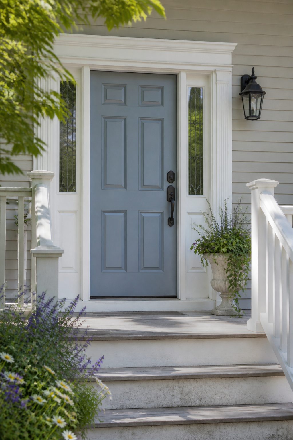
Benjamin Moore Blue Heather reads as a pearly gray-blue that almost disappears in direct noon light, then quietly turns blue again as the sun shifts. That near-invisibility is its strength on doors that face a busy street or share a narrow porch with neighbors: the color settles in rather than shouting for attention.
Subtlety works best when the architecture already carries the interest. My own porch has thin original trim from the 1920s, and a saturated blue would have fought the spindle work rather than framing it. A gray-blue lets the carpentry read first. The risk is choosing quiet paint for a quiet house and ending up with nothing at all. If your siding is already a flat white or beige, Blue Heather may read simply as dirty gray.
Test it beside the siding, not in isolation. I taped a sample card to my door for three days and found the color warmed considerably against red brick, cooled against pale siding, and looked almost lavender at dawn. What stayed consistent was its refusal to declare itself, which for some doors is exactly the point.
11. Boothbay Gray
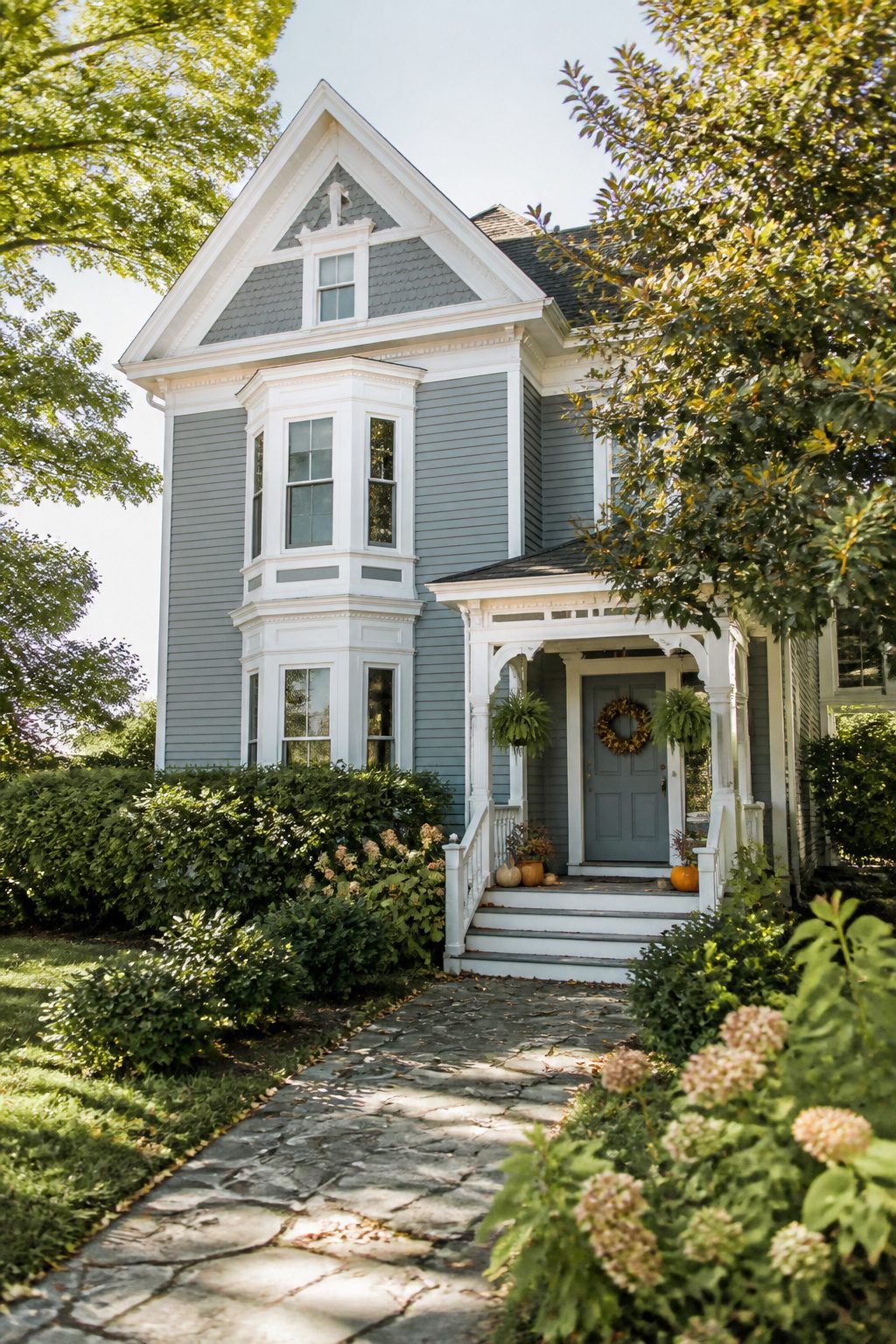
Benjamin Moore Boothbay Gray (HC-165) carries a warmth that keeps it from reading cold or coastal in the way some gray-blues do. The "steely gray with a hint of blue" description undersells it; what you actually get is closer to old English plaster or a softly weathered French blue-gray, a color that settles into itself rather than calling attention.
That warmth matters on a front door. Cooler gray-blues can feel defensive, like they are guarding the house against you. Boothbay Gray bends the other way. It looks good against crisp white trim, but it does not collapse against a creamier white either, and it holds up surprisingly well next to cedar shingles where a starker blue would clash.
The pigment load is subtle enough that light becomes a real factor. A north-facing door or one tucked deep in porch shade will read darker and grayer. Strong southern sun pulls the blue forward and brightens it. If your door gets both conditions depending on the season, the color shifts with them, which is either charming or maddening depending on how much change you want to live with. I would test a swatch and watch it at morning, noon, and dusk before committing, because this one is a chameleon in a way that truer blues rarely are.
12. Debonair
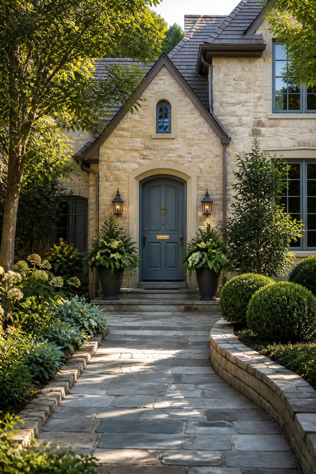
Sherwin-Williams Debonair (SW 6226) sits on the cooler side of blue-gray, and that temperature is what makes it behave outside. Against green landscaping, the gray in it keeps the blue from clashing with whatever is growing beside your stoop. Warm stone, limestone or buff brick, gets the same service: the cool tone steps back rather than competing, so the stone reads as the warmth and the door reads as the accent.
I like this one for a reason the swatch does not quite prepare you for. Outdoors, Debonair reads brighter than its muted base suggests, but it stops short of the sun-glow some light blues pick up in direct light. You get visibility without the chalky fluorescence.
A Victorian-era Denver home I saw photographed used it as the field color, paired with deep maroon trim, navy accents, and gold metal at the column caps. The palette sounds busy on paper, yet the coolness of Debonair held it together. If your own house has ornate trim or mixed materials, that same anchoring quality applies to a single front door surrounded by busier siding.
The risk is pairing it with already-cool gray stone or blue-toned siding; then the whole entry can feel flat. Against warmth, though, Debonair earns its name.
13. Hinting Blue
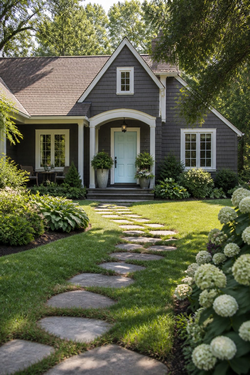
Sherwin-Williams Hinting Blue (SW 6758) sits at the lighter end of what most people picture for a front door, closer to a sky-tinted white than a true blue. That airy quality works on doors surrounded by deep greenery or dark siding, where it reads as intentional color rather than primer that never got its second coat.
The question I kept running into reading about it is whether something this pale holds its own against direct sun. Light colors reflect heat, which helps the paint film itself, but UV can push them toward chalkiness faster than mid-tones. Hinting Blue reportedly carries enough pigment load to resist that drift, though south-facing doors in Zones 7 and up may need repainting a season earlier than they would with Naval or Hale Navy.
I would use it on a door with good shadow from a porch roof, or pair it with charcoal or forest trim to anchor it. Alone on an unshaded door in a hot climate, it risks looking washed out by August. For renters or anyone keeping hardware brass, it is one of the few light blues that does not turn sickly against gold tones.
14. Languid Blue
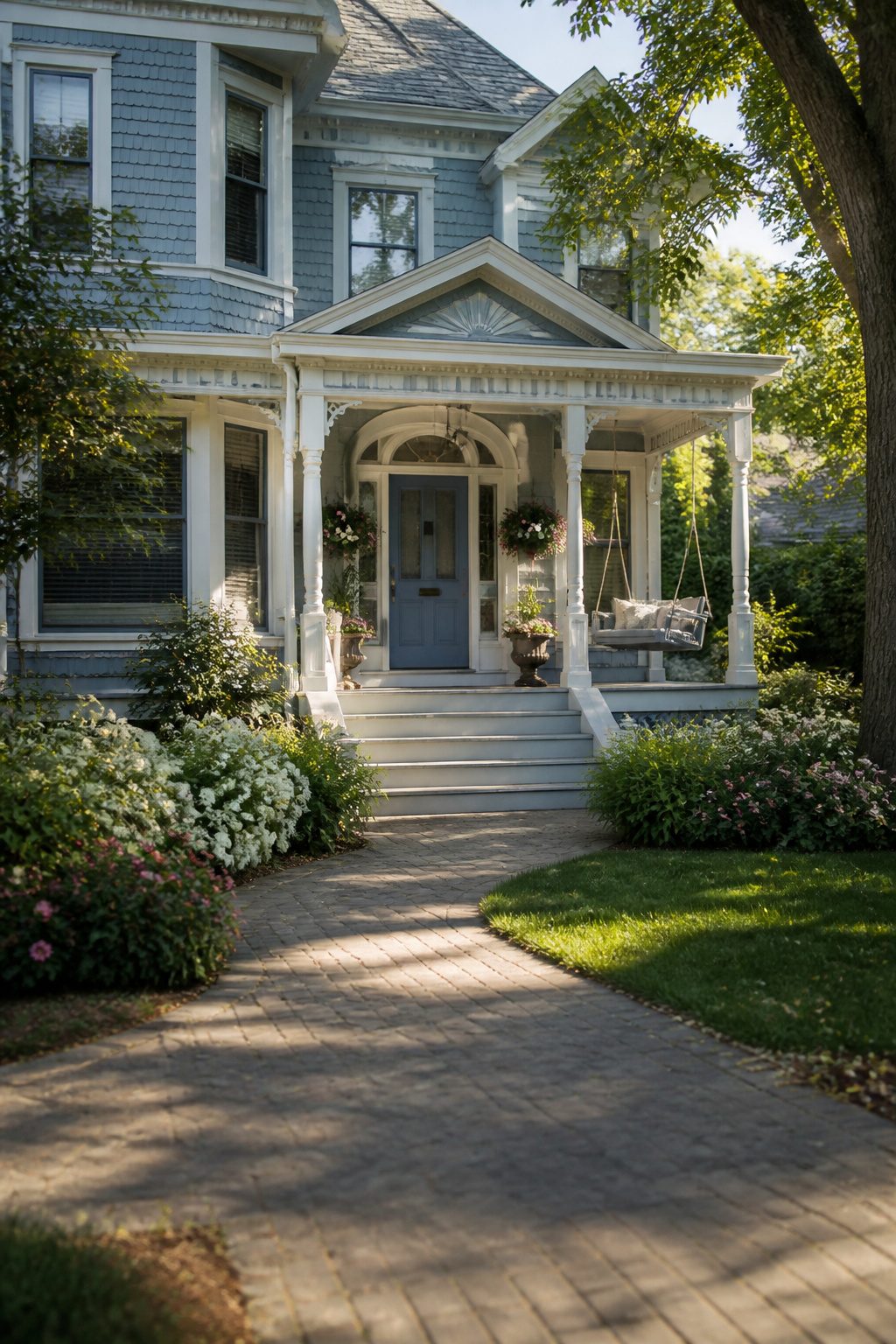
Sherwin-Williams Languid Blue (SW 6226) carries a relaxation that almost slumps on the door, and that laziness is the whole point. It is a muted blue, not crisp or sailing-school bright, and in full outdoor sun it keeps its composure rather than flashing back at you. I would put it on a home that already has something coastal in its bones, a porch with a swing or siding that weathered to soft gray, but it would also settle a more ordinary suburban facade that needs to stop trying so hard.
The Coastal Victorian pairing I saw used it two-toned with Labradorite for the body, and the effect worked because neither color shouted. For a single front door, Languid Blue gives the same unhurried arrival: you are home, the commute is done, no further announcement required. Where brighter blues read as nautical energy, this one reads as tide going out. That makes it a poor fit for a house that needs waking up, and a strong one for a house that needs calming down.
15. Weathered Blue
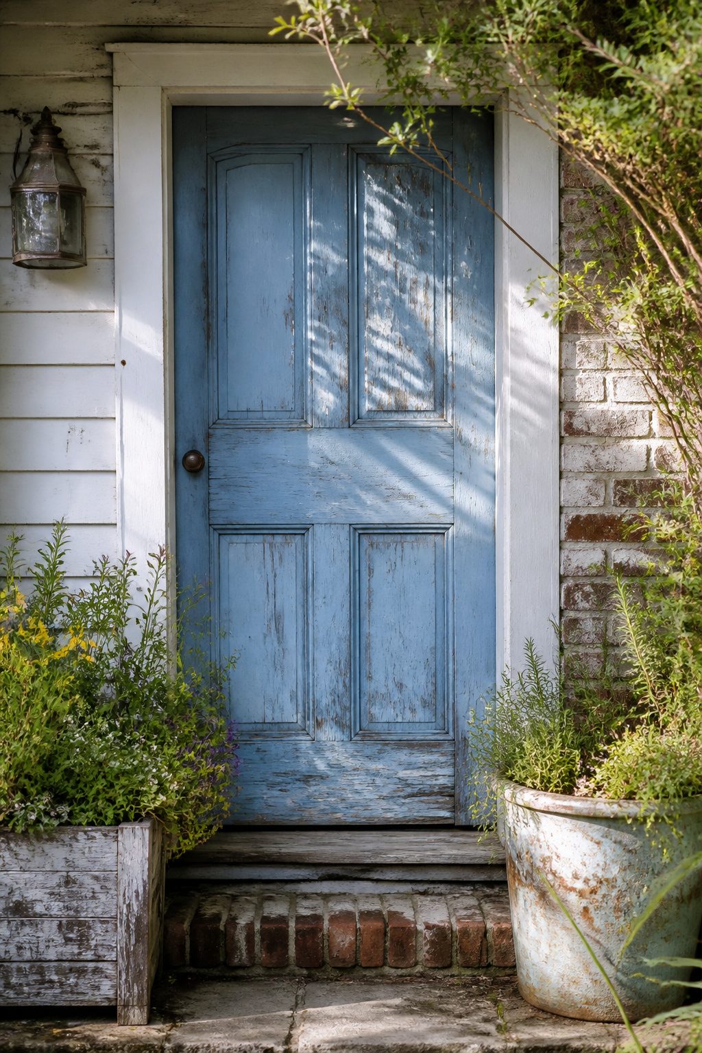
Benjamin Moore Weathered Blue carries a soft, chalky fade that reads as decades of sun exposure whether your door is two weeks or twenty years old. The color sits in that uncertain space where gray meets blue, and the effect changes dramatically depending on what surrounds it. Against fresh white trim and new nickel hardware, it can look merely dirty, a mistake someone means to repaint when they get around to it. Pair it with aged brass, a dented copper planter, or clapboards that have softened to oatmeal, and the same paint becomes intentional, collected over time.
I spent an afternoon once comparing swatches on a friend’s 1920s porch where the floorboards had gone silver. The Weathered Blue sample there looked like it had always belonged; on her neighbor’s vinyl-sided house four doors down, it looked like a color that had given up. The faded quality is not inherent to the paint. It is borrowed from whatever near it has actually weathered. If your house is crisp and new, this shade asks you to rough up the context, not the door itself. A rusted boot scraper helps. So does letting the garden go slightly wild against the foundation. Without that collaboration, Weathered Blue risks looking like a stain you are waiting to power-wash.
Why Blue Works on a Front Door
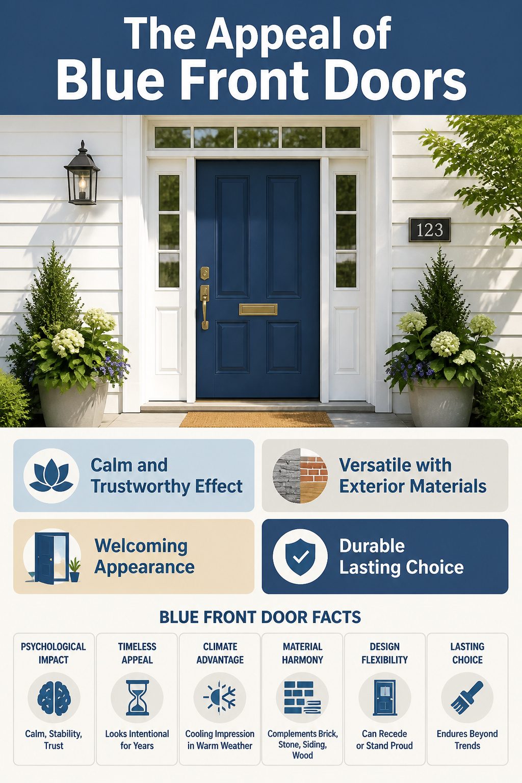
Blue front door colors feel different the moment you walk up to them. The paint itself does not create calm; what registers is the association built from a lifetime of seeing the sky before rain, the ocean at a distance, the shade that sits stable in a changing day. Sources tracing why blue endures keep returning to the same words: calm, stability, trust. Those are not abstract benefits painted on like primer. They are what a visitor reads before the door opens.
A deep navy reads as reliable, the kind of choice that still looks intentional ten years out. A sky blue reads as welcoming without trying hard for attention. The cooling quality of the color matters in practice too, especially where summers run long; a blue door carries that impression of freshness before you register why the house feels easier to approach.
That blue works with almost any exterior material helps explain why it persists. Brick, stone, white siding, natural wood trim: the door does not fight its surroundings. It can recede or stand proud depending on the shade. The versatility is earned, not claimed.
Paint names will shift with the year. The psychology underneath does not, which is why blue front door colors remain the default homeowners return to after flirting with trendier choices.
Testing Paint in Real Light
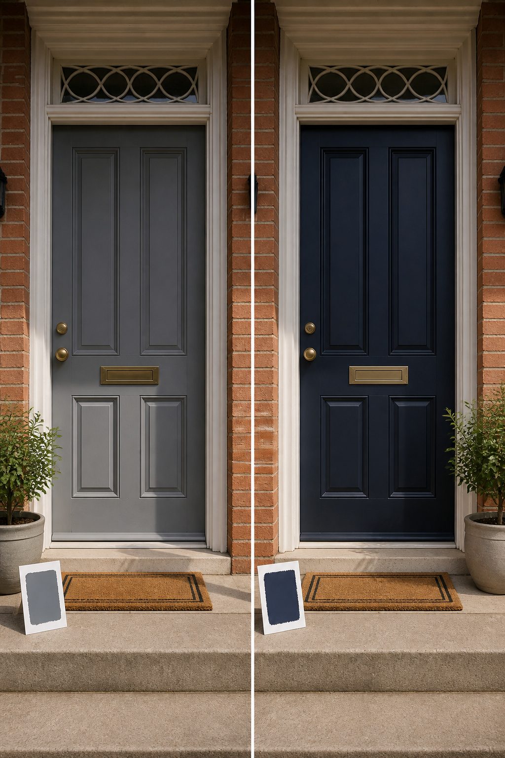
Blue paint on a front door shifts more dramatically under changing light than almost any other color. The same swatch that reads crisp navy at ten in the morning can flatten to near-gray by dusk, or a teal-leaning blue can swing hard green when the porch sits in shadow. A fixed element like your roof tone or the warm brick beside the door only amplves the effect.
The standard advice holds: paint a large sample directly on the door, then check it at morning, noon, and evening. Last spring I stood on my neighbor’s porch at three different hours before I believed how much their "safe" mid-tone blue dulled once the overhead porch shade took over. East and west-facing entries exaggerate the swing because direct and angled light hit at different temperatures. Morning sun tends cool and blue; late afternoon throws amber.
Several sources recommend ordering extra-large 9-by-14.75-inch peel-and-stick samples rather than relying on chip cards, since a two-inch square gives almost no information about how a color breathes across a whole vertical surface. I would add only this: give yourself two full days of observation before you commit. A color that charms on Saturday morning may feel like a stranger by Sunday evening, and front doors are tedious to repaint on impulse.
Pairing Blue With What You Already Have
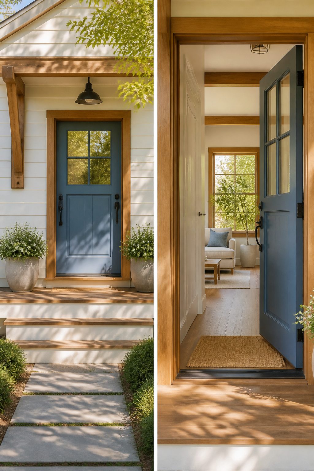
Painted my aunt’s porch ceiling Haint Blue one July without checking it against her siding first. Looked fine in the can, then clashed hard with the warm cream trim once the sun hit it. That afternoon of repainting taught me: the door color lives in relation to everything else, not on its own.
Blue front door colors sit differently against white, wood, or brick, and the same shade reads calm on one house and cold on another. Benjamin Moore’s Blue Note, a near-navy that borders on black, worked on my aunt’s place only after we swapped the trim to a cooler white. Against her original brick and that warm cream, it had felt heavy and theatrical. With the right pairing, it turned sophisticated and quiet.
White siding gives almost any blue room to breathe. Natural wood trim pulls cooler blues toward gray and makes them feel institutional, so I lean toward mid-tone or slightly warm blues with oak or cedar. Brick is the trickiest: red brick wants a blue with some depth, not a pastel that looks accidental. Deep navy or slate blue creates actual contrast, while a soft blue gets swallowed into the mortar lines and looks like a faded leftover.
The specific shade matters less than the temperature match. Hold the paint chip against your siding in morning light and again at dusk, and believe what you see, not what the name promises.
Frequently Asked Questions
How do I choose a paint color for my front door?
Start with what your house already gives you. Brick, siding, stone, and wood each pull blue in different directions, so match the undertone, warm exteriors with teal-leaning blues, cooler ones with gray-blues or navy. Paint a large sample directly on the door and watch it across two full days, morning, noon, and evening, because blue shifts more dramatically in changing light than almost any other color.
What are the best blue front door colors?
Hale Navy, Naval, and Aegean Teal are the most backed choices across the sources. Hale Navy carries a gray undertone that reads near-black in shadow and rich navy in sun. Naval stays cleaner and more architectural, a safe bet that still feels deliberate. Aegean Teal sits between blue and green, with the green emerging in bright midday sun against warm materials.
How can I make my blue front door stand out?
Hardware does more than you would expect. Brass warms a deep navy and keeps it from going maritime; black or chrome sharpens the contrast for a more formal read. Seasonal planters and a doormat in natural fiber extend the statement without competing. For a single bold move, Galapagos Turquoise against neutral stucco or brick reads as straight turquoise and hard to ignore.