
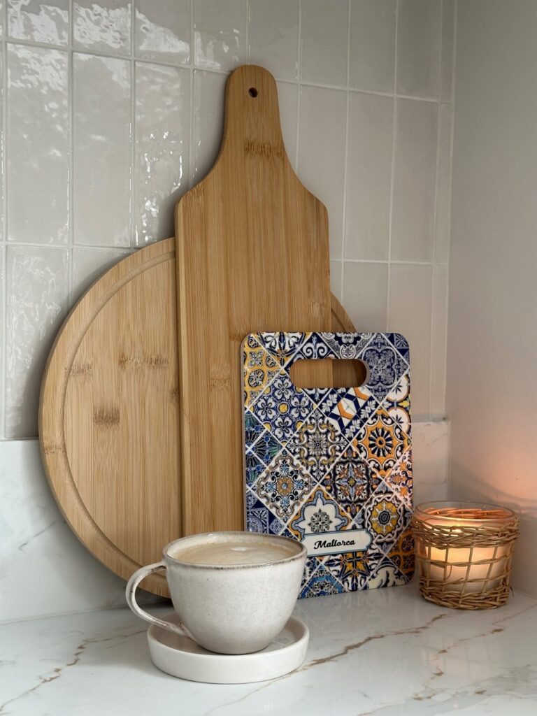
Most of these ideas land in the weekend-project range where a can of paint or a cordless drill gets you there; a few, like a custom metal hood, run closer to a used-car payment.
What separates one idea from another is your ceiling height, your outlet count, or whether you rent and need to roll it up when you leave.
A painted floor needs patience: solid pine underneath, then two full weekends while each coat of porch-and-floor enamel cures hard enough to walk on.
1. Open Shelving
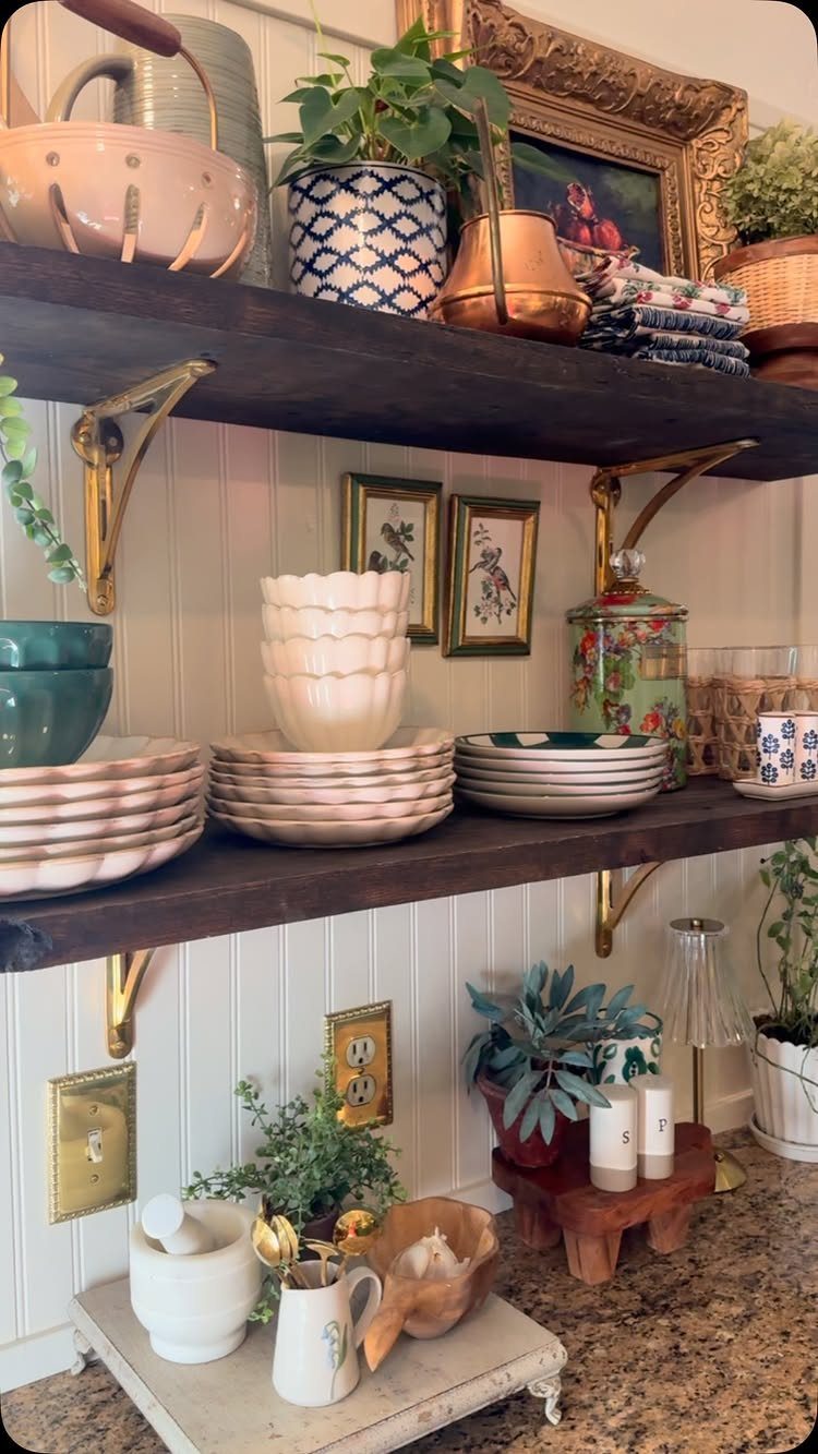
Open shelves turn your everyday dishes into the room’s main event. I group mine by color, stacking plates on one end and tucking small bowls in front so nothing looks scattered.
Keep only what you actually like looking at: a few cream pitchers, a small framed print, maybe a trailing pothos that doesn’t mind the dry air.
This works best when your dishes have some unity, even if it’s loose. Mismatched vintage can look collected; mismatched everything looks like storage.
If your cabinets are solid now, removing the doors costs little and lets you test the look before committing. Glass fronts soften the same idea if full open feels too exposed.
2. Install Glass Cabinet Doors
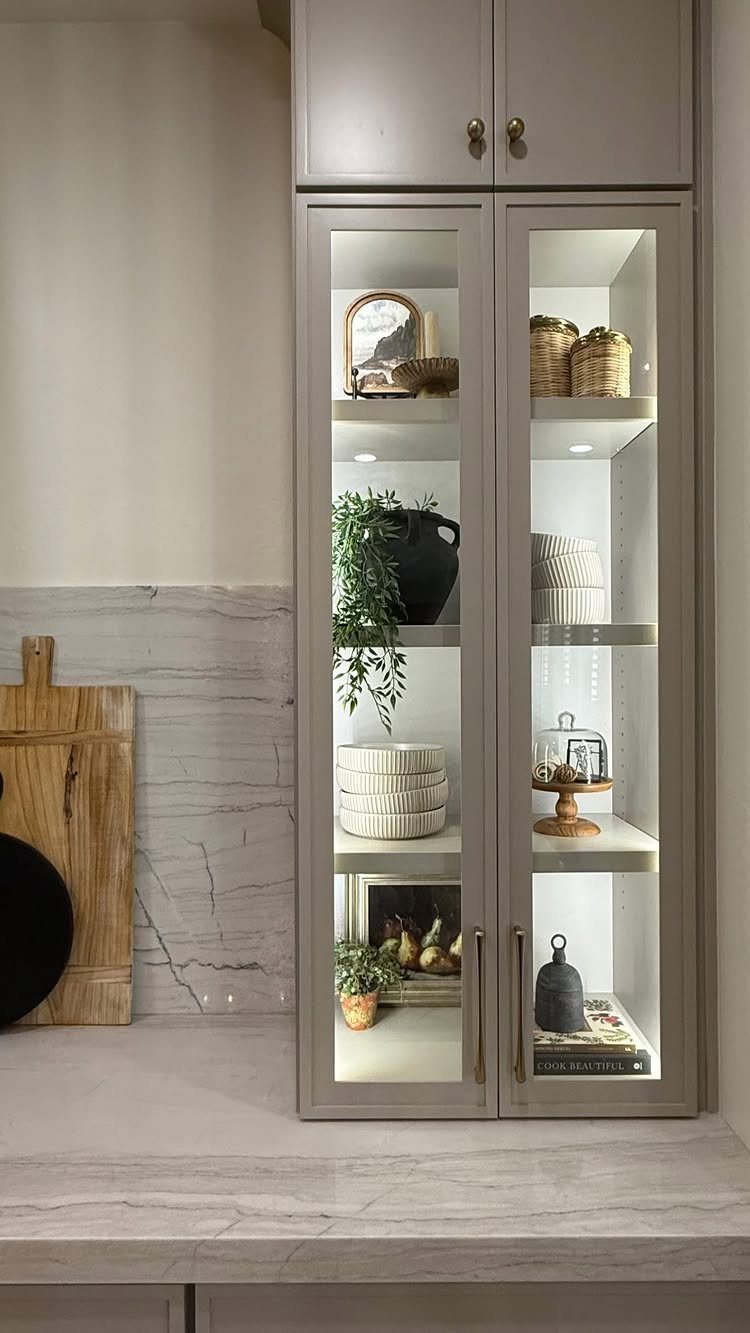
Glass cabinet doors do what open shelves do, but with a buffer. You still see your dishes, yet the dust stays out and the visual noise drops.
I’ve done this two ways: paying a carpenter to cut glass into existing doors, and ordering new "glass-ready" frames from a cabinet shop. The second route cost more but looked cleaner.
One thing I missed the first time: the inside of the cabinet was raw wood, nothing like the painted exterior. Once I painted the interior to match, the whole thing came together.
If your cabinet boxes are dark and your kitchen is light, that gap will show. Check before you order.
3. Hang Pans
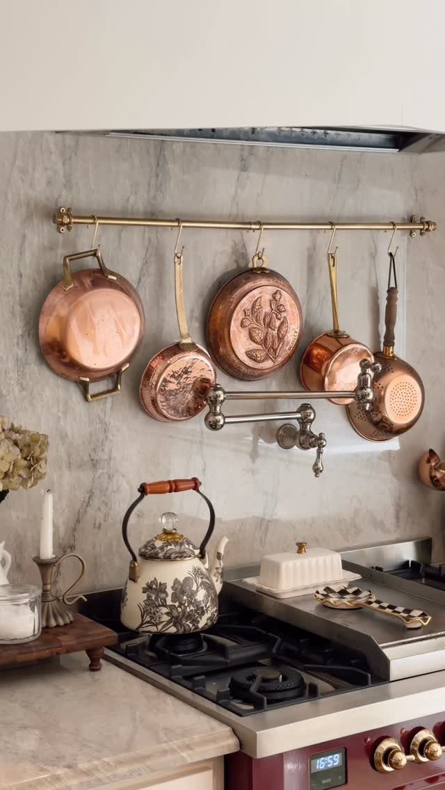
A brass rail across the backsplash turns copper pans into something you want to look at, not just cook with. The rail itself is simple hardware; the interest comes from what hangs from it.
I favor pans with some age on them, the ones that have gone matte and pinkish where the tin has worn thin. New copper can look theatrical.
Weight is the real limit. A heavy cast-iron Dutch oven needs a stud behind it, not just drywall anchors.
Test your rail with something light first, then add. If your pans are all nonstick black or battered stainless, this idea trades storage for display and may not pay off.
A single row of matching skillets works better than a crowded jumble.
4. Incorporate Unique Artwork
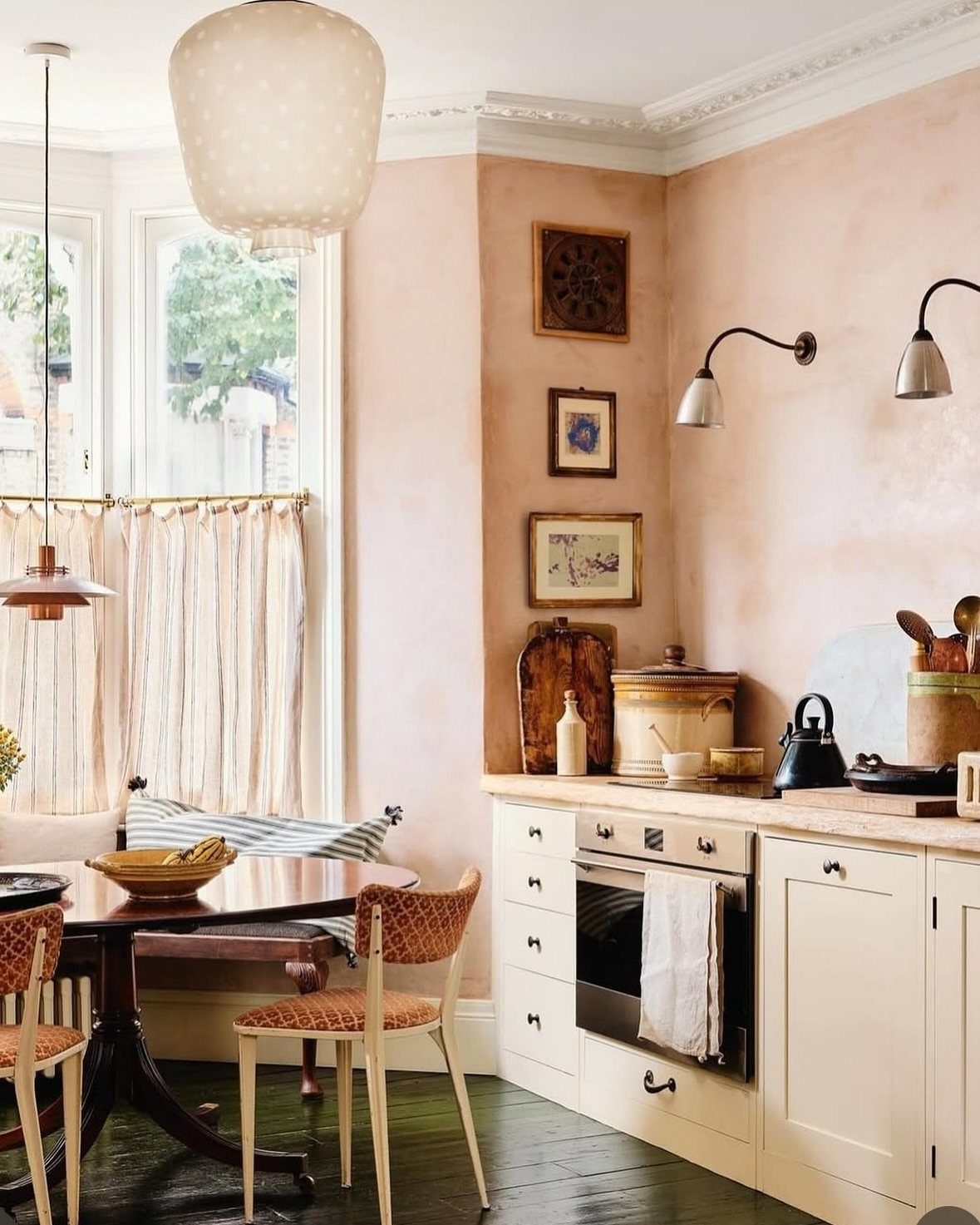
Kitchen art doesn’t have to be fruit prints or coffee signs. A large botanical, nothing to do with cooking, works well where blank wall space sits unused.
It changed how the whole room felt.
Size matters more than subject. A small frame gets lost above a counter; go bigger than you think, or stack two or three vertically.
Leaning art against the backsplash on a shelf reads casual, but it also collects grease. I reserve that move for spots away from the stove.
If your walls are already busy with tile or open storage, skip this one. It needs room to breathe.
5. Go Blue on Blue on Blue
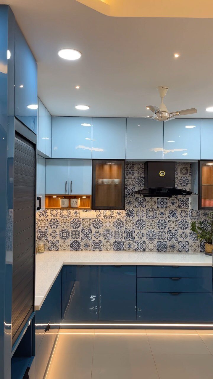
Blue layers well because it shifts so easily from moody to airy. Dark base cabinets, light uppers, and a patterned blue-and-white tile slipped between them keeps the color from going flat.
That gradation keeps monochrome from flattening out.
The risk is making it feel like a bathroom. I avoid glossy finishes on every surface and mix in wood, brass, or matte black to break the coolness.
If your kitchen is small, lighter blues on the uppers keep the walls from closing in. A single blue wall with white cabinets does the same thing more quietly, and you can paint over it when you’re tired of it.
Wallpaper with a blue floral, like Shannon Roberts used in Savannah, commits harder but rewards more.
6. Use Fresh Herbs as Decor
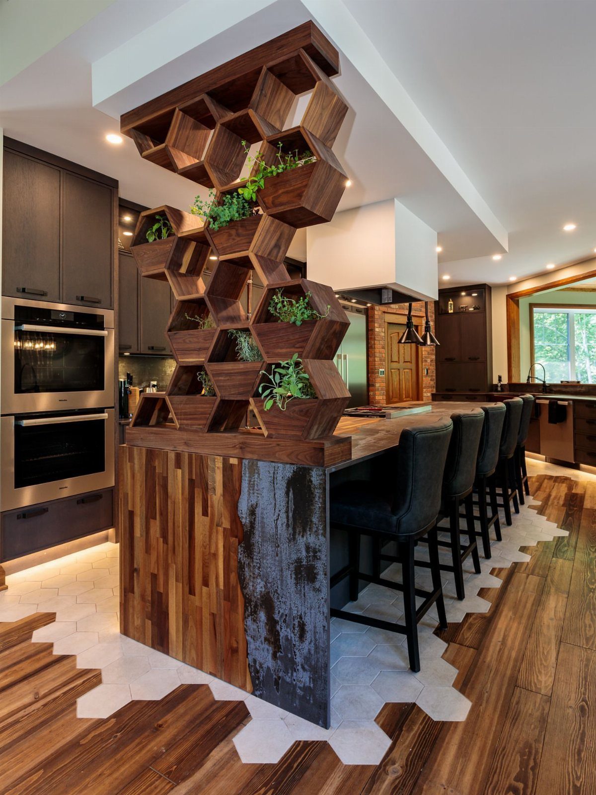
Herbs on the counter do what a flower arrangement does, except you snip them Tuesday night and they grow back. Small mason jars or a pitcher near the stove keeps herbs where you’ll actually use them.
Basil lasts longer than you’d think; rosemary practically takes care of itself.
A windowsill with three matching pots does the same work without the custom install. What kills kitchen herbs is usually overwatering or too little light.
A south-facing window is ideal; in a dark kitchen, stick to parsley or mint, which tolerate less sun than basil or rosemary. If you travel often, this isn’t your decor.
Herbs want a splash of water every few days and a quick trim to keep them bushy.
7. Decorate with Dish Towels
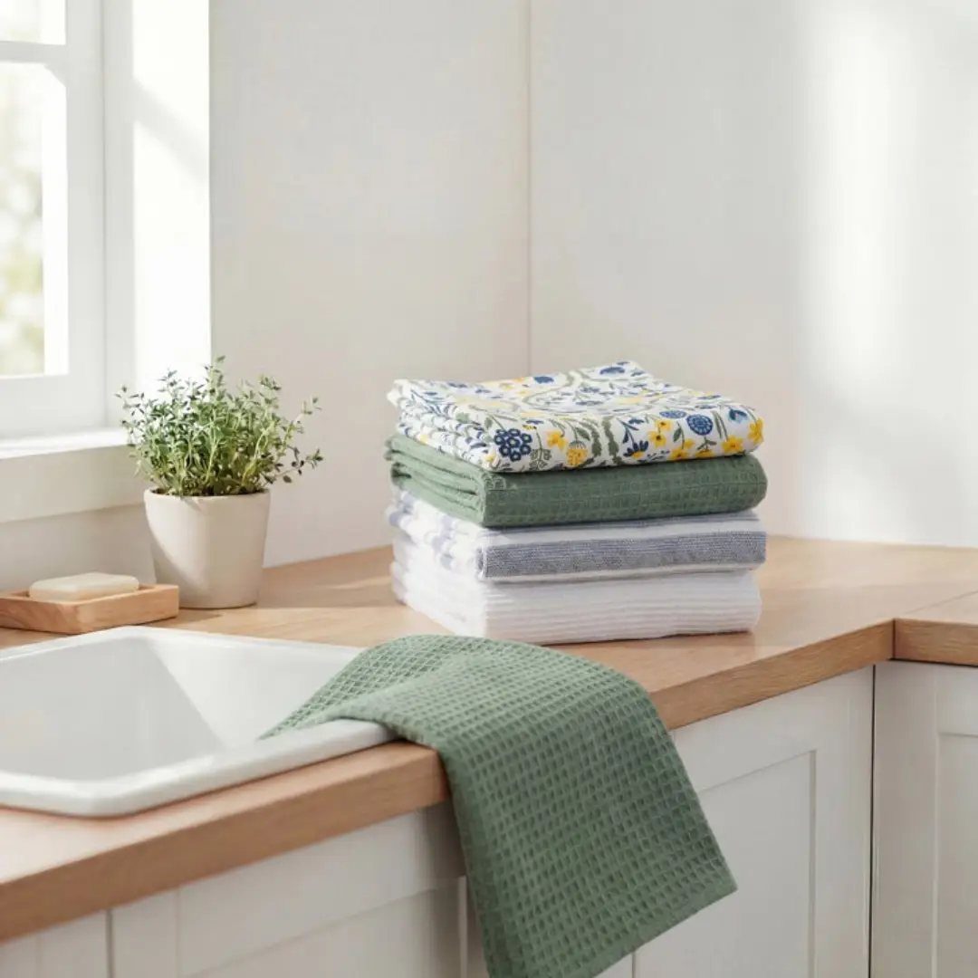
A good dish towel does two jobs at once: it dries your hands and it carries a color you want more of in the room. Keep two stacks: the pretty ones for show and the workhorses for spills.
The display stack sits folded on the counter or draped over the oven handle, picked to repeat a color already in the cabinets or the tile. Switching them out takes under a minute and costs less than a takeout lunch.
This suits renters and anyone who tires of a look fast. Storage is the only catch; you need a drawer or basket for the backup set.
8. Use Seasonal Decor
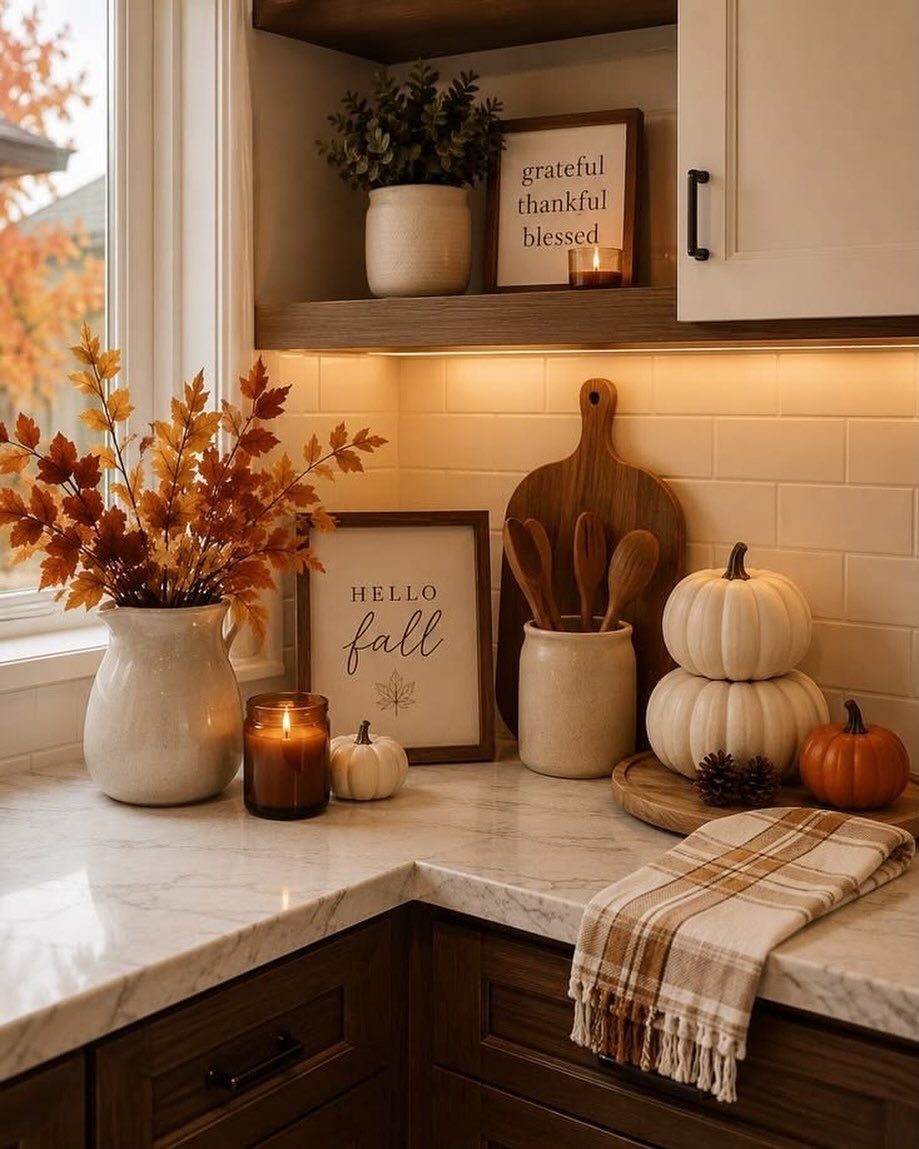
Seasonal kitchen decor sounds like clutter, but a single corner of counter does the work. A small pumpkin, a pitcher of dried stems, one candle: three items, no more, swapped when the weather turns.
Choose a spot visible from the living area, so the kitchen feels tied to the rest of the house without spreading decorations everywhere. I set mine where I do not prep food, so nothing moves for cooking.
This asks for pocket change a season if you buy, nothing if you forage. Skip it if your kitchen has no spare surface; a crowded counter looks messy, not festive.
9. Create a Vignette
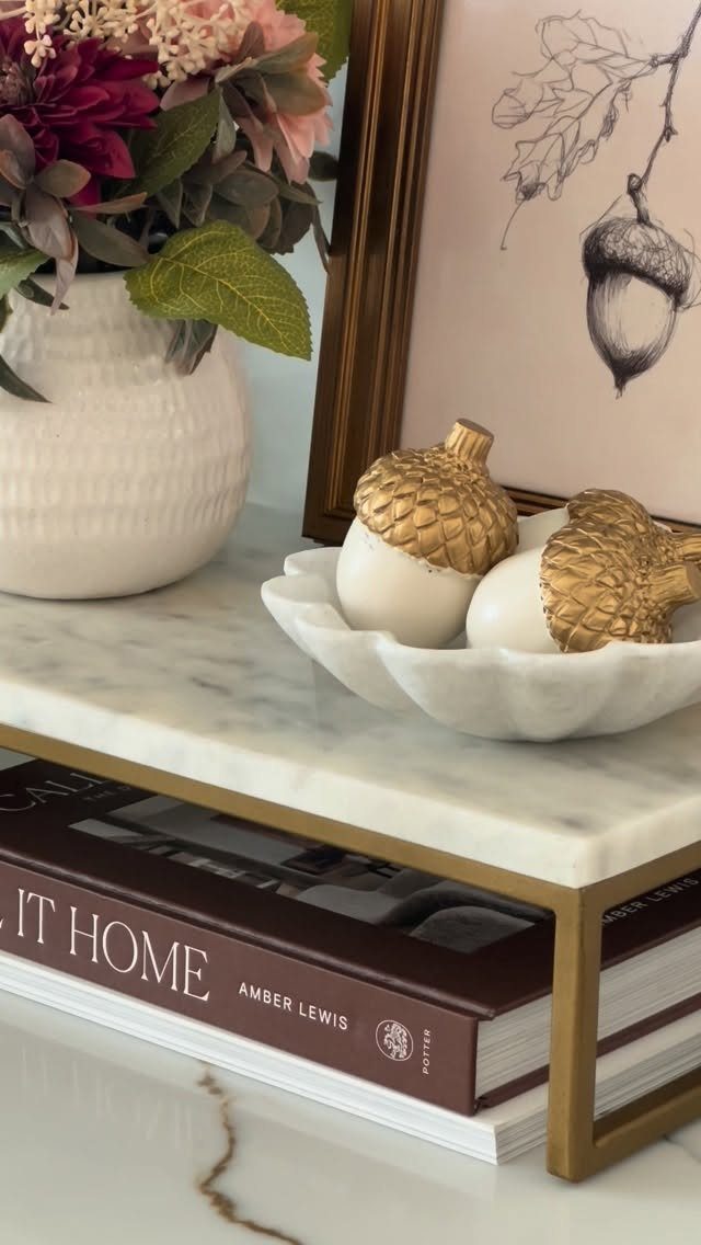
A vignette is just a small group of objects that looks deliberate. A cutting board, a tray, or a basket gives you something to build on.
Layer in one tall thing, one low thing, something with texture. Flowers give height, a bowl gives shape, a book gives weight; that is the formula.
I build mine on the island corner I never use for chopping, visible from three rooms. Seasonal items keep it from going stale; acorns in fall, a citrus bowl in January.
This costs nothing if you shop your own shelves. It fails when everything matches too well; you need one piece that does not quite belong.
10. Show Off a Mug Collection
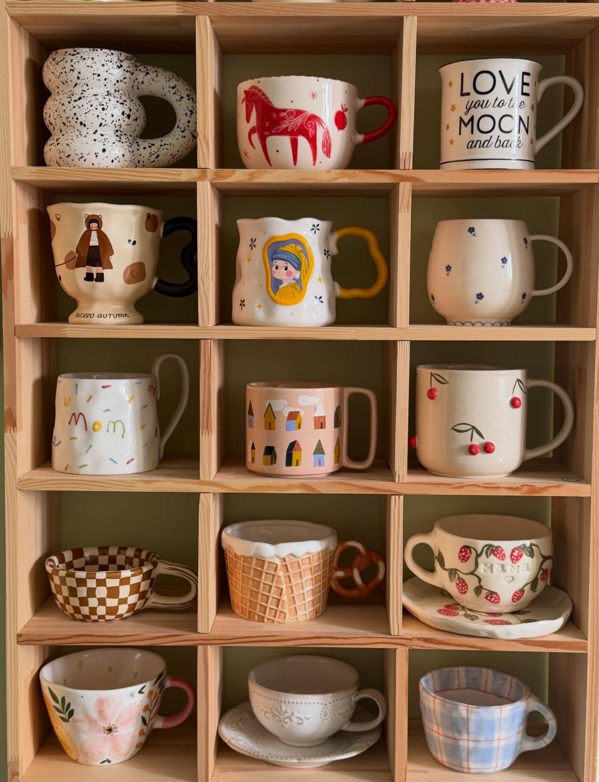
Mugs multiply. After the third cabinet shelf fills, the collection becomes a display problem or a display opportunity.
A pegboard wall, cubby shelving, or a simple row of hooks turns them into color blocks against plain tile. Cubbies keep dust off and group by size; pegboards let you rearrange when you add a new favorite.
I would pick pegboards for a rental, since the holes patch with spackle later. Exposed handles collect grease near the stove, so mount away from cooking splatter.
This works best when your mugs share a palette or a maker; a random assortment reads as storage, not curation.
11. Display Your Cookbooks
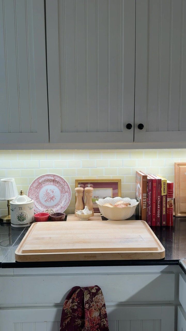
Cookbooks with stained spines belong in use, not on display. But the ones with good covers, the gifts, the splurges: those earn their counter space.
Stand a few upright against the backsplash, or open one on a stand to a photographed recipe. I match the cover color to whatever the kitchen already repeats, so the books read as intentional, not accumulated.
The cost is the shelf or stand, about the price of a nice dinner out, and the lost prep space they occupy. This suits cooks who actually reference books; if you cook from your phone, the display feels hollow fast.
A single open book on a cutting board does the same work with less commitment.
12. Statement Lighting
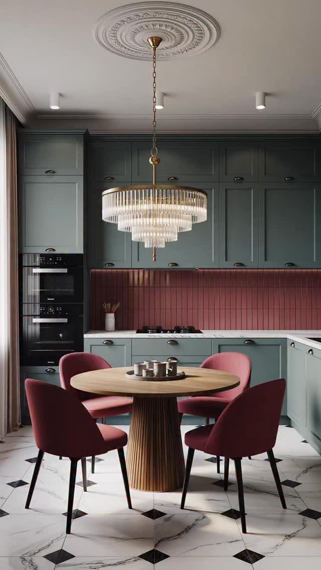
One oversized fixture anchors the whole room in a way scattered small pendants cannot. An oversized fixture over a dining table or island anchors the whole room the same way.
Scale matters more than style; a too-small light looks like an afterthought, and a too-large one turns cooking into theater. Light is where I would spend money before cabinet hardware, since you notice it every time you enter.
Installation needs an electrician for most people, and bold fixtures cast bold shadows. Skip the statement if your kitchen ceiling is low; a flush mount keeps headroom.
13. Incorporate Vintage Rugs
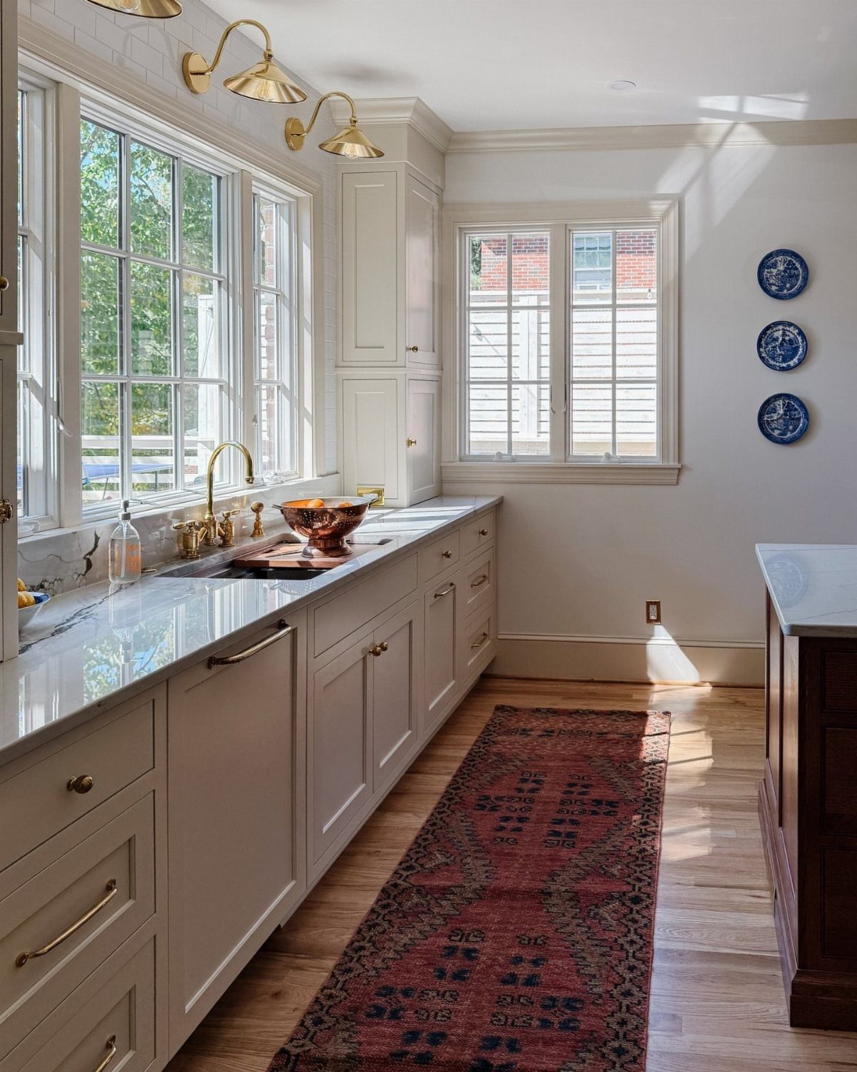
A worn runner underfoot softens the hard surfaces that dominate most kitchens. Vintage rugs cost less than you’d think if you hunt estate sales, and they hide the spills that light wood or tile announce immediately.
Low-pile wool or flat-weave cotton works best near the sink; shag traps crumbs and never lets go. I lay a rug pad underneath every time, even on bare wood, because a sliding runner is a broken ankle waiting to happen.
Red tones warm a cool palette without repainting a cabinet. For renters, this is the single biggest change you can make and roll up when you leave.
Breakfast nooks take smaller scatter rugs, 3×5 or 4×6, layered over whatever came with the apartment.
14. Add Patterned Shades
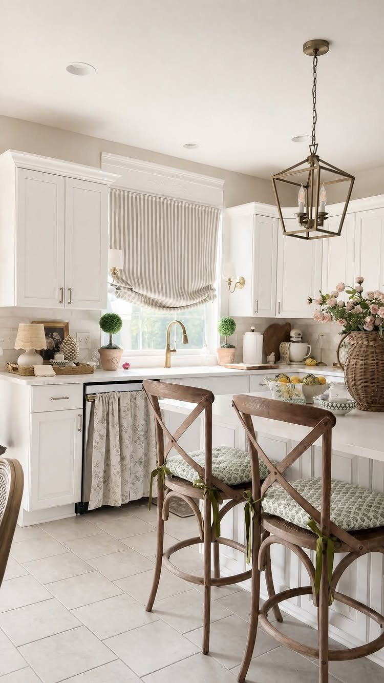
Striped Roman shades do what bare windows cannot: they add pattern at eye level, where you actually notice it while washing dishes or leaning on the counter.
Fabric shades cost less if you measure and order yourself; custom work solves odd sizes but runs the bill up fast.
A brass rod is a detail worth copying. A cheap shade on a handsome rod looks intentional; a beautiful shade on a flimsy rod looks like a mistake.
The stripes here run horizontal, which widens a narrow kitchen visually; vertical stripes would lift the ceiling instead.
Cafe curtains work for sinks that face a fence or wall, where full coverage is unnecessary and half the fabric is enough.
15. Use Checkerboard Tile
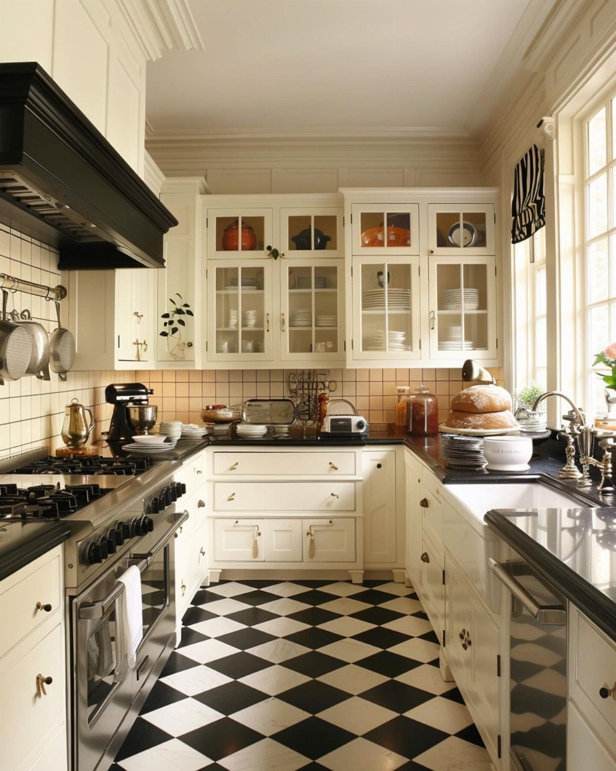
Checkerboard tile reads as classic because it is: the pattern has been down in American kitchens for a century, and it still looks correct because it never committed to a trend it could fall out of.
A diamond layout turns the squares, which slows the eye and makes a narrow galley feel wider than it is.
Black and white is the standard, but cream and charcoal or two blues work if the contrast stays sharp enough to read from the doorway.
Porcelain tile is the real thing; vinyl mimics it and softens underfoot, though it will not last.
Small kitchens need the pattern contained. I stop checkerboard at the cabinet footprint; running it under islands or tables breaks the rhythm and looks accidental.
16. Use Bold Window Treatments
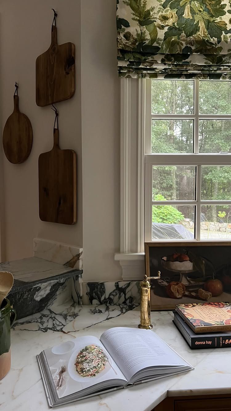
A floral Roman shade at the window turns a kitchen into a room that happens to cook, not a utilitarian box.
A still-life painting and cutting boards can share the same warm palette so the shade does not float alone but anchors a cluster of objects that talk to each other.
I choose patterns with a background color that already exists in the kitchen, never the accent I am trying to introduce.
A floral on white, as here, suits white cabinetry; on wood cabinets I would look for a ground tone that matches the stain.
Full-length curtains in a kitchen collect grease near the range and require washing quarterly. Roman shades stay above the sill, out of the splash zone, and vacuum clean in place.
17. Create a Wine Nook
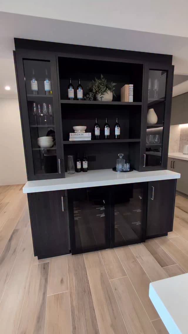
A dedicated wine nook saves the counter from the jumble of bottles that otherwise migrates to every horizontal surface.
A built-in can use glass doors above to display glasses, solid doors below for the clutter of cocktail shakers and spare corks, and open shelving in between for the bottles themselves.
I plan for one bottle per linear inch of shelf; anything denser looks stocked, not curated.
The wine cooler at the base is a splurge, but it protects reds from the temperature swings of a kitchen better than any rack above the refrigerator.
Renters can replicate this with a bar cabinet on wheels, positioned against a wall that already has an outlet.
I have seen narrow credenzas, 18 inches deep, hold thirty bottles and all the glassware for a small dinner party without dominating a galley layout.
18. Maximize a Galley Kitchen
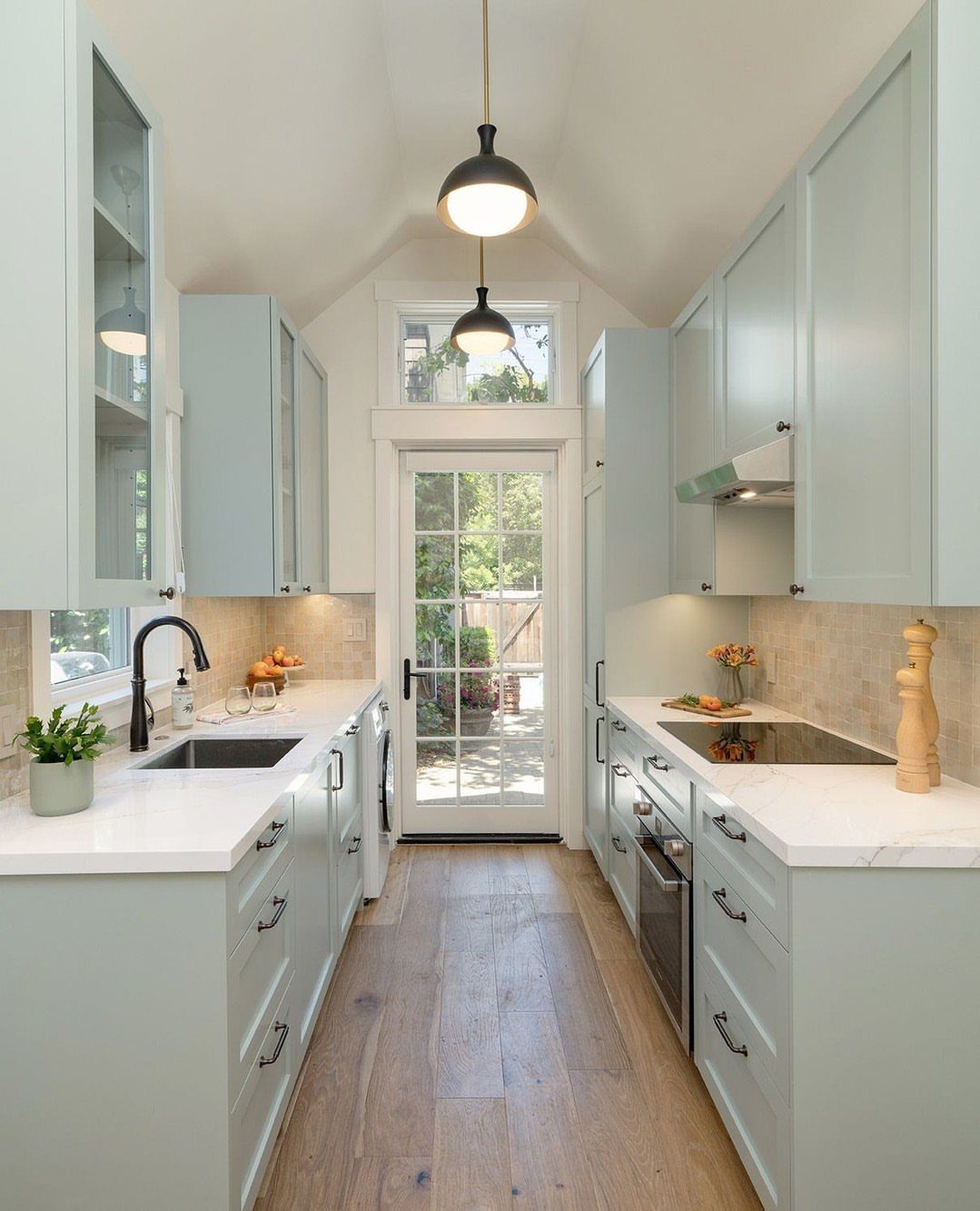
Galley kitchens force every decision because the space permits so few.
Light blue cabinets running both walls in a color that is not white but reads as bright is the compromise for a room with only one window at the far end.
Open shelving on the upper half of one wall, as here, breaks the tunnel effect of facing cabinets. I limit open storage to dishes I use weekly; the special-occasion platter in a galley collects dust and looks neglected.
The glass door at the terminus is the real move. Where a solid wall ends a galley, I hang a mirror or a framed print with depth to fake the same escape route.
Pendant lights over the counter, not the ceiling fixture alone, drop light to where hands actually work.
Hardwood floors run the length to stretch the room visually; crosswise planks or busy tile stop the eye and emphasize the narrowness.
19. Ditch Upper Cabinets
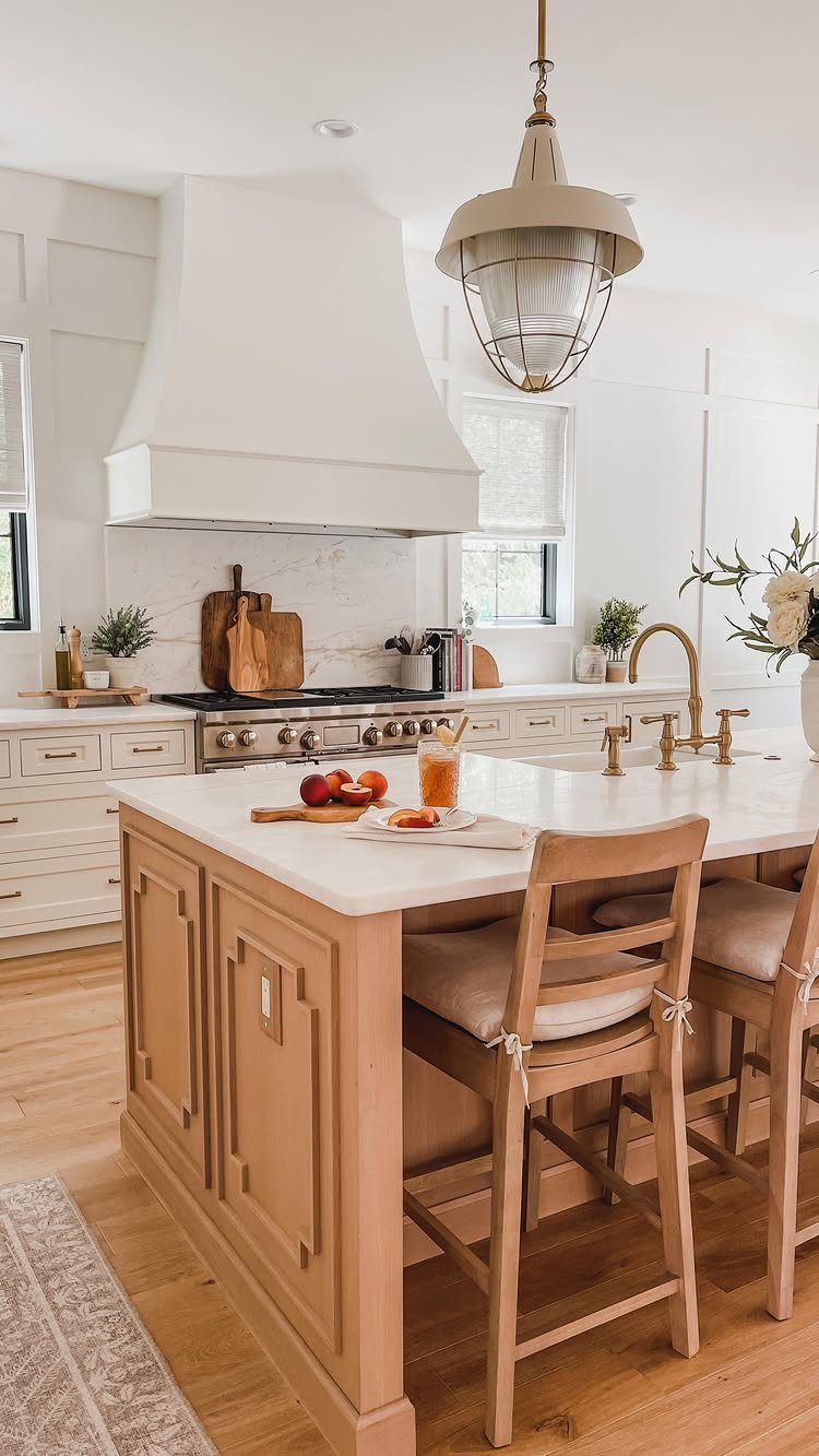
Removing upper cabinets trades storage for breathing room. The wall opens to windows or bare plaster, and the kitchen feels larger even in a small footprint.
I would only do this if I already had a pantry or a run of base cabinets that could hold the overflow. Without that, the daily hunt for a mixing bowl gets old fast.
A friend in a galley apartment tried it and ended up reinstallating a single shelf for everyday plates.
If you go this route, keep the lower cabinets in a warm tone and run the backsplash up to the ceiling. The eye reads that vertical surface as space.
20. Add a Built-in Ladder
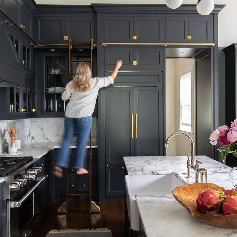
A rolling ladder on a brass rail turns tall shelving from wasted height into usable storage.
Dark painted cabinets and marble counters set it off, but the same idea works with open pine shelves in a cottage kitchen.
Cost runs higher than a step stool, though a good stool still costs plenty and does not stay in view.
This suits kitchens with high ceilings. Anything lower and the ladder becomes ornamental, which is fine if you want the look, but the function drops away.
21. Use Decorative Hood
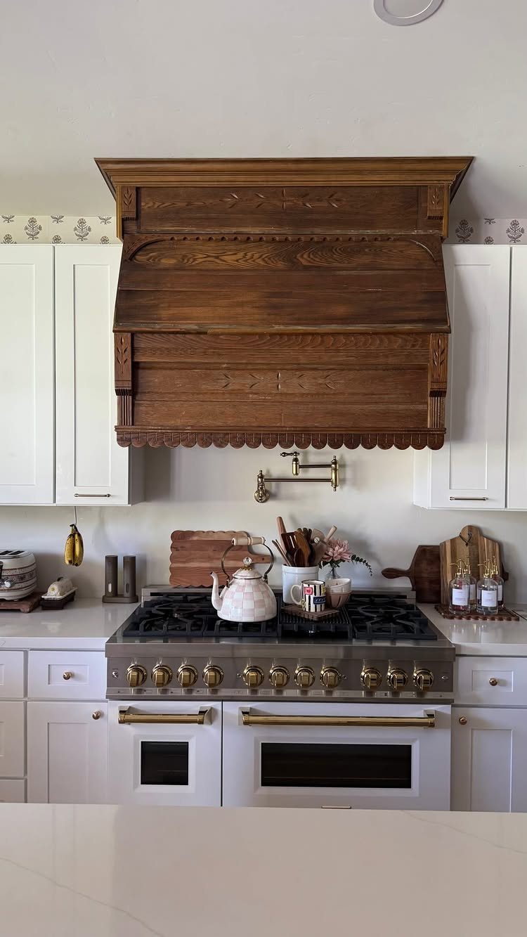
A range hood carved from wood or finished in patinated metal becomes the room’s sculpture.
Custom work from a metal fabricator runs the most, but salvaged pieces and ready-made decorative covers cut the price.
I would check that the blower and ducting still move air properly; a hood that looks beautiful but leaves grease on your cabinets is not a good trade.
This works best when the rest of the kitchen stays quiet: white cabinets, simple hardware, no competing pattern. Let the hood carry the visual weight.
22. Paint the Floor
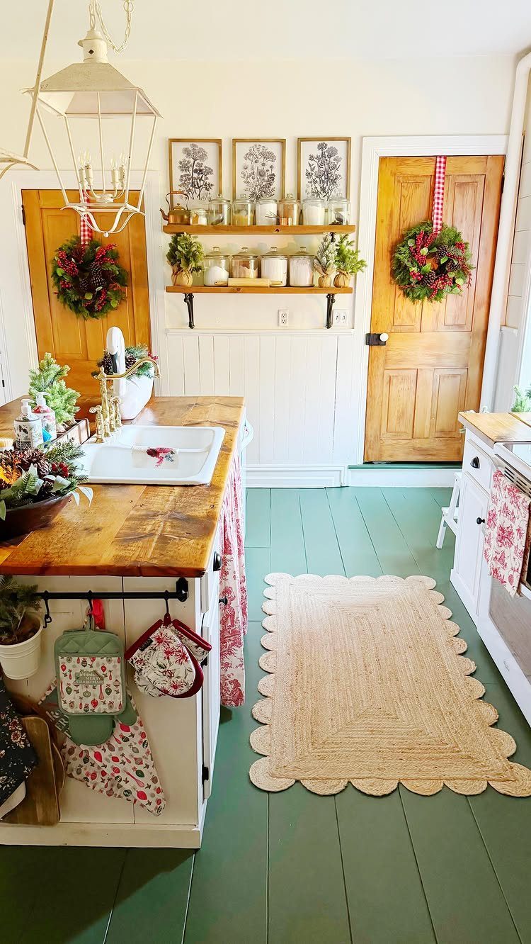
Painted plank floors read as intentional, not temporary. Sage green or a blue-and-white check gives a country kitchen its character and hides scuffs better than bare wood.
The prep is the work: scrub, sand, prime with an oil-based blocker, then two coats of porch-and-floor enamel. A weekend of drying between coats, so plan to eat elsewhere.
A woven rug over the traffic path saves the finish and softens the sound.
I would not attempt this over engineered hardwood or laminate; the paint chips where the surface flexes. Solid plank or original pine is the right base.
23. Incorporate Animal Decor
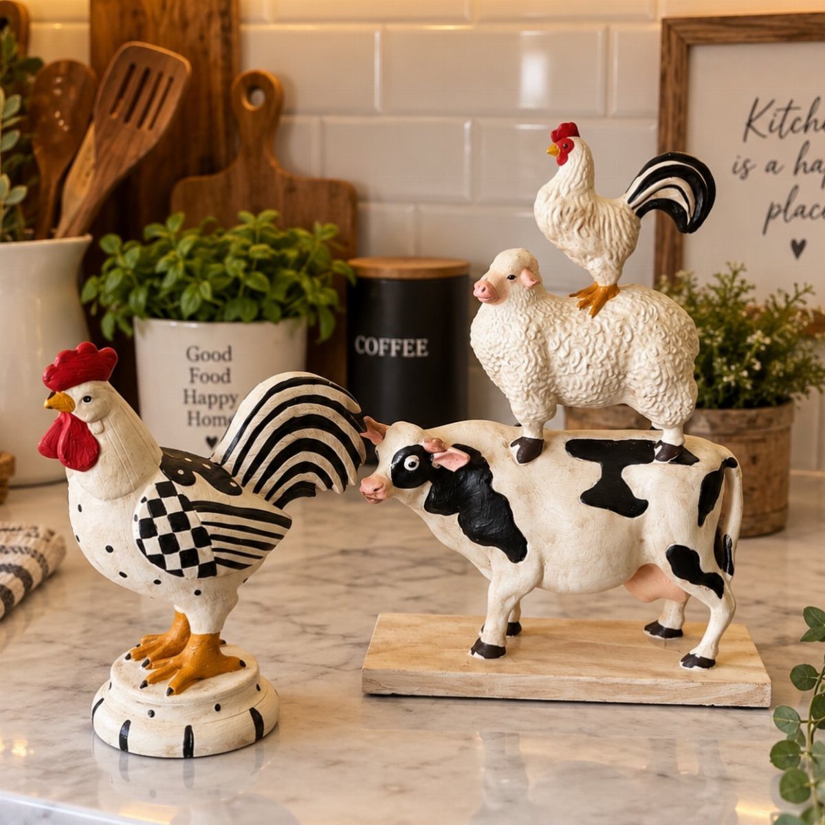
Ceramic roosters, sheep, or a small beetle in a frame add personality without demanding a full redesign. White figurines with black detail, stacked on marble, give a playful rather than rustic effect.
One or two pieces carry the theme; a shelf of animals reads as collection, not accident. I would place them where the eye lands in a pause spot: beside the coffee canister, on a windowsill, not clustered where prep happens.
If your taste runs more modern, a single graphic print of a fish or fowl does the same work with cleaner lines.
Importance of Personal Style
A kitchen that feels like yours rarely arrives all at once.
It builds from the objects you already own and actually use: the cocktail glasses from a trip, the cookbook with the sauce-stained page you return to, the small ceramic figure that has moved with you three times.
These items carry weight because they hold memory, not because they cost much.
Give them a stage without letting them scatter. A single shelf, a corner of counter, a windowsill: one defined spot keeps the personal from becoming clutter.
I group by what connects the objects, not by what matches. Two blue glasses and a green bowl work if they share a scale or a curve.
Three items with nothing in common but that you like them read as collection; six items read as mess.
Change the grouping when you tire of it. That is the freedom of working small.
Budget-Friendly Updates
Most kitchen updates that matter cost less than a full tank of gas and take an afternoon. Hardware is the obvious place: new pulls on old cabinets are cheap if you shop online, and the swap needs only a screwdriver.
Matte black or brushed nickel pulls finish a kitchen in a way old brass rarely manages.
Countertop changes without replacement mean a new tray, a fresh stack of towels in a color you have not used before, or a single open shelf where a cabinet door hung.
The backsplash is harder, but peel-and-stick tile has improved enough to try behind a coffee station or beside the range, a short strip that reads as intention rather than renovation.
One change per season, and only after living with the current state long enough to know what actually bothers you, keeps the budget and the peace intact. Speed decorating wastes money.
A single hardware pull you notice every morning beats a bigger change you stop seeing in a week.
Functionality and Aesthetics
A beautiful kitchen that fights you while you cook is a showroom, not a room.
The balance tilts when decoration starts stealing function: art above the range that you must wipe weekly, open shelving so packed that finding a plate becomes archaeology, a rug so thick that rolling a cart across it requires two hands.
I test every decorative choice with a single question: does it add work? A pegboard of mugs adds none if it mounts away from splatter.
A Roman shade adds little if it vacuums clean in place.
The kitchens I return to in memory all got this right. The glass cabinet with the interior painted to match the exterior, so display did not fight shadow.
Beauty that respects the work a kitchen does lasts longer than beauty that ignores it.
The way you decorate your kitchen can heavily affect how you feel in it.
Seasonal Decor Rotation
Rotating decor with the seasons sounds like effort until you limit it to a single shelf or cabinet front. Open shelves and glass-front cabinets both suit this; the difference is only how much dust you are willing to wipe.
Glass cabinets work better as display than storage, which makes the seasonal swap fast.
Summer means a stack of bright plates, the kind that turn a Tuesday lunch into something lighter. Fall brings ceramic pitchers in amber and cream, the collection that grew one estate sale at a time.
Winter is white bowls, simple and clean against the dark outside.
The rule is three items, no more, and never every shelf. Breathing room between stacks reads as curation; tight packing reads as hoarding.
I leave one cabinet entirely unchanged year-round, a small anchor so the room does not feel like a stage set.
The cost is zero if you shop what you already own and store the off-season pieces in the back of a lower cabinet. The effect is a kitchen that notices the year turning, which is more than most rooms manage.